Dashboards: Hot, Desirable, and a Useless Mess?

Hey there!
What do you think of when I say the phrase “data dashboard” to you?
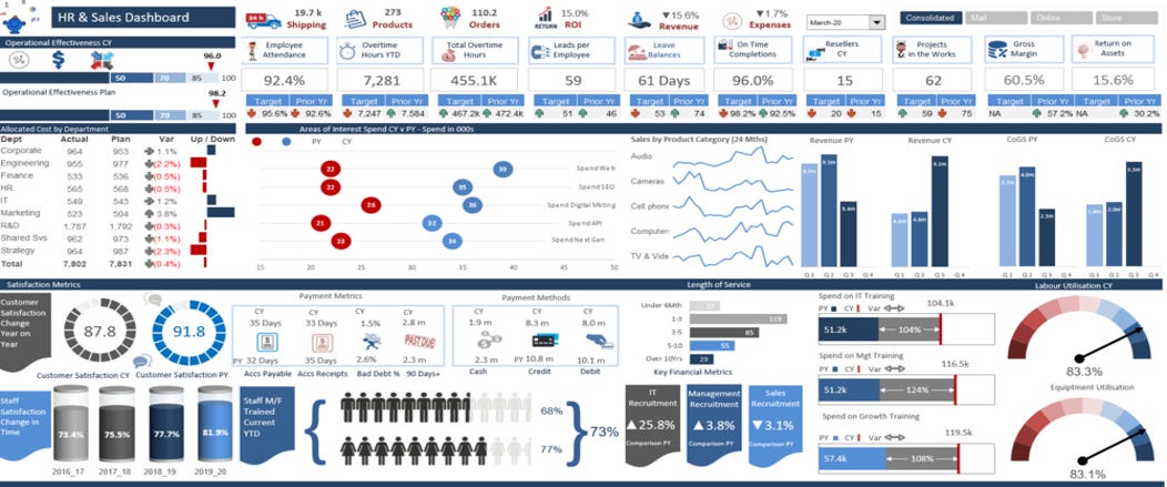
You probably think of either a dashboard you use regularly, or one that you’ve seen that made an impression on you. Either of them (or both) were probably jam-packed full of data and visuals and tables, right? Some pie graphs… some line charts. Tons of stuff.

Data dashboards are great for that, right? Just being able to have a ton of information right there for anyone to sift through and explore. THROW ALL THE DATA IN THERE!!!
This is the big draw of dashboards. This is why everyone wants them.
It’s also the #1 reason why most dashboards are TERRIBLE.
They are a HOT MESS.

Think of a dashboard again… FILLED with data.
Now, imagine that you are trying to find one bit of insight from one of these complicated dashboards. The insight isn’t immediately evident because there’s so much data being shown. You probably have to filter something, and then filter another thing, and then filter yet something else to find a key number or insight you are looking for. Like, how many widgets were sold in a certain area in a certain time period, by a certain salesperson.
It’s a Hot Mess. It may look impressive, but it’s a functional mess. Hard to use, hard to find key bits of data, hard to love.

Your users will end up either ignoring your report completely or if they can’t ignore it, they just hate using it.
Most dashboards try to be a jack of all trades, and become a king or queen of NONE.
They do an okaaaay job at a bunch of things, but you don’t want to make something that someone describes as “okaaaaaaay…” You want to make something that knocks their socks off with awesomeness. Like, knock their socks into the next county with ease and speed.
Make your dashboards easy to read, and easy to use. You don’t *need* everything in one view. A dashboard can have a ton of data coming into it without hitting the viewer over the head with it.
Make that dashboard quick to use and easy to use.
People want quick. People LOVE easy.

Want to know how to make easy and quick dashboards that drive right to the point for your viewers?
Get in touch with me. I love to teach people new things.
You can reply to this email (or comment below if you’re not reading this in your email.)
Email me at joe@traversdata.com
Follow me on Instagram @travers.data
Connect with me on LinkedIn @traversdata