How to code a Transparent color in DAX
Welcome to the post about coding a transparent color in Power BI.
This little trick used to be needed alllll the time, but recently Microsoft has added transparency sliders to a lot of chart elements.
That doesn’t mean that we can forget about knowing how to code transparency, however, because it still comes in handy.
If you want to use the same Power BI file I screenshot in the written summary below, here’s the pbix file to download. You can also click the graphic below to get it.

Video Instructions:
Written Instructions:
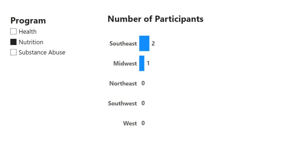
We’re starting off with just a basic Power BI file that has a Bar Chart and a Slicer, and if we click around in our slicer, we can see that while our Health and Substance Abuse programs have a good number of participants, if we click “Nutrition” there are only a few participants.
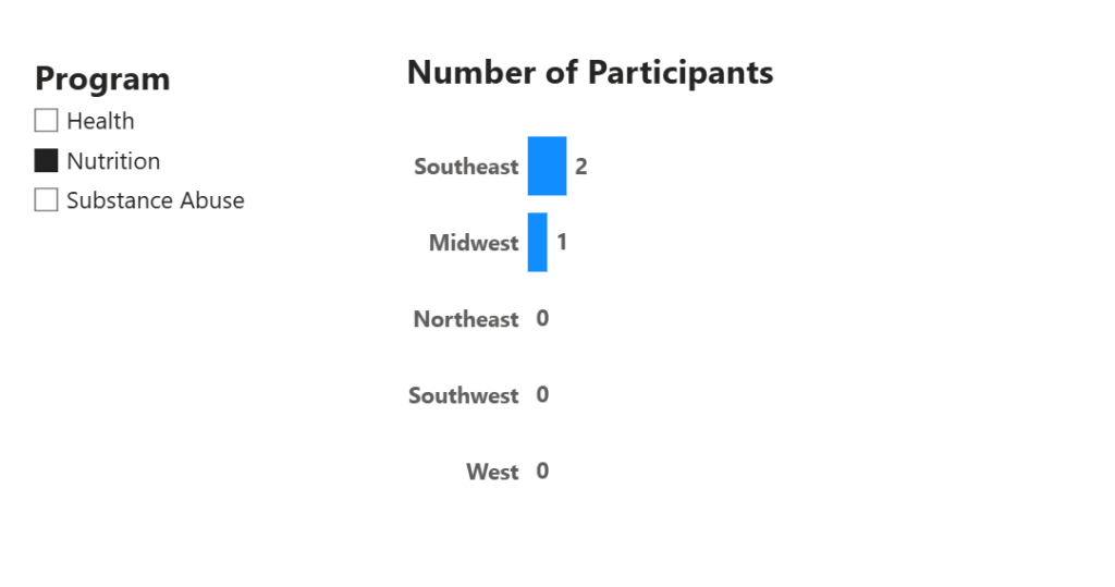
There could be a few reasons for this, but sometimes the reason is that the program is brand new, and sign-ups for the program are still happening. In a case like this… your boss, or board, or CEO may say “Can we have this chart not show up if Nutrition is selected? It looks like no one wants to be in it… we can show it once sign-ups are complete.”
Quite the ask, huh? Is this is even possible?
It’s not only possible, but it’s pretty darn easy.
First, let’s look at what will NOT work, which is the built-in Transparency options in Power BI formatting. Most of these options are pretty new, but still have limitations.
The Bar, and Data Label formatting options have Transparency Sliders where we can adjust transparency of those elements.
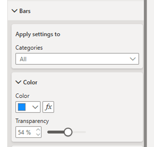
Our Y-Axis Values and our Title settings do NOT have this option at all.
Plus, if we slide that Bar transparency slider all the way to 100%, our bars disappear completely, no matter what Program is selected.
So, the transparency sliders don’t actually work at all for what we need.
We need Transparency on ALL elements of our Bar Chart when Nutrition is selected on our Slicer, but only then. If anything else is selected, we want to see our amazing bar chart.
The solution, conditional transparency, is easy.
First, we need to use a Transparent color code in a little bit of DAX code we are going to write. A regular color code is a 6-character “hexidecimal” code. The code for white is #FFFFFF (6 Fs), and the code for black is #000000. Every color has a code.
To make a color transparent, all we need to do is add two 0s on the end of the code. That’s it.
So making white transparent, the code would be #FFFFFF00.
Easy right?
Now, we just need to write a bit of DAX that tells Power BI we want a measure that holds a transparent color code, but ONLY when our Nutrition program is selected in our slicer.
Let’s go. Click ‘New measure’ in the ‘ribbon at the top of ‘Home’ ribbon at the top of Power BI and write this code (and hit enter).
TRANSPARENCY = IF(MAX('Table'[Program]) = "Nutrition", "#FFFFFF00")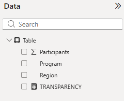
It’s a really simple IF statement that used a MAX function to check if the Program column is sliced for Nutrition. If it is, this measure is going to hold our code for the color white, but those two 0s to make it totally transparent.
Now we just need to apply it to the different elements of our chart.
First, let’s make sure ‘Nutrition’ is selected so we can make sure our transparency trick is working.
Now let’s apply our conditional transparency to all the pieces of our chart.
Go into the Visual Formatting, then into the Bars section, and click the fx button next to the color dropdown.
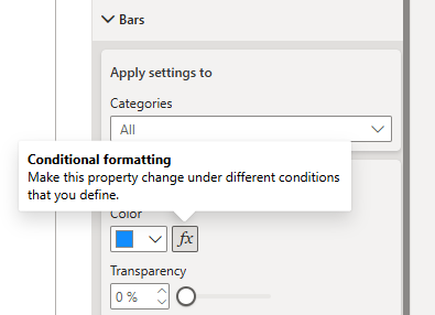
Clicking this opens up a conditional color formatting window.
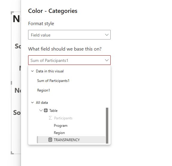
We want our Format Style to be ‘Field Value’ because we’re going to specify our new Transparency measure. Then find the measure in the ‘What field should we base this on?’ dropdown.
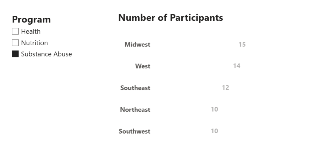
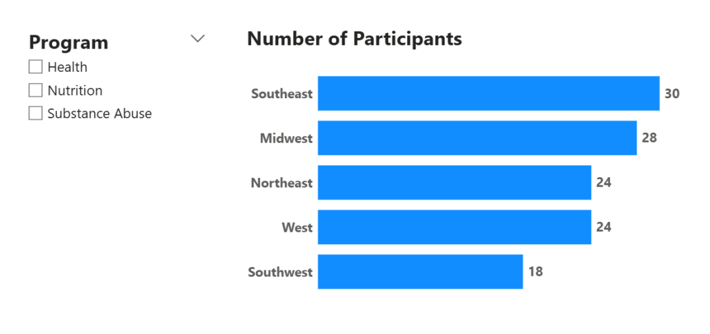
That’s it! Your bars should disappear, but ONLY when ‘Nutrition’ is selected in our slicer.

Now we do the exact same thing in the color options for our Data Labels, and our Y-Axis values, and our Title. Just find that little fx button next to the color selector, and specify that you want to use the TRANSPARENCY measure Field Value.
Once you’ve done that, the chart totally disappears if ‘Nutrition’ is selected. If anything is selected (or nothing at all), then the chart appears!

Super cool, right?
You’re welcome.
Take care everyone,
Joe.
More Hot Tips!
Posts about Formatting
Like these posts but need more formal (but still engaging and fun) training in Power BI? Contact me, Joe Travers or at joe@traversdata.com. I got you.

Contact Joe | TraversData.com | People-Friendly Power BI | LinkedIn