4 Alternatives to Bar Charts in Power BI

Don’t you hate how whenever you buy something online, you see algorithm ads for days/weeks/months afterwards for that same product?
It’s like that big AI Skynet hivemind living in Jeff Bezo’s basement, while very smart, isn’t necessary intelligent. You have bought, say, a chandelier, and now the Amazon/Google monster thinks:“they bought one chandelier, and haven’t returned it, or left a bad review, therefore they must want MORE chandeliers. Bombard them with chandelier ads! Money money capitalism singularity sell to the humans”.

It has LOST the thread of our chandelier story. We don’t need another chandelier once we’ve bought one (usually, I don’t know your lighting needs situation). What we need to buy is maybe special-sized lightbulbs for that chandelier, or we need a guide to figure out how to install it. Or we need some kind of special duster to clean it.
We need a different tool. We bought the tool that holds light sources. Now we may need the light sources, or an installation guide tool, or a cleaning tool.
This is why it’s SO important, when you are building something, to actually know the needs of the person/people that will be using it.
This is why we need charts other than regular ol’ Bar/Column Charts. While easy and useful, sometimes something else is better.
In the last two editions of People-Friendly Power BI, we learned 5 Essential methods for making great Bar Charts in Power BI (things you should do *every* time you make a bar chart) and 5 Advanced methods to make Bar Charts amazing.
We’re ending our Bar Chart series (for now) with 4 Alternatives to Bar Charts. A couple of these are variations of bar/column charts (they still use bars) but have important differences, and a couple are completely different chart types.
Alternative 1: Overlapping Bar Charts
True, we’re still in the Bar Chart part of the data visualization world with an Overlapping Bar Chart, but it serves a whole different purpose than a regular bar chart.
While a regular bar chart allows us to compare categories of something really easily, an overlapping bar chart lets us do this PLUS show how a subset of data relates to the whole.
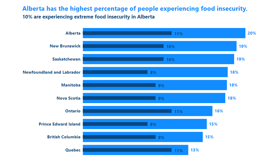
This chart type is VERY alternative in the Power BI world because it’s NOT a chart type that comes with Power BI. It has to be hacked using Power BI’s formatting options. It’s not hard once you know how. I try not to use external visuals and all their issues.
If you’d like to learn about how to make an Overlapping Bar Chart, get yourself on the VIP List for the Evergreen Data Visualization Academy. I create the Power BI tutorials there and we have one on how to make Overlapping Bars.
Alternative 2: Waterfall Charts
Waterfall charts are a different form of bar/column chart. Instead of each column starting at the 0 point on the y-axis, each bar either rises (or falls) from where the previous bar ends. It’s fantastic way to show how different elements or factor contribute to an increase (or decrease) of a metric.
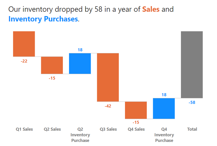
Waterfall charts come as a “stock” option in Power BI. I customized it by formatting the heck out of it, adding dynamic colored value labels and of course a great descriptive title.
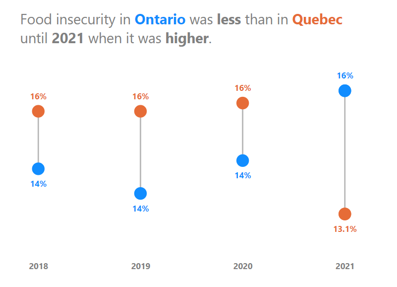
Alternative 3: Lollipops!
Sometimes a regular bar chart IS the right chart for your users and the insight you are trying to communicate from your data, but bar chart fatigue is a real thing.
Change things up with a Lollipop Chart, which is still excellent for comparing categories of something (just like a bar or column chart), but is a little easier on the eyes AND emphasizes the value more visually. A dot that represents the number gives more emphasize to that number.

Lollipops don’t come stock with Power BI, and there are some custom visuals you can add to make them (all with limited formatting), but why go out and get a visual when a Lollipop Chart is totally doable (and easy) to do in Power BI?
Vertical Lollipops (columns) are totally doable and easy. I’ve alllllmost figured out Horizontal Dumbbells (without resorting to adding in an external visual). Almost.
If you’d like to learn about how to make a Lollipop Chart, get yourself on the VIP List for the Evergreen Data Visualization Academy. I create the Power BI tutorials there and we have one on how to make Lollipop Chart.
Alternative 4: Dumbbell Dot Plots
Sometimes, people try and use Bar Charts to show the difference between two metrics across categories, and they always end up with those charts with a ton of bars that are impossible to decipher with a lot of work. It’s a mess. A Mess.
If your message is about the difference, then just show the difference, and emphasize that difference. Dumbbell dot plot charts are great at doing this. They focus the visual on just the data points and the differences between them.
This is another chart type that Power BI doesn’t come with, and while there are external visuals that will make these, they can be made with an easy Power BI hack.
If you’d like to learn about how to make a Dumbbell Dot Plot, get yourself on the VIP List for the Evergreen Data Visualization Academy. I create the Power BI tutorials there and we have one on how to make a Dumbbell Dot Plot.
Now you have 4 options to change things up and visualize bar/column chart data in different ways to tell the stories in the data better. That’s what it’s all about.