Five ADVANCED ways to make your Bar Charts amazing in Power BI

We’re going to talk more about bar charts everyone. Contain your excitement.
Okay… okay… let that excitement OUT! We’re talking about BAR CHARTS, after all!

Last time on People-Friendly Power BI, we talked about the five essential ways to make your bar charts the best in Power BI.
Namely, great titles (dynamic ones!), better labels and taking out chart clutter are all relatively easy to do in Power BI if you know where to click, and you WANT to do ALL of these things to make your bar charts easier and better for your users.
In this post though, we’re leveling up a TON. We’re going to take our simple (yet effective) bar charts and add features that not only make our charts EASIER for our viewers and give them MORE data, but makes people (like your boss) sit up and say “I had no idea a Bar Chart could DO that in Power BI!”
First let’s remind ourselves about where we left off in our last Bar Chart post with a visual.

A beautiful bar chart, right? This should be the bare minimum for all your bar charts. Easy labelling, no chart clutter, and a title that tells a story.
Now let’s explore multiple ways to take a bar chart like this to the next level.
1. MORE Dynamic text and calculations
We finished off our last post talking about creating awesome dynamic titles for our bar charts that CHANGE and tell a story as data changes. Well, Dynamic titles can tell simple stories but dynamic text can tell complicated stories. With a bit more work, you can perform ANY calculation in your data, and communicate it effectively in a title (or anywhere else).
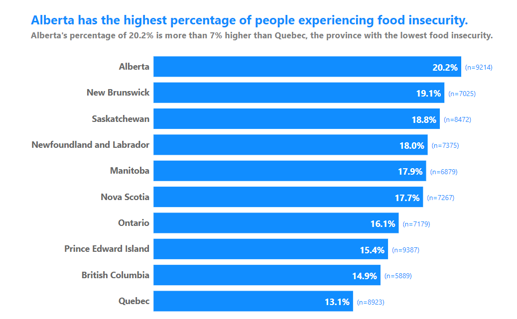
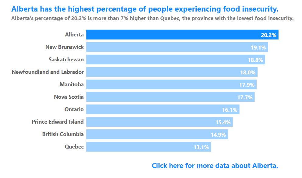
Here’s an example. Let’s say that we not only want to highlight what province has the highest percentage of food security, but HOW MUCH HIGHER that percentage is that the value in the province with the LOWEST value?
It’s doable! We can add a subtitle with that extra insight.
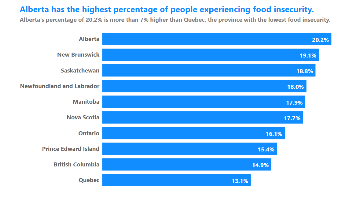
So, this chart title is now not only telling MORE of a story to viewers, but it’s doing work for them. It’s figuring out the difference between the highest and lowest values instantly and communicating it FOR your viewers, so they don’t have to!
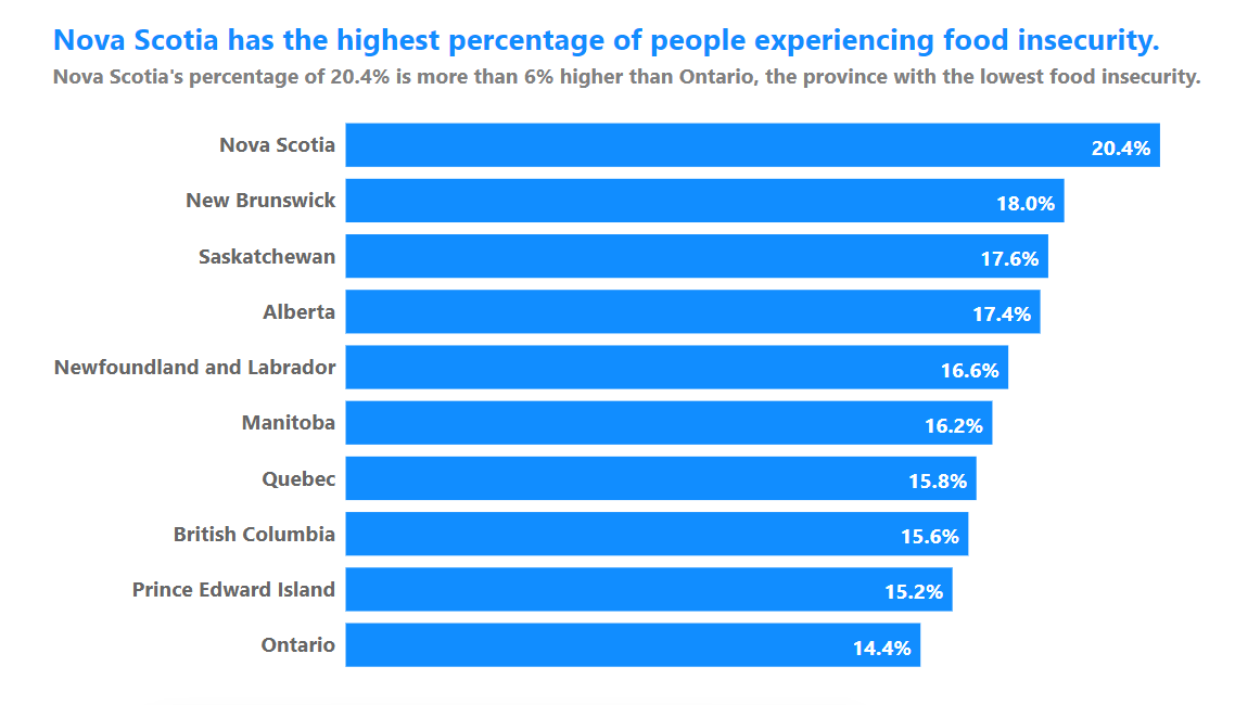
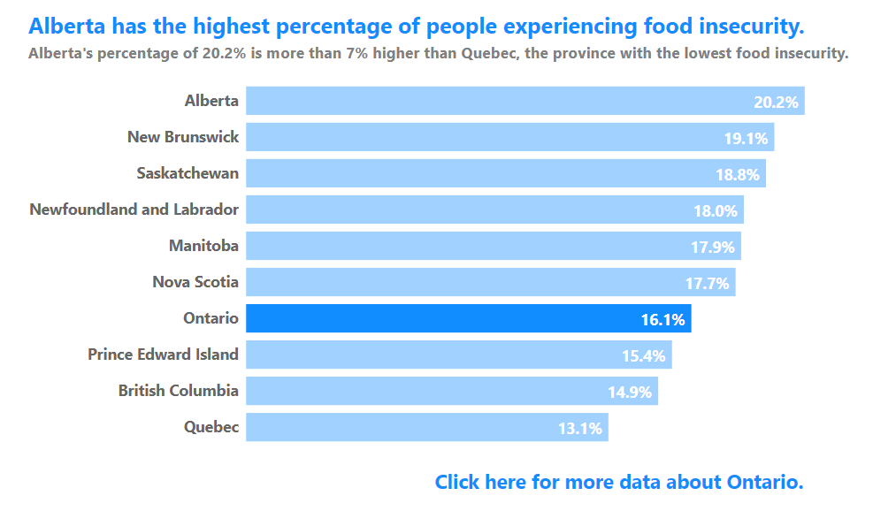
Let’s say our data changes. No problem!
Remember, what story and insights your viewers need can only be known by TALKING to them. Go talk to them and create dynamic titles that will knock all their socks off.
We can literally put ANYTHING we want in our titles, and have it change as our data changes.
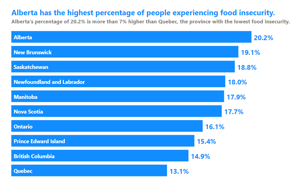
2. Benchmarks!
We can also add in Benchmark lines to easily show what bars in our bar chart are exceeding (or not) a certain value. Managers LOVE benchmark lines as they can instantly tell if that benchmark value is being met.

In this example, we have a benchmark line at the average percentage of food insecurity:
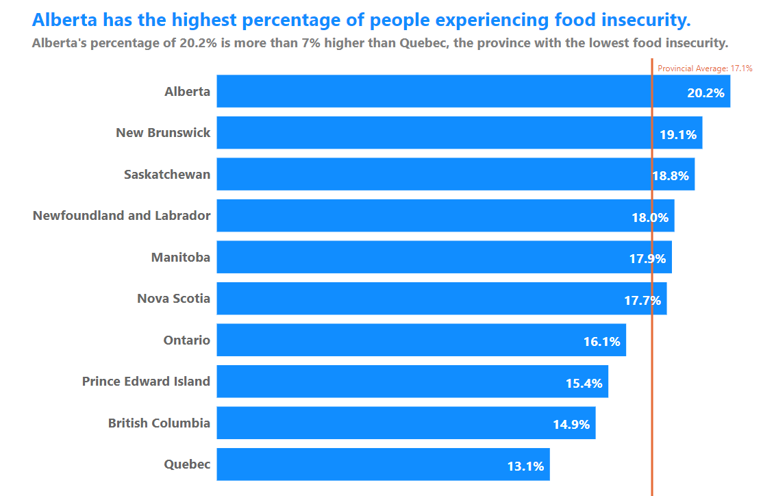
While we can’t format benchmark lines very extensively in Power BI (at least not yet), they can still be useful in providing some context for your viewers.
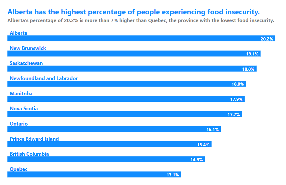
Conditional Colors
We can also color our bars based on conditions. This bar chart colors the bars of provinces that exceed the average differently that those below the average.
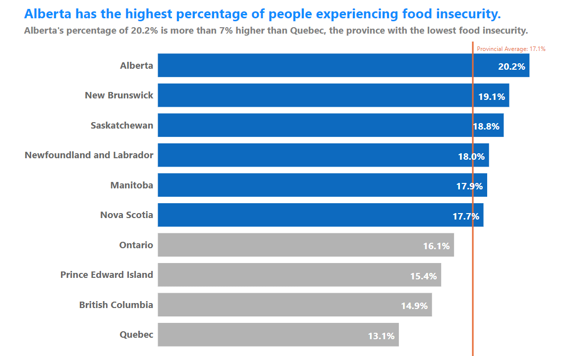
It’s a great easy way to really draw attention to the data you want your viewers to focus on.
4. Hack your labels (and more)
Power BI is designed so that we as designers have to do things in a particular way. It’s not designed for “out-of-the-box” thinking, but that doesn’t meant that we can’t hack Power BI to do things it’s not designed to do.
With a bit of time with the program and creative thinking, you can do all sorts of cool things.
Maybe your boss wants show your n-values or sample sizes right there on the bar chart in addition to the percentages. It’s not a built-in option in Power BI, but that doesn’t mean we can’t hack it:
Or maybe we want to get rid of our Y-axis completely and put our Province names right IN our bars. There’s a hack for that:
How about popping our Y-axis labels OVER our bars? We have the hacking technology! 🙂
Essentially, even though Microsoft puts a ton of limitations on how we can build and format charts, we can still hack our charts into creative variations.
5. MORE Data (but only when needed)
You never want to hit your viewers with too much data. Too much data at once makes charts and dashboards LESS usable, as your viewers will spend a ton of time figuring out (or just looking for) the data and insights that are relevant to them. We want to give them a high level look at the data and then allow them to delve deeper into the details IF they want to.
Give them that choice.
One way to give them that choice is by adding customizing the tooltips that show up when a viewer hovers their mouse over a bar. They have access to the data if they need it, but it’s not splayed all over the dashboard by default.
In this example, the detailed data shows food insecurity levels in each province over time (and you can incorporate dynamic text into these as well).

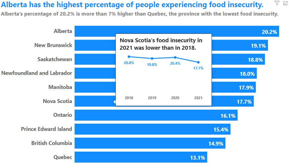
As amazing and awesome that tooltips can be, one important thing to remember is that screenreaders do not read tooltips, so they are not the most accessible feature in Power BI.
An alternative could be what’s called a Drill Through filter. With a Drill Through filter, someone can click on a bar and get access to more data about that bar on a new custom filtered page that screenreaders CAN read.
In the below examples, some clickable text shows up when a bar (any bar!) is clicked on, allowing your viewers to access more data about that province (or whatever your bars are about).
Now you have 5 different advanced ways to make your bar charts more useful for your viewers in Power BI.
Even though you now have great examples of how to make bar charts awesome (and essential fixes you need to make to the Power BI defaults), you may also way to move away from bar charts sometimes.
Next time on People-Friendly Power BI, we’ll talk about alternatives to bar charts that we can make in Power BI.