Five ESSENTIAL ways to make your Bar Charts the best in Power BI.

Who fell asleep when they saw that this edition of People-Friendly Power BI was about Bar Charts? You can admit it, I won’t think less of you.
Bar Charts are the unsung heroes of the data visualization world. When you ask anyone what their fave type of chart is, “Bar Chart!” is never the answer.
However, we all use them, don’t we? Chances are, if you’ve visualized data for an annual report, a powerpoint, or a dashboard, you’ve most definitely made a bar chart.
This is because they are EASY to understand. Any audience can understand them. The bigger the bar, the higher the number it represents. Humans are *really* good at comparing the length of bars and it doesn’t matter if the human is a theoretical physis Nobel prize winner or a kid looking at a bar chart about halloween candy.

Bar charts, as easy as they are, aren’t perfect when we make one in Power BI.
This edition of People-Friendly Power BI is all about the ESSENTIAL changes you should make to Bar Charts when you make them in Power BI. Power BI makes garbage bar charts by default… you gotta tweak those bar babies into something your Power BI dashboard users are going to love.
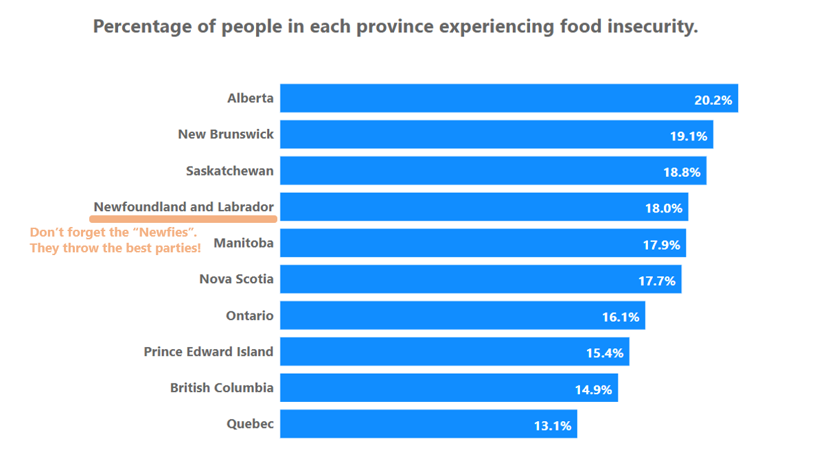
Let’s look at the kind of default bar chart Power BI gives us when we add data into the bar chart visual.
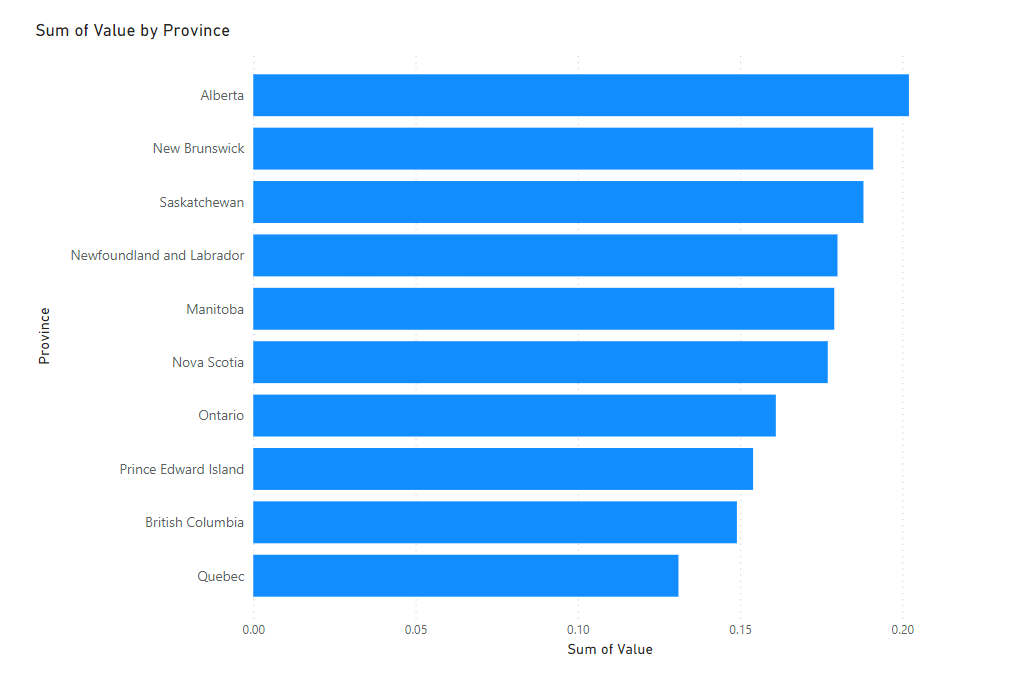
This chart is about food insecurity in Canada’s provinces.
It’s recognizable as a bar chart (yay!) but it’s not as good as it could be, so here are 5 essential modifications to make to really make your bar charts shine.
1. A good descriptive title
Tell your users what your bar chart is about. This is the most important part of any chart (yup, even more important that those bars). You want to have a descriptive title that describes what your chart is about and ideally what the main key takeaway is.
This way, even if your chart is hard to understand (but let’s make sure it isn’t!) your viewers will still get the point.
Delete the awful default title Power BI gave the chart and write out a better one that describes your data. Make it bigger and more visible. People need to see it. Always left align your title and keep it at the top. Our brains and eyes in the western world are programmed to start reading content at the upper-left.
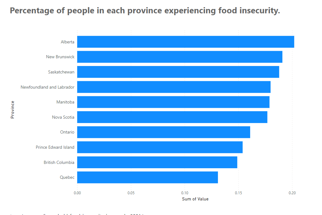
2. Add value labels and enhance your Y-axis
By default, Power BI gives us an x-axis with values, and faint gridlines that give our viewers a little bit of help estimating how large each of our bars is.
While this may work for some bar charts, namely those where you just want to show that some categories of data are larger than others (with no one caring about exact values), most of the time, if you’re comparing categories of data (which is what bar and column charts are amazing at showing), viewers will also want to know the exact size of the bars so they can easily figure out the differences between them.
Add value labels, and since these are percentage amounts, format them as percentages. Also increase the font on your Y-axis so those data categories can be seen easily.
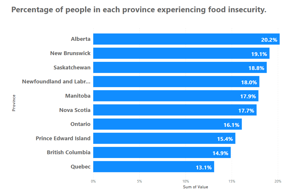
3. Take out chart clutter
There are a few things on this chart that don’t add anything to the message we’re trying to communicate. In addition getting rid of our axes titles, we can also remove the x-axis itself. We don’t need the x-axis labels anymore, as our bars are labelled directly.
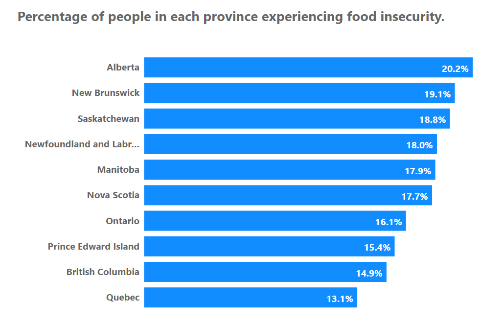
4. Give your Y-Axis more space (if needed)
Our bar chart is looking pretty darn good, except for our Y-Axis. We can’t see the full province name for Newfoundland and Labrador. Power BI just cuts it off with a “…”
If this is happening with your bar charts, go into the Y-Axis options and look for a Max Area Width slider. You can tell Power BI to devote as much as 50% of the width of your chart to your Y-Axis labels. Then long items like Newfoundland and Labrador will fit (and god, it looks so much better).
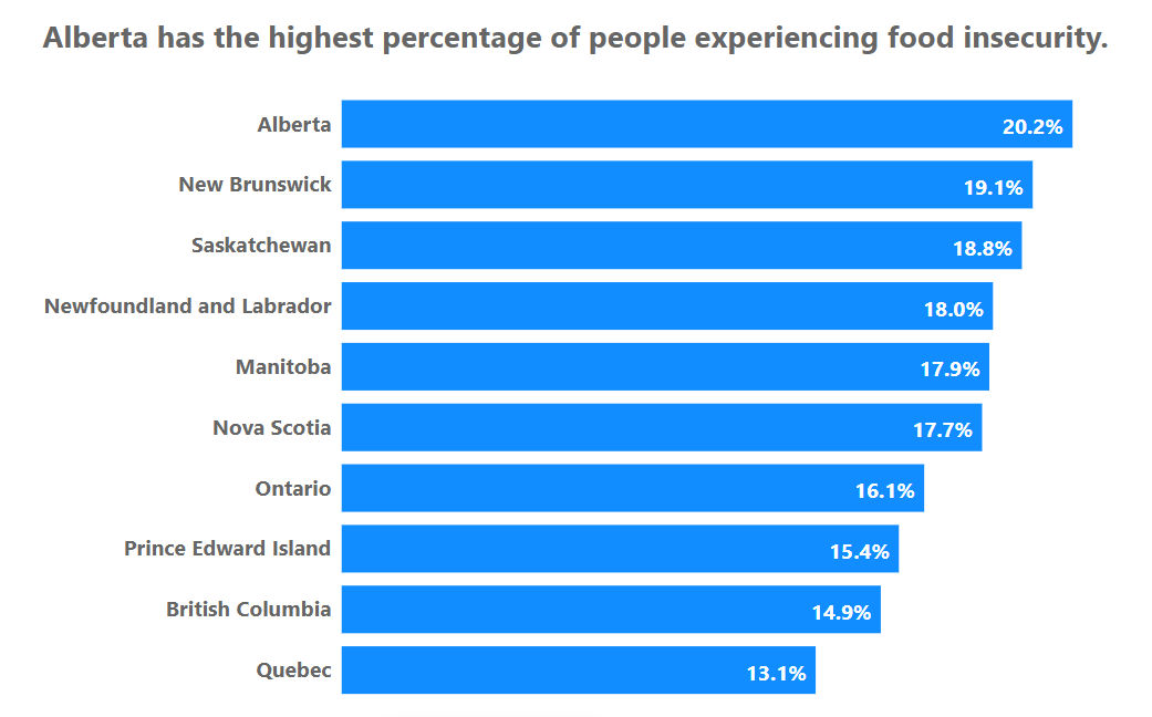
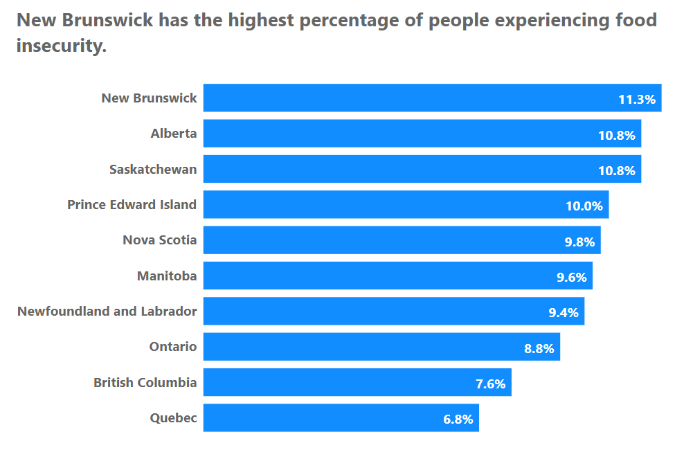
5. A Dynamic Title
Our last technique seems advanced, but really isn’t. It’s also something that every chart and dashboard needs but so few have. Dynamic titles are titles that *change* as your data changes (and we’re talking dashboards, so there’s a good chance the data will always be changing).
Dynamic titles are world changing for your viewers. If you’ve done your job and know what your users need to know from your dashboard (always the first step in dashboard creation), you can create really simple DAX measures that let you highlight key insights with titles. Titles that change when data changes.
If Alberta has the highest rate of food insecurity, the title can call that out:
If it’s New Brunswick, the title can say that.
Now we know 5 essential ways to make your Power BI bar charts not only better, but *easier* for your Power BI report users.
Next time, we’ll learn at least 5 *advanced* ways to make bar charts better by taking them to the next level.