Put the People in your data first.

Hey everyone,
We have a bit of a departure for this issue of People-Friendly Power BI. While we always talk about how to make Power BI easier to use for our dashboard and report audiences (the people!), this issue is about the people in our data.
Those of you (hi!) who I’ve worked with, or have taught Power BI to (or even been following this newsletter for a bit) know that this newsletter has the name it does because for me, the most difficult and stupid part of working with data is how BADLY it’s communicated to people. It is my #1 pet peeve.
You’ve put all this money and time into collecting data, cleaning data, analyzing data, and then you get to the communicating / reporting stage and …. you do this part badly and all that money and time on the previous steps is basically wasted.
Either data is visualized badly (ignoring the needs of the audience) or it’s communicated by someone who is too techy (sorry techies!) and while they have the “hard” data skills, their people skills are not stellar, and communication breaks down.
Frequently, the issue is BOTH. Bad visuals AND bad communication.

I named this newsletter People-Friendly Power BI because I make Power BI friendly to you, who may need to start using it (or continue using it) to develop reports but ALSO for your audience so they’ll LOVE your reports.
People are important to me. They are the most important part of data. They make decisions with data. Use data to move along a process or project. They ARE the data.
Data is people.
(I’m refraining from putting a gif here of Charlton Heston yelling “It’s People!!! It’s made from people!!!”) You’re welcome.
So, what do I mean by this “data is people” statement? Of course it’s people, you say. Data is about people.
We SAY this. Data people SAY this. But do we pay attention to it? Way too often, data is analyzed and displayed WITHOUT thinking about the people and the lives that make up that data. Way too often, a data analyst is trying to make a good chart, or trying to find a pattern or story in the data. It becomes just numbers.

Let’s use an example.
Here’s two charts made with the same data. One is a bar chart, one is a beeswarm (some people call it a jitter plot, but that’s less fun).

The bar chart is aggregating everything together and visualizing the average for each group. Nevermind that a bar chart isn’t the best way to show an average, lots of people use bars for averages… look at the Groups… and imagine if instead of Group A,B,C,D we had races listed instead. Some conclusions, generalizations, and stereotypes would jump out immediately.
The beeswarm is the exact same data, but the individual data points are shown, and they show that the “story” isn’t so simple as the one being told (or being assumed by the audience) by the bars. The averages are really NOT the story. The spread and variance are the story.
(Charts by Eli Holder, via Dr. Stephanie Evergeen. Read more about how visualizing data in a society with hundreds of years of built up systemic racism can make things worse here.)
The data is people.
Let’s take this one step farther, and it’s a step we should all take constantly. It’s a step that anyone working with data should think about. The data isn’t numbers (or words). Any data worth working with (in my opinion) is capturing the lived experiences of people. Their births, their lives, their deaths.
I recently worked with Mamow Ahyamowen, which is an epidemiology alliance of First Nations governed health service organizations based in northern Ontario. Their goal is to provide health information to communities that they can use to work toward health equity.

Before I even started working with them, I attended a virtual session where they presented some health data (specifically mortality data), but before launching into all the numbers of deaths and co-morbidities and how their mortality data compares with province-wide data, they paused.
They paused to reflect on the nature of the data, who the data was about, and what it meant to all of them. When I asked them about it, staff shared that this practice was inspired by teachings from Elders and Knowledge Keepers who have been involved in their work.
More organizations (and the “data world” as a whole) need to do this. Data is not just data. It’s lived experiences, ancestors and history.
Mamow Ahyamowen’s health data is perhaps the perfect example of this. Indigenous communities in Canada (and all over North America, and the world) have lived through centuries of land theft, oppression, and systemic racism. Families and communities were ripped apart throughout the 19th and 20th century and thousands of children were abused and killed in government-run and church-run residential schools. It doesn’t end there; colonialism has changed forms but continues to affect the lives of Indigenous people to this day.
All this affects the health of communities in a big way.
I trained a lot of great people at Mamow Ahyamowen in getting started with Power BI, and these were training sessions that used their data. Data about their families and ancestors.
So, the first thing we did at the start of every session was the same thing they did during the webinar, like all their meetings where data plays a part. We paused and honored the people and lives captured by this data.
We also built a slide like this into the start of the presentation:
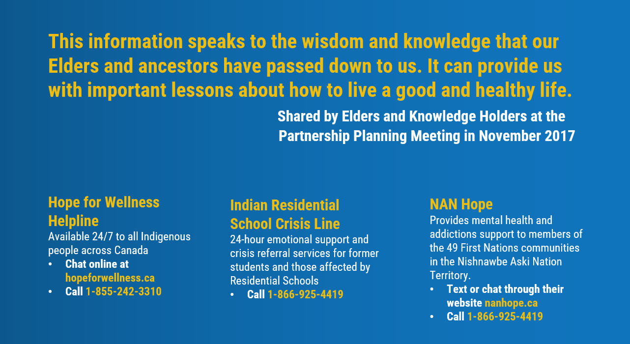
This wasn’t lip service. We shared links and phone numbers to mental health and crisis support lines. Because exploring data that tells a story about how your community and family has been abused for generations is traumatic.
I really wish more organizations and data people would think about things like this.
We, the people who collect, analyze and communicate data, cannot in good conscious ignore the stories in the data. We can not present it “without bias” (which is impossible), no matter how much we try. The bias is implicit and systemic.
But we can expose the bias, know why it exists and counteract it, alongside the racism systems that perpetuate it. We can also think mindfully about the lives and communities the data speaks to. Context matters. Data is useless without context.
So this is what I’m doing.. because I think I can use my privilege and skills to help in some meaningful way.
What are you doing?
More about Mamow Ahyamowen:
Building on the success of the mortality analysis discussed above, Mamow Ahyamowen is working on three new projects that will explore chronic conditions, mental health and addictions, and injuries. You can stay up to date with their work by signing up for their newsletter.
More about Maureen Gustafson
(Maureen helped me write and lent her thoughtful editorial eyes to this post):
Maureen Gustafson is a member of Couchiching First Nation with mixed Ojibwe and settler roots. She grounds herself first and foremost in her relationships as an auntie, sister, daughter, cousin, and friend. Maureen holds a Master of Public Health and is privileged to serve Mamow Ahyamowen as a Knowledge Translation & Exchange Specialist.