How to build a ring donut chart
This How To Use Power BI post is all about how to make an impressive looking “Ring Donut” chart with Power BI, specifically using new border options Microsoft has added to Donut and Pie charts.
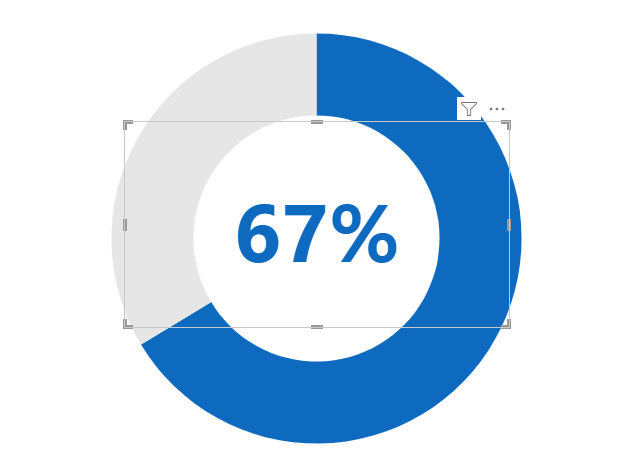
The new border options are NOT super useful in terms of making charts better and more user-friendly (and you can read all about that here in this post called How to (not) use new transparency and border options in Pie & Donut charts) but you CAN use borders in a very specific way to make a Donut Ring Chart like this:

We’re going to use a simple Power BI file to get to know how to do this. If you’d like to use the same file, you can download it here.

Video Instructions:
Written Instructions:
We’re starting off with a normal Donut chart for this tutorial:
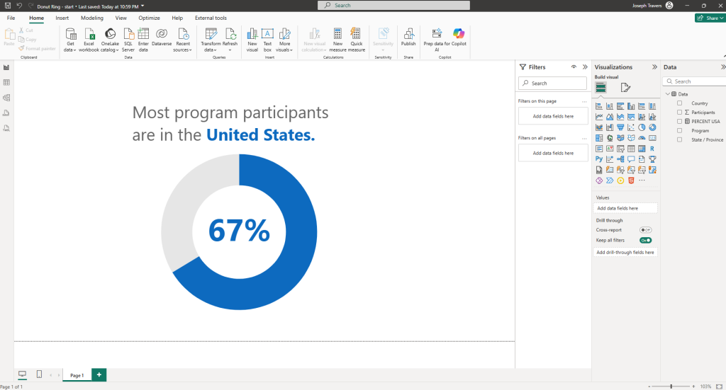
But, you may notice that we also have a percentage value in the middle of it. This is not part of Donut Charts, but is rather a data card that shows the percentage value we’re interested in.
If you’re interested in how to show a percentage for just PART of your data like this using DAX, you can see the code I used if you download the .pbix file I shared above.
The DAX uses a combination of CALCULATE, DIVIDE, and COUNT functions.
To make this donut into the thinner version that you see in the screenshot above, we basically only have to do TWO things. Nice and easy!
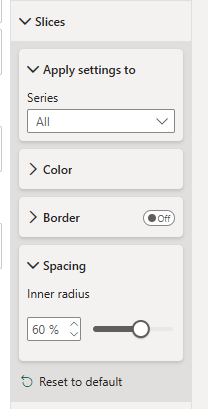
The first thing we’ll do it make our donut pieces thinner. Another way to look at is is making the center hole larger.
To do this, we’ll go into our Donut chart formatting pane, open up the Slices section and open up the Spacing options.
Then adjust the inner radius setting to something larger so the center hole gets bigger.
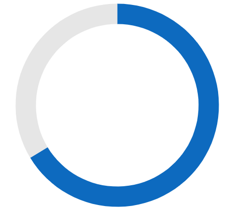
Now all we need to do is add a border to this part of the Donut chart.
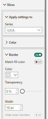
This is the part of the donut that represents the program participants in the United States, so we’ll make sure U.S.A. is selected in the Series dropdown, and then we’ll turn on and open up the Border section.
We can then choose the color and width of our border.
For the color, choose the color that matches the other part of your donut chart. I’m using grey for it because it’s the part of the donut that’s not important in our visual. We want all the attention on the U.S.A data in blue.
For width, that’s up to you. I’m using 10 px for this example.
That’s it. That’s all you need to do make a regular Donut chart into a thinner “Donut Ring” chart.

Just like I said. Nice and easy.
Take care everyone,
Joe.
More posts about Pie Charts:
More posts about Donut Charts:
Like these posts but need more formal (but still engaging and fun) training in Power BI? Contact me, Joe Travers or at joe@traversdata.com. I got you.

Contact Joe | TraversData.com | People-Friendly Power BI | LinkedIn