How to make a Table Visual
Welcome to the post about how to make a table visual in Power BI. This is pretty easy on the surface, but tables have their own little quirks and idiosyncracies, so we’ll explore them a bit with this post.
If you want to use the same Power BI file I use in the below video and written notes, here’s the pbix file to download. You can also click the graphic below to get it.

Video Instructions:
Written Instructions:
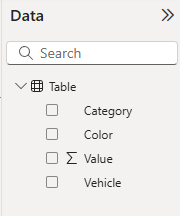
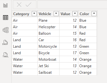
We’re using a nice and simple Power BI report to explore the basics of tables. You can see we have a few columns in our Data Pane, and if switch to our Table view, we can see our simple dataset.
Real talk here… tables are pretty much the worst way to visualize data. They can be hard to understand and pull meaning from easily. This is why it’s usually always better (if you know how to visualize data effectively) to pop data into a chart that communicates your data in a more engaging way.
However, sometimes you need to use a table. Maybe your boss loves tables and wants to see a detailed breakdown of a bunch of data. Maybe a department of people need to drill down into some high level insights to see more detail about what makes up certain metrics. These are cases where tables DO work.
Let’s create a quick Table visual with this data and see how they behave.
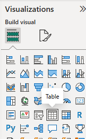
We’ll switch back to our Report view, which has our canvas where we build visuals, and we’ll click on the Table visual to add a space for it on our canvas.
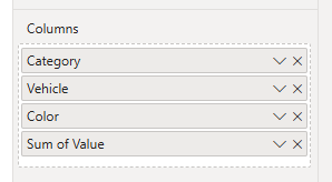
Let’s drag our data columns over to the visual space and see what it gives us.
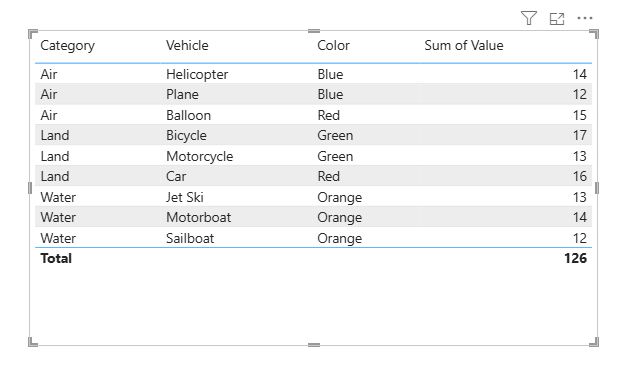
This is the default table that Power BI gives us. Column headers at the top, alternating shading for our rows of data, blue border lines over and below our actual data, plus a Total at the bottom that sums up our numeric column.
We’re not stuck with how a table displays things though. If we wanted to summarize this data a bit, we can.
Let’s use the example of wanting to know how many vehicles are in our table, but using the other columns like Category and Color as groupings.
If we right-click on our Vehicle column where we added it to our Visualization Pane we get summarization options. For text columns like the Vehicle column, the default is “Don’t summarize” but we can get the table to list the first vehicle listed in each grouping, or the last, or a count.
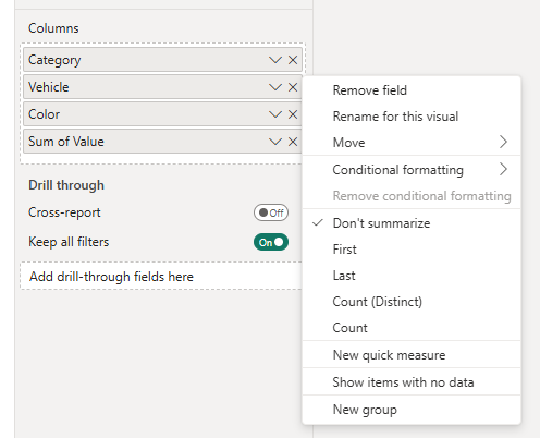
We’ll select Count to show you how this works
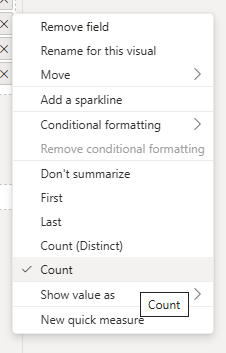
It now changes our Vehicle column in our Table visual from a listing of Vehicles to a count of Vehicles.
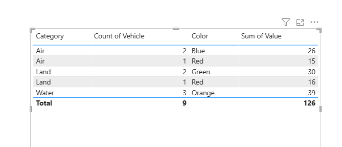
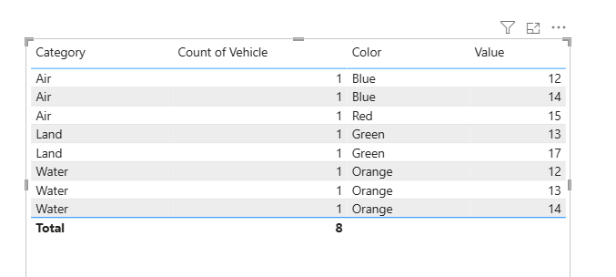
The other columns come into play here. You can see we have two rows for the Air category now, because while we have 3 vehicles in that category, we have them in both Blue and Red colors. The Value field is summing them up for us.
We also have a total vehicle number at the bottom of that column now.
So you can change how a table organizes data like this, and you can even, if you want, tell it not to summarize it at all.
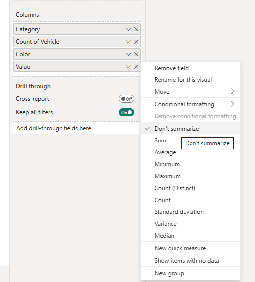
We currently have it summarizing the overall values of each vehicle, grouped by category and color, but you can turn still show counts of vehicles and the values of each by turning off summarization on that Value column.
Just right-click on it in the Visualization Pane and click “Don’t Summarize”. You’ll also notice that because this is a numeric column we have a lot more summarization options like Average, Standard deviation, Median, etc. etc.
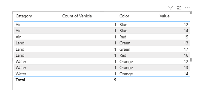
When we do that it shows the value for each row again, counting each vehicle as a 1.
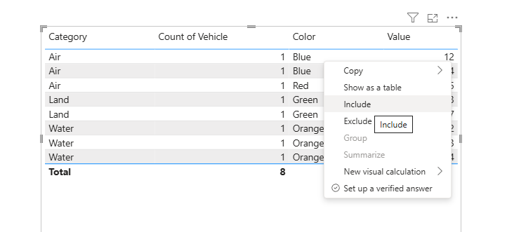
That’s about all we can do with tables, but one little bonus thing we can do is include or exclude a specific row of data.
If we right-click on a row, we can Exclude it, meaning it won’t be in our table. Like if we don’t want to see the row with Land and Red in it.
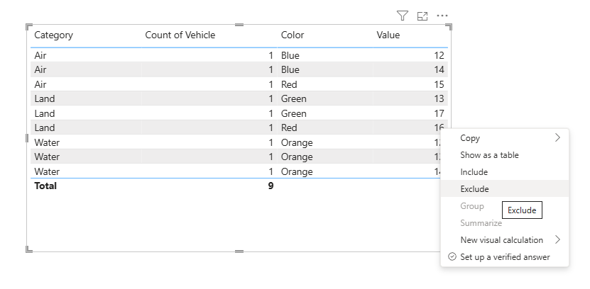
Now it’s gone.
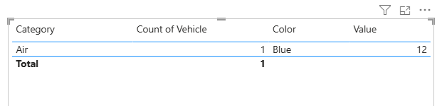
Alternatively, if you just want 1 row of data in your table, you can right-click on it and select Include.
You have some options with tables.
In a couple weeks, we’ll have a new post about how to format Table visuals to make them easier for your viewers.
Take care everyone,
Joe.
More posts about Table Visuals
More posts about all chart types:
Like these posts but need more formal (but still engaging and fun) training in Power BI? Contact me, Joe Travers or at joe@traversdata.com. I got you.

Contact Joe | TraversData.com | People-Friendly Power BI | LinkedIn