Post Series: Line Charts
Everything you need to know about Line Charts!
Once you’ve connected to some data, you may want to build a Line Chart. Line Charts are easy to build, and more importantly, they are easy for people to understand.
Line charts are excellent for showing data that has a time-based element. They are fantastic to show whether a value is going up or down over time (or staying the same).
The following posts will help you build the best Line Charts possible in Power BI.
How to make a Line Chart in Power BI

The basics of how to make a Line Chart. Where do drag your data columns, etc.
How to format a Line Chart in Power BI

How to format your Line Chart so that it’s the very best Line Chart it can be. This includes strategies to make your Line Charts more user friendly.
How to add Series Labels to a Line Chart
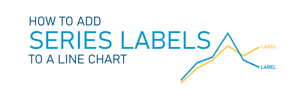
Ditch your legend and embed your series’ names directly at the ends of your lines. It’s user-friendly!
Why value labels can fail on line charts, and how to fix it.

Sometimes, when you add value labels to charts (especially Line Charts), Power BI totally messes up the spacing and puts labels so they are directly overlapping data points and lines. Here’s when it happens and one method to fix it.
More posts about Line Charts
Recent “Hot Tip” Posts
Like these posts but need more formal (but still engaging and fun) training in Power BI? Contact me, Joe Travers or at joe@traversdata.com. I got you.