Post Series: Pie Charts

Everything you need to know about Pie Charts!
Once you’ve connected to some data, you may want to build a Pie Chart. Pie Charts are easy to build and are so easy to build (in Power BI as well as other programs) that they are frequently used.
Pie charts are excellent for showing part-to-whole relationships… as in what percentage something is out of 100%. This also means that Pies are best when they only have 2 or 3 slices, at most.
The following posts will help you build the best Pie Charts possible in Power BI.
How to MAKE a Pie Chart in Power BI
The basics of building a Pie Chart, as well as, perhaps more importantly, now NOT to make a Pie Chart.

How to FORMAT a Pie Chart in Power BI
How to format a pie chart so that it’s most useful to your Power BI dashboard users.

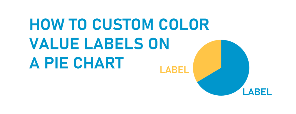
How to custom color value labels on a Pie Chart in Power BI
How to color labels in a Pie Chart to match your Pie Chart slices. It’s a bit of a different process.