How to make a Pie Chart in Power BI
Let’s learn how to make everyone’s fave chart in Power BI, the Pie Chart!
Just kidding, Pie Charts don’t get a ton of love in the data visualization world, and there are lots of situations when they should NOT be used, but there are also times when they SHOULD be used.
So, in this post we’re going to learn how to make them in Power BI and when you should use them.

We’re going to start off with a report that already has some data connected. If you need to learn how to connect data, go watch the Connecting to Excel Data post first.
If you’d like to use the same Power BI file I use in this post (a blank report with data connected), you can download it here:

Here’s the Excel data file that the report connects to as well.
You don’t need to download it separately for what we’re doing in this post, but you can still download it so you have your own copy, if you’d like. That way, you can make your own Power BI file and connect it to your own copy of the Excel file.

Here’s the video version of this post. Below the video is written instructions.
Video Post:
Written Instructions:
We’re starting off here with a blank Power BI report where the data has already been added. Let’s have a look at the Data in the Table View to get a sense of it.
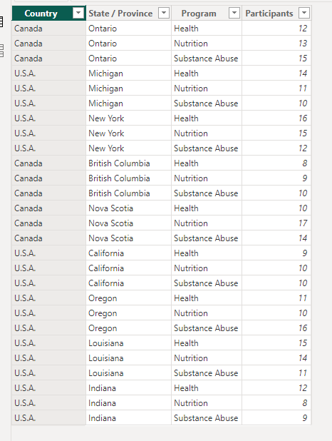
It’s a simple dataset with just 4 columns. It’s about the numbers of participants in different health programs in various states and provinces in the U.S. and Canada.
Let’s go back to our report canvas and learn how to (and how NOT to) make a pie graph with this data. Click the Report View icon on the left to go back to the canvas.
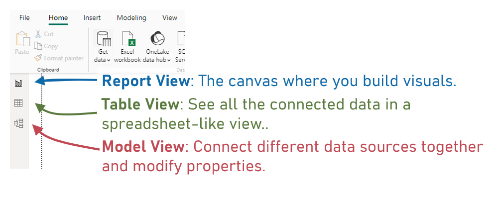
First, we’ll click the visual icon in the Visualizations Pane that looks like a Pie Chart. This makes sense, right?

This gives us an empty Pie Chart placeholder box.
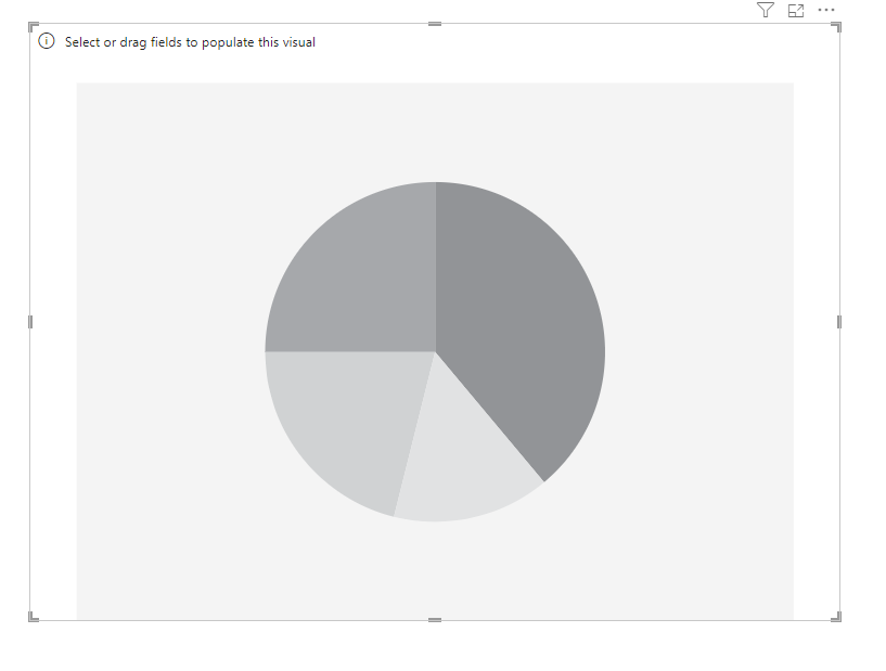
Let’s use a scenario where we want to see how many participants are in different geographic regions in our data. We’ll first make a pie chart that does NOT work (and talk about why).
Bring the Participants column to our Values box.
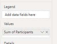
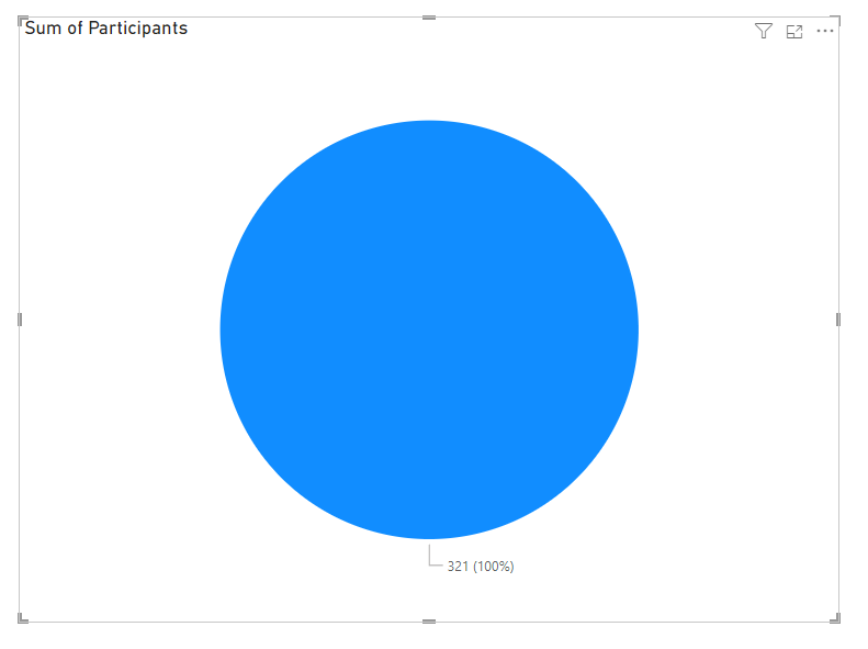
That gives us one big honkin’ blueberry pie of a Pie Chart.
Now, the step that MOST people do is bring the State / Province column to the Legend Box, as they want to split up this pie by region. Let’s try that.
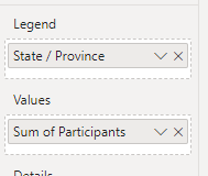
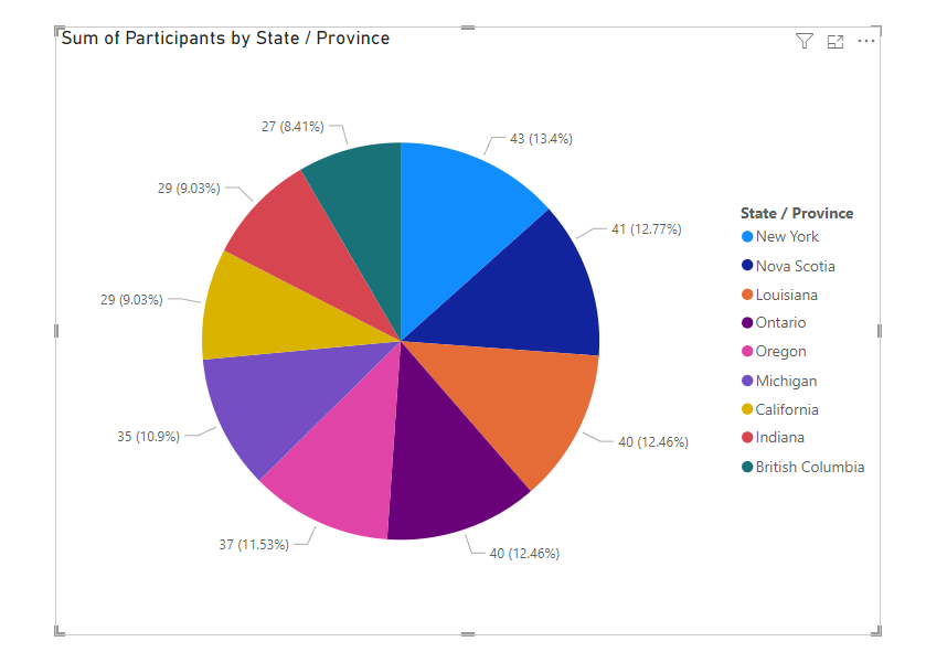
This gives us a wild pie that probably looks super familiar to you.
This is the WRONG way to make a pie chart. This kind of pie chart gives pie charts a bad name, and who wants to disparage pie, right? Pie is delicious.
Pie Charts are for showing relationships between a PART of your data and ALL of your data. They are MOST effective when they only have TWO slices, but you can probably get away with 3 or maybe 4 slices. Maybe.
A pie chart with 9 slices (or more) like the above one? Never ever.
Never. Ever.
Why not? When a pie chart has a lot of slices, our brains try to COMPARE the size of the slices to get some meaning out of why the pie has all these slices. Our brains try to take what we’ve given it (9 slices, or more) and make some sense out of it.
But, if the goal is to compare the number of participants in different regions, a pie chart is the wrong way to do it. Our brains are bad at quickly comparing the sizes of different pie slices.
IF your goal here is to show the comparison of different regions, then you want to take this Pie Chart and click the Clustered Bar Chart icon in the Visualizations Pane to instantly switch this to a Bar Chart:
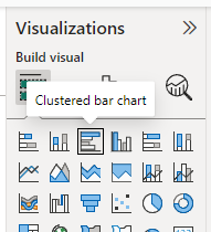
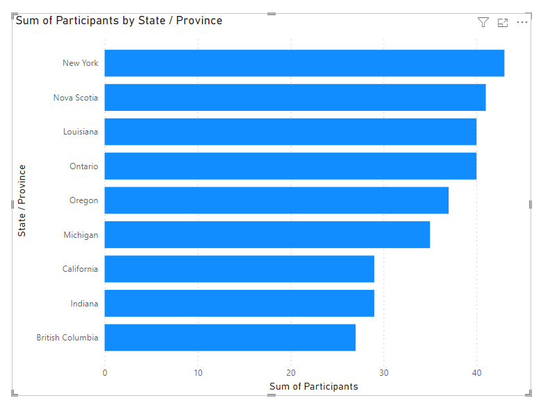
This Bar Chart is totally unformatted and cleaned up, but it’s SO much better at comparing categories of data than a Pie Chart.
Check out the Bar Chart Posts to learn more about making Bar Charts:
Okay, let’s switch this back to a Pie Chart and make a GOOD Pie Chart.
Click the Pie Chart icon again with your visual selected to switch it instantly back to a Pie Chart.
Okay, our 9-slice Pie Chart is awful.
Since Pie Charts are best when they show a part-to-a-whole relationship, we’re going to replace the State / Province column in our Legend box with our Country column.

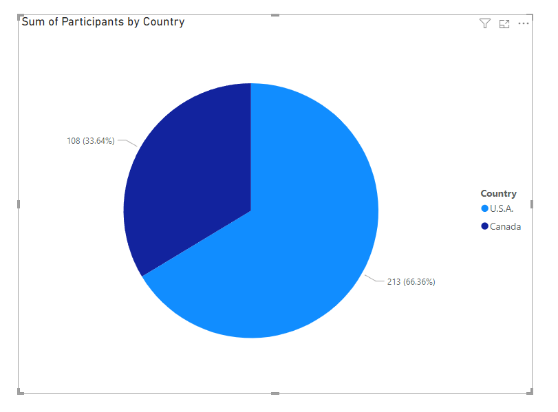
This Pie Chart is SO much better.
It’s showing the part-to-whole relationship for both Canadian and U.S. participants.
Most importantly, it’s EASY. Your audience does NOT have to figure anything out. No comparing tons of numbers and slice sizes.
That’s all there is to making GOOD Pie Charts in Power BI. You don’t want them to have more than just a couple of slices, and you don’t want to make them complicated at all.
Just like with real pies, the simpler the better. Your audience will thank you.
Now you know how to make a Pie Chart (and how NOT to, and what to use instead).
Take care everyone,
Joe.
Like these posts but need more formal (but still engaging and fun) training in Power BI? Contact me, or at joe@traversdata.com. I got you. 🙂
