Add a Benchmark Line to a Bar Chart in Power BI

Let’s learn how to add a benchmark line to a Bar Chart! Benchmark lines are great for showing progress towards (or beyond) a target.
For this post we’re going to start with a Power BI file that already has a simple Bar Chart made, and we’re going to add a benchmark line to it.
You can download a copy of the .pbix file by clicking here.

The data the Power BI file connects to is the excel file below. If you want your own copy of it, you can download it here:

Video:
Written Instructions:
Alright, we have a bar chart here, and if you want to use the same Power BI file that I am in the video, look above the video for a link to download the file. I’ve also linked the Excel file that is the data source for the file.
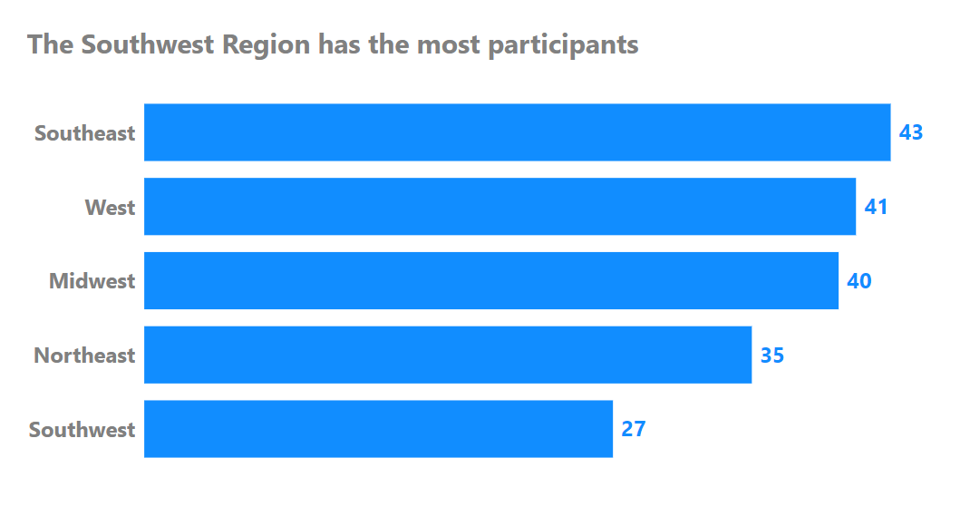
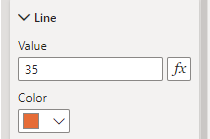
Let’s use a scenario where regions aim to have at least 35 participants signed up for programs. We’d like a vertical line extending from the 35 value point on our X-Axis.
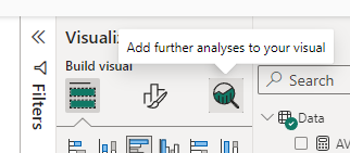
We make this happening using something called the Analytics Pane.
The Analytics Pane is a subpane in the Visualization Pane. We get to it by selecting our Bar Chart and then going over to the Visualizations Pane and clicking the little magnifying glass icon at the top.
Once we click into the Analytics subpane, we see a lot of options for putting lines at various places. Some are self-explanatory like Min and Max (which puts a vertical line either at the end of your lowest or highest bar value) and some need more work.
We’ll have posts about some of our other line options soon.
Subscribe to HOW TO USE POWER BI: Posts like this about getting started are totally 100% free.
Subscribed
Today we’re interested in the “Constant Line” section at the top of the Analytics subpane. Open it up and we see this:
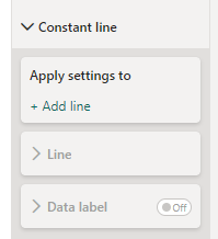
To add a line, we’re going to click the “+ Add line” text (makes sense, right?) That opens up a lot of options for us:

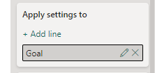
Let’s start with the very first thing we see, and that’s the grey box that says “Constant Line 1”. We can double-click on it and name our line whatever we want. Let’s name it “Goal”.
Cool.
Before we start adjusting anything else, We can see that “Value” box says “0” in it, and if we look at our Bar Chart, there’s a faint dashed blue line extending vertically from the 0 point on our X-Axis.
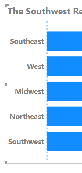
That’s our line. We haven’t given it a value yet, so it’s just hanging out at 0.
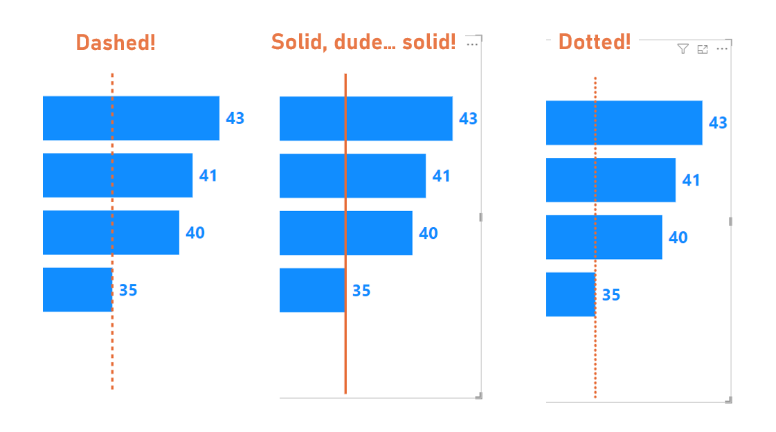
Let’s punch a 35 into our Value box. While we’re there we can adjust things like our line’s color with the color selector. Let’s pick orange for this line.
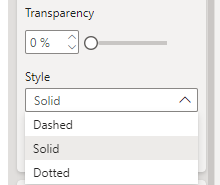
We can also adjust the line’s transparency with a Transparency slicer (I’ll bring it right down to 0 to make our line totally opaque), and there’s a Style dropdown where we can choose between dashed, solid, or dotted line styles. I’m going to choose solid.
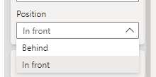
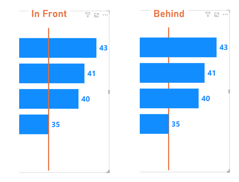
You can also decide if you want the line to be in front of or behind your bars with the Position dropdown:
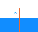
Finally, we can also turn on a little data label for our benchmark line. Turn on the little on/off switch where it says Data Label at the bottom of our line options.
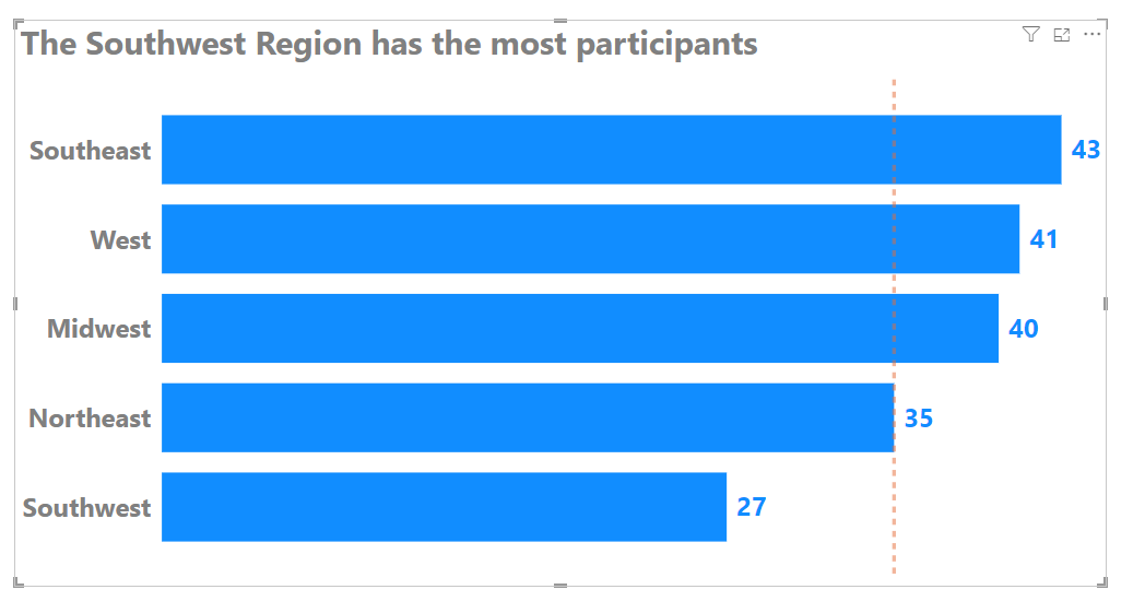
This puts a little “35” up at the top of our line.
We can open that section up and see a lot of options.
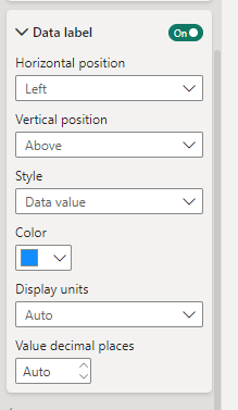
Horizontal position puts our label to the left or right of our line. Vertical position puts the label either at the top or bottom of our chart.
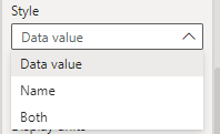
Style is where we can decide if we want the label to show the Value, the Name (we named it “Goal”), or both.
Then we have color selector to change the color of our label font. We also get a “Display Units” dropdown which allows the value to be shown in different formats, like if your number is in the millions, you can have it say 5.3 million instead of 5,300,000. You can also choose how many decimal points to show, if your value has decimal values.
There are NO options to make our label bold or change the font size, unfortunately.
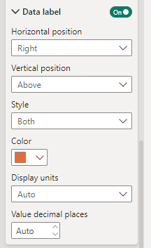
For our line, I’m going to keep it at the top, but move it to the right side of the line. I’ll also pick the same orange we used for our line, and I’ll have it show both our line Name and Value.
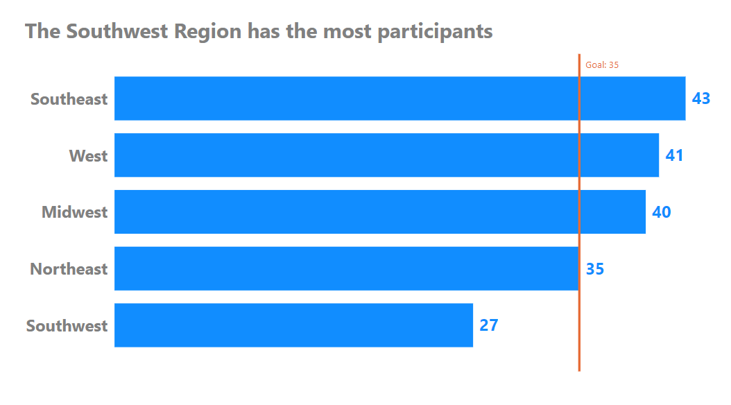
That’s it. That’s how to add a simple benchmark line to your Bar Chart.
Take care,
Joe.
Like these posts but need more formal (but still engaging and fun) training in Power BI? Contact me, or at joe@traversdata.com. I got you. 🙂
