How to align visuals in Power BI

It’s always important to align visuals in Power BI. Alignment helps organize how your reports look and helps your reports look more professional.
There are 4 main ways to align visuals and we’ll go over them all in this post.
We’re going to use a Power BI report that already has some data connected and a few visuals made so we can launch righto into aligning visuals. If you want your own copy of this Power BI file to do this on your computer, here you go:

If you’d also like the Excel spreadsheet the above Power BI file is connecting to, you can download it here, and connect your Power BI Desktop to it.

Here’s the video post, followed by a written version.
Video:
Written Instructions:
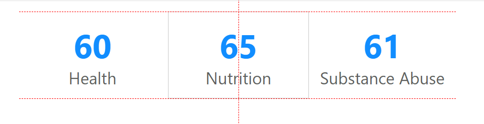
We’re starting off with a Power BI report with a few visuals made already so we can get right to how to align them with one another.
We’re going to go through 4 ways of aligning visuals.
1. “Smart Guides”
The first method of aligning visuals shows up automatically for us when we click and drag visuals around our canvas. Little red dashed lines called “Smart Guides” show up when the visual you are dragging around is in line with other visuals.
It’s a great easy way to line visuals up with other visuals.
2. Alignment Menu
The next method of aligning visuals is something you’ve seen in other Microsoft Products. It’s a menu for aligning items. It’s most prevalent in Powerpoint, but it’s here too… you just need to know where to find it.
If we click into the Format tab in Power BI Desktop you’ll see and “Align” button just like in Powerpoint with options for Aligning 2 or more visuals to their left or right or top or bottom edges. Even their middles. Just select the two visuals (or more than 2) you want to align and chose the alignment option you want.
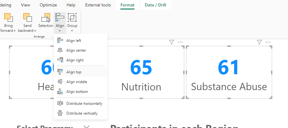
This Align button also lets us distribute visuals horizontally and vertically, so if you need consistent spacing between visuals, you can use these.
3. Gridlines
Another way of aligning visuals is by putting a visual grid on our Power BI canvas to allow us to “eyeball” placement of our visuals.
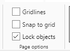
Clicking into the View tab of Power BI, we’ll see a section in the middle of our ribbon called “Page Options”, and the top option there is “Gridlines”. Check that and you’ll a dotted grid show up on the canvas that will allow you to line visuals up to the gridlines.
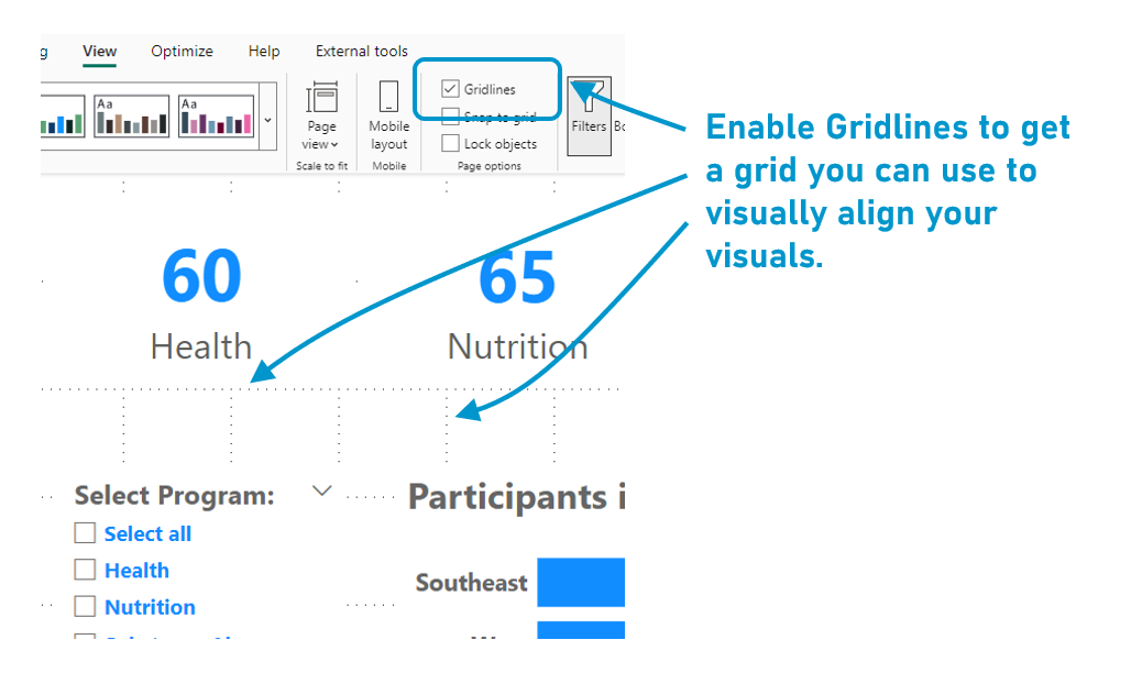
You’ll also notice a “Snap to Grid” checkbox right below the Gridlines checkbox, which in theory is supposed to automatically put your visuals on these gridlines. I’ve NEVER had it work for me (and never seen it work for anyone else).
If you know the secret to using this, let me know in the comments below.
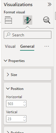
4. Pixel-by-Pixel (Formatting Properties)
The 4th way of aligning visuals is the most specific and let’s you align and position visuals to the exact pixel.
With a visual selected, go into the Formatting section of the Visualizations Pane and go into the General Formatting. In there is a “Position” section that you can use to place a visual in a specific place.
You DO have to really careful with this, as Power BI is a bit glitchy keeping visuals in place. I’ll show you what I mean.
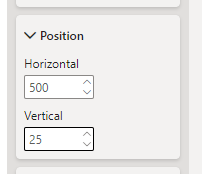
Let’s give this middle number card coordinates of 500 Horizontal and 25 Vertical. This means the top edge is 25 pixels from the top edge of the canvas and the left edge is 500 pixels from the left edge.
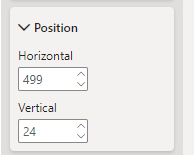
If we then change the size of the visual a bit (not move it, just change the height), our positioning changes. It’s now at 499 Horizontal and 24 Vertical.
It’s a pretty big pain in the ass, to be frank.
Bonus: Locking Objects
If you are completely happy with the position of everything and don’t want to change the location or size of any visual, we can go back to the View tab and check the “Lock objects” checkbox that’s under the Gridlines and Snap to grid checkboxes.
This will do exactly what is advertised. You won’t be able to move or resize ANY visual on your canvas. You can still click on them to select them to change something about their content, but that’s it.
If you have questions about aligning visuals, ask in the comments below. There are a ton of little nuances with aligning visuals (topics for future videos!) so if you notice something weird happening with alignment, ask me about it!
Take care everyone,
Joe.
Like these posts but need more formal (but still engaging and fun) training in Power BI? Contact me, Joe Travers or at joe@traversdata.com. I got you. 🙂
