How to make a Bar Chart in Power BI

Learn the basics of making a Bar Chart with this post.
We won’t get into too much detail about the many things we can do with bar charts, but those will be their own tutorials.
Video:
Written Instructions:
We’re going to start off with a report that already has Excel data connected. If you need to learn how to connect data, go watch the Connecting to Excel Data post first.
Here is the data file that is connected to the report, if you want to download it and do this along with me.
The first action we’ll take when making a bar chart is select a bar chart visual from the Visualization Pane. We’re going to pick the 3rd icon in the Visualization Pane, which is the Clustered Bar Chart.


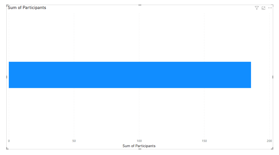
Bar Charts need two basic things to be built. The first thing they need is something that can be counted. In our data we have a numeric field called Participants, which has the number of participants for different programs in different regions.
We’ll bring the Participants field to our X-axis. The X-axis is along the bottom of our graph, so we’re adding data that will make bars that will extend from left to right, along our X-axis

.
Having the Participants field on our X-Axis and no other data added gives us one big bar.
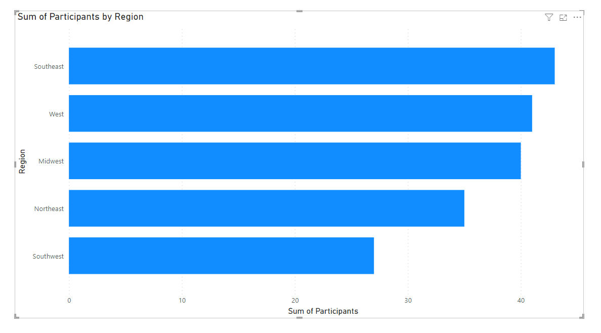
How we need the 2nd thing a bar chart needs, and that’s data that splits our one big bar into multiple bars. We’ll use our Region column for that. We’ll bring Region to our Y-Axis, and we get our regions along the Y-Axis side of our bar graph, and different bars for each region.

Those are the basics of a bar chart, but you’ll notice that the Visualizations Pane also has a few more boxes or “wells” as Microsoft calls them. One called Legend, one called Small Multiples, and one called Tooltips.
The Legend box is how we can split our bars into more bars. Let’s give it a try by dragging our Program field to that box. We get each of our bars split into 3 bars for the 3 programs in our data: Health, Nutrition, and Substance Abuse.
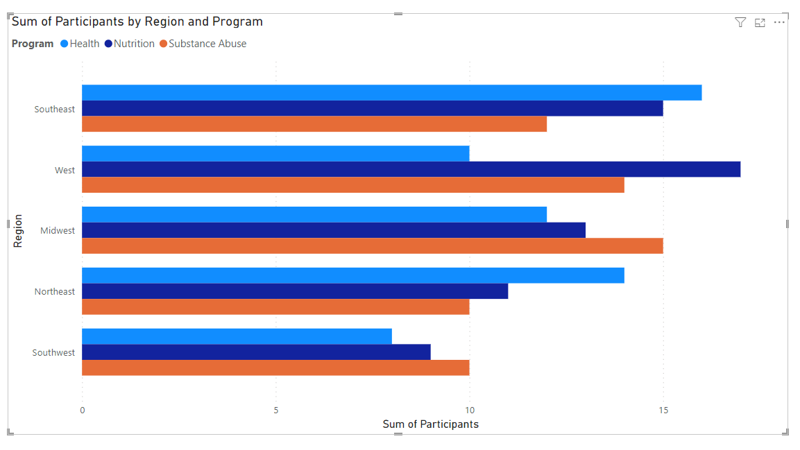
While this is a very popular way of making a bar chart, it’s not the easiest to understand. If a viewer was interested in seeing the number of participants in a certain program, they have to visually only pay attention to a certain color of bar. It’s not the easiest for our viewers.
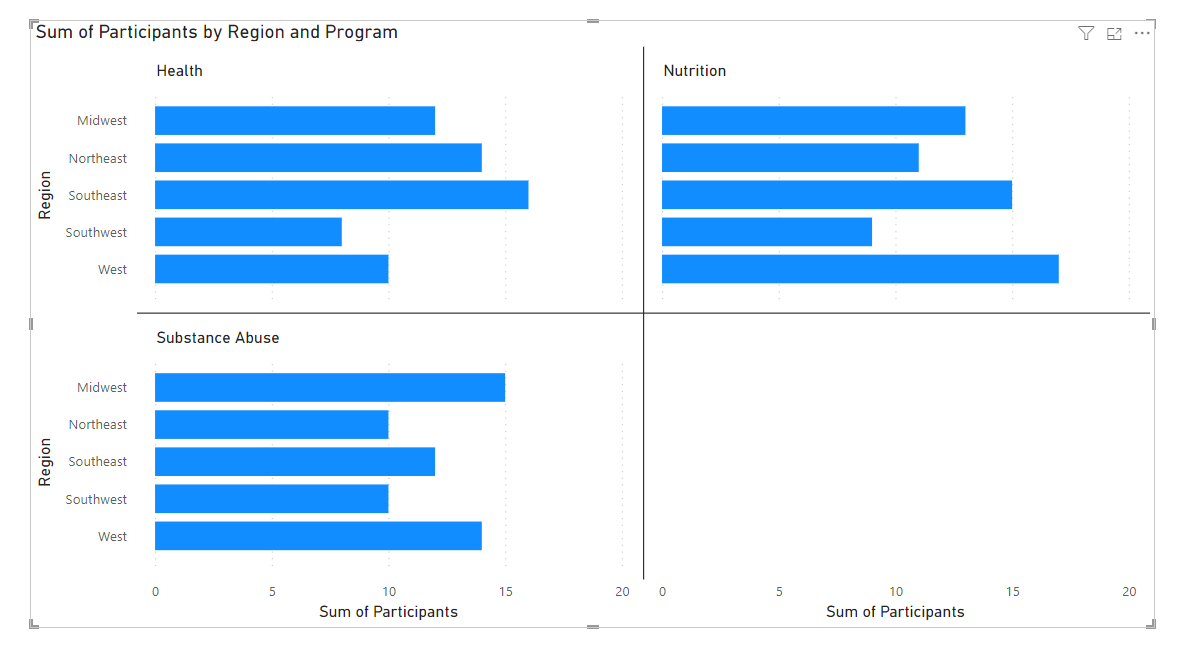
Instead, let’s use our Small Multiples box to split our data up to be a bit more user-friendly. If we move our Program field from Legend to Small Multiples, our bar chart splits into 3 bar charts. One for our Health, one for Nutrition, and one for Substance abuse

.Our Tooltips box on the Visualization Pane lets us add more info to our Tooltips, which are the boxes that pop up when we hover over data. If we hover over a bar of data, you can see the tooltip has data about the 3 fields we’ve added to the boxes in our Visualization Pane already: Region, Participants, and Program. If we had another field and we want information about it to show up in our Tooltip, we would drag that field to the Tooltips box.

Now you have an awesome simple Bar Chart.
Take care everyone,
Joe.
Like these posts but need more formal (but still engaging and fun) training in Power BI? Contact me, or at joe@traversdata.com. I got you. 🙂
