How to override font size limitations
We’re going to learn a formatting tip in this edition of How To Use Power BI and it’s specifically about an annoying formatting limitation that is turned on in Power BI by default.
There *IS* a very good reason for this limitation, but it doesn’t need to be on by default.
We’re going to learn the easy way to turn it off, because you’ll want to eventually. I guarantee it.
For this post, we’re going to use a simple Power BI report with a bar chart. If you want your own copy of the .pbix file, you can download it here (or click the graphic below).

Video Instructions:
Written Instructions:
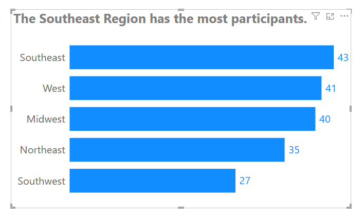
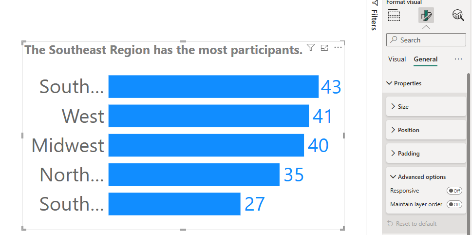
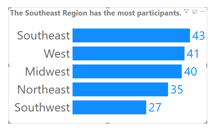
Our Power BI file has one bar chart that we’re going to use to show this formatting limitation.
This bar chart is built using the information in our How To Make Bar Charts and How To Format Bar Charts posts. Learn how to make and format them to make them even *easier* for your viewers to understand (they are already pretty easy, but there are techniques to make it even easier.)
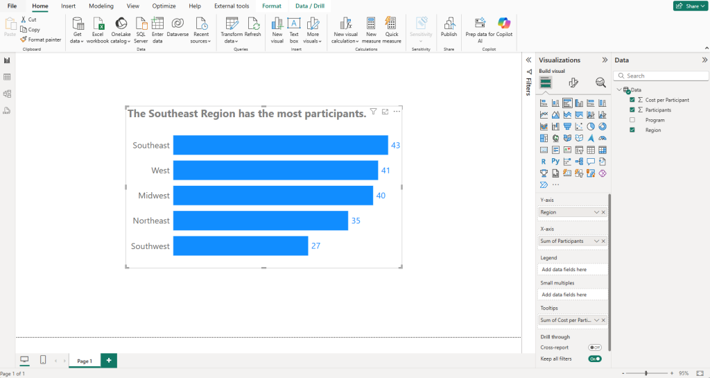
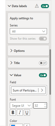
This bar chart is great, but let’s go through a scenario where you know you’ll want a larger font size on your Y-axis labels (our Region categories) and on our value labels at the end of our bars. Maybe your audience is an audience with vision challenges. Maybe you’re designing this Power BI report to be viewed on a phone (I have a whole post about mobile Power BI over on People-Friendly Power BI)… whatever the reason, we want that font to be bigger.
This is just one example, and you’ll likely run into what I’m about to show you on other chart types and scenarios.
Let’s try increasing our Y-Axis category font first. We’ll go into our Visual Formatting options, open up the Y-axis section and increase the font size from 16 to 24, or even go larger if you want.
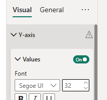
This changes NOTHING on our chart Y-axis. It looks EXACTLY the same.
Our Y-axis font size hasn’t changed AT ALL. *insert sad trombone noise*

This ALSO happens with our Data Labels. If we go into the formatting for those and increase that a bunch, we get the same result.

So, this obviously can be frustrating, and I’ve definitely sworn in my head at the people who programmed this into Power BI, but it’s something we CAN override, if you know where to look.
And, believe me, I didn’t know where to look for a long time.
What we’re going to do, with our Bar Chart selected, is go into our General Formatting options. Then, we’re going to go into the Properties section.
THEN, we’re going to open up Advanced options.
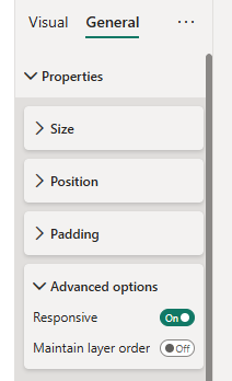
That Responsive on/off switch at the bottom is our nemesis for this.
It’s there, in the words of Microsoft, who added this Responsive feature wayyyyy back in 2017 to:
Power BI responsive visualizations change dynamically to display the maximum amount of data and insight, no matter the screen size.
As a visualization changes its size, Power BI prioritizes the data view, for example removing padding and legend tweaks such as moving the legend to the top of the visualization – automatically, so the visualization remains informative and beautiful even as it gets smaller.
Power BI blog, July 6, 2017
What this says in normal-speak is that it will *force* your visuals to change depending on your screen size. This isn’t a big deal for monitors, which can be different sizes but don’t vary *that* much, but it IS a big deal when you are talking about viewing reports on phones.
Shrinking everything down to be smaller isn’t a great strategy if you want your dashboards to be accessible (and we do).
Oh, and when they added this feature, it was OFF by default. They changed that at some point.
Okay, enough talk… let’s turn the Responsiveness OFF and see what happens.
Cool! Our fonts are HUGE now.
One issue is our Y-axis labels are now too big and are getting cut-off.
No worries. Just go into the Y-axis formatting options and slide the Maximum width slider all the way over to 50%.
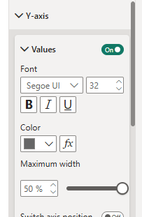
Now that we’ve done this, our Y-axis and labels are now bigger than our title, so that’s not good (you’d want your title to be at least as big as the text elements in your chart), but this is just to demonstrate this.
Now the next time when Power BI won’t change a font size for you, you can say “Not today, Power BI, not today….”
Take care everyone,
Joe.
More posts about Line Charts
More posts about Formatting:
Like these posts but need more formal (but still engaging and fun) training in Power BI? Contact me, Joe Travers or at joe@traversdata.com. I got you.