Power BI Concept: Row Context

This post is about the concept of Row Context in Power BI. This is SUPER important when it comes to writing DAX measures, but applies to visuals not using DAX as well. To explore more DAX posts, check the DAX tag.
This post was made with the February 2024 version of Power BI desktop. While Microsoft updates Power BI Desktop every month, how DAX functions work almost never changes. But, if it does, I’ll update this video and write-up.
We’re going to use a very simple dataset to learn about the concept of Row Context when we are using DAX calculations in Power BI. Row Context isn’t a DAX function, but a core concept that is *everywhere* in Power BI and helps us understand how Columns and DAX work with visuals.
If you’d like to use this simple dataset (the same one I use in the below video and the written instructions below) here it is for you to download:

Video:
Written Instructions:
Here’s the video. Written instructions are below.
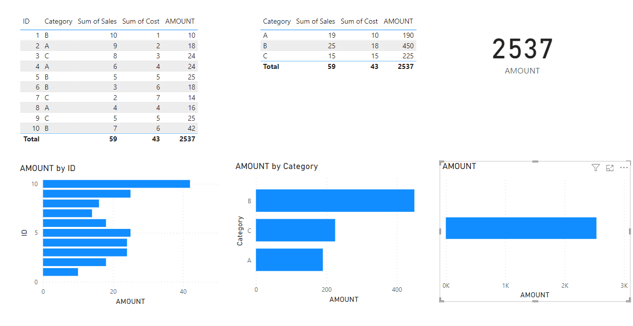
Let’s get started by building a simple table with our simple dataset. This report is blank, with the Excel file above connected. We’ll throw all our columns into our table.
By default, it COUNTS our ID field, so let’s change that by clicking the chevron in our ID field in the Visualizations Pane and clicking “Don’t Summarize”. We don’t want anything aggregated in this table right now.
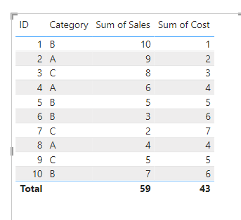
Okay, there’s our table, with our 10 rows of data. We have IDs, 3 Categories (A,B, and C) and some numeric fields for Sales and Costs for each ID number.
Let’s create a DAX Measure that takes our Sales and multiplies that with the Cost.

Nice and easy. SUM of Sales multiplied by SUM of Cost.
Let’s bring our new measure into our Table and see what happens.
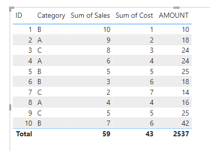
We’ve got a new column, and it’s doing what we asked it to. It’s multiplying our Sales and our Costs and giving us the product FOR EACH ROW in our Table.
Each row is acting like a filter for our DAX measure. That’s ROW CONTEXT.
You can see that it’s ALSO doing it for our TOTAL row.. it’s multiplying 59 by 43 and giving us 2,537. That isn’t the total of our AMOUNT column in this table.. it’s the product of our Total Sales and Costs multiplied.
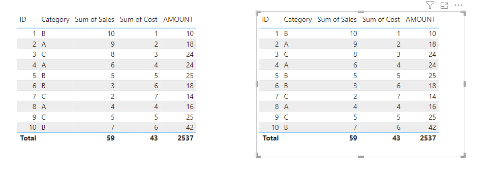
Let’s select this table, press CTRL+C to copy it to our clipboard and then click on our canvas and press CTRL-V to duplicate the table.
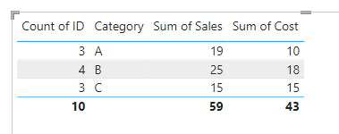
On the 2nd table, we’re going to take out our ID column, which makes the table summarize things by Category:
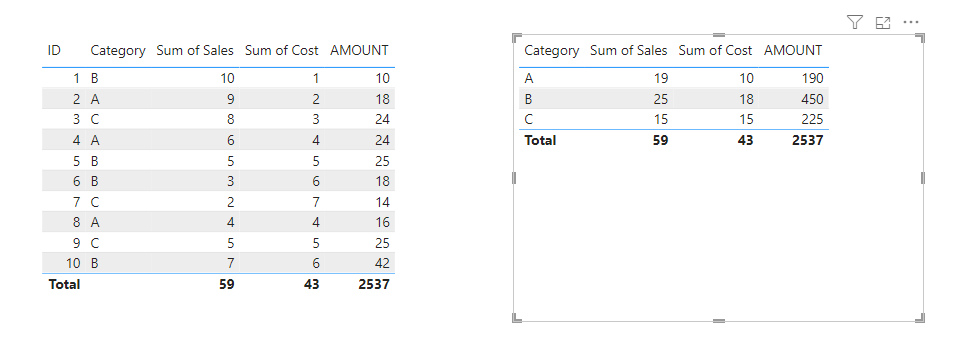
That Row Context is still there… our DAX measure is multiplying Sales and Costs again, FOR EACH ROW. Boom. Row Context.
What happens when there is NO row context? Let’s bring our AMOUNT measure to a Data Card.
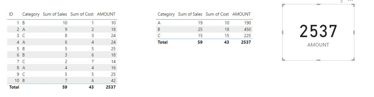
We get the Sum of Sales multiplied by the Sum of Costs, completely unfiltered by rows.
This works the same no matter what kind of visual we are making. We used tables here so we could see what was happening in the data, but let’s try it with Bar Charts.
I’ll click the Bar Chart icon and place the space for it below our first table. This table has a row for each ID number, so I’ll bring ID to our Y-Axis. Then I’ll bring our AMOUNT measure to our X-Axis.
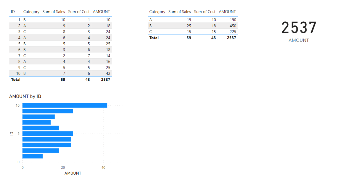
We get 10 bars. One for each ID number. Our Bar Chart uses that Row Context just like our Table does. The rows filter our data.
Let’s make a copy of our Bar Chart and put the copy under our 2nd table. Then we’ll remove ID from our Y-Axis and put in Category. We get a chart with 3 bars. Our data is being filtered by our Row Context again. In this case, it’s the 3 Category rows.
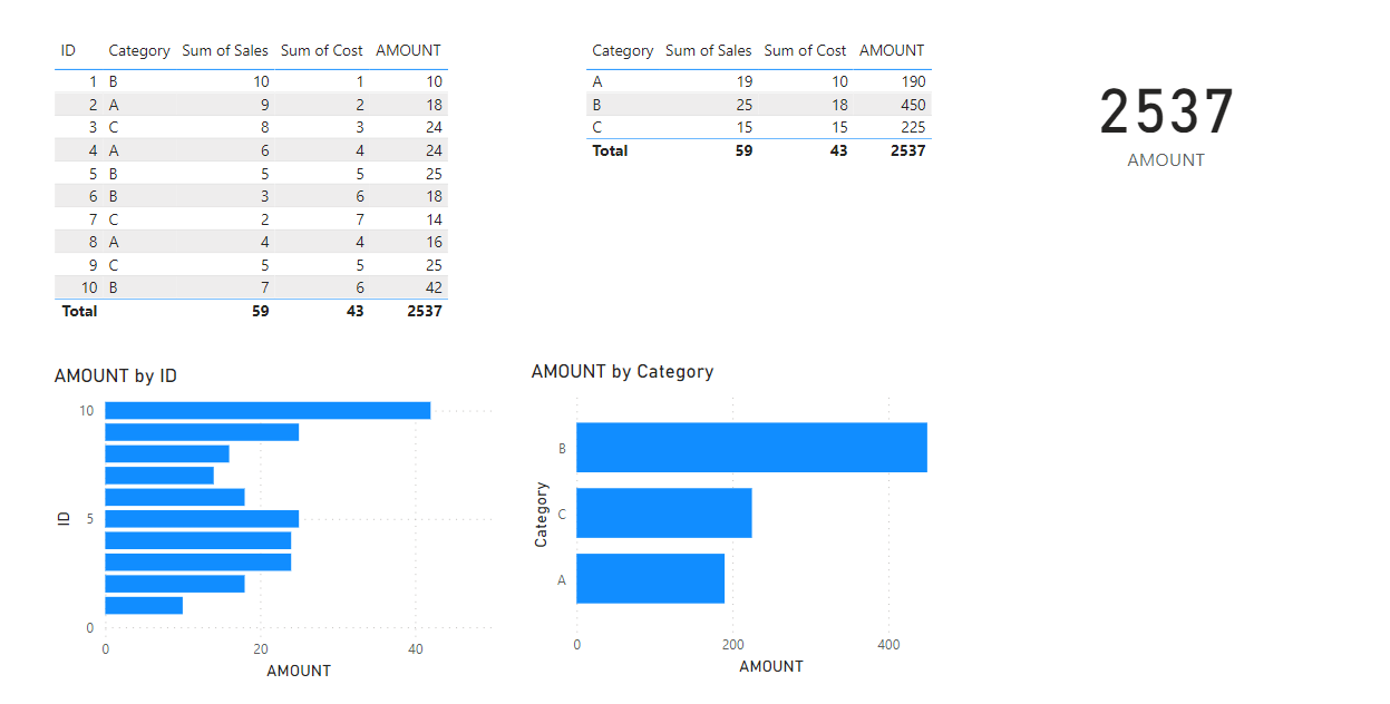
The main concept here is behind every chart is a table of data, even if we can’t see it. By adding fields to our chart, we are telling Power BI what data is in our table.
For this category chart, we’re telling it to take our AMOUNT measure, but split it into different bars according to the data in our Category field. 3 categories means 3 rows of data means 3 bars.
To finish this off, let’s make a Bar Chart without any row context, like we did with our Card Visual. Copy our category Bar Chart, and delete category from the Y-Axis, so we’re left with just one bar representing our measure with no row context.
This is one of the most important concepts to understand when writing DAX, no matter if it’s simple DAX (like we’ve done here) or more complicated.
It’s not hard to understand ONCE you know what’s going on behind the scenes, but until you do (like you do NOW!) it can be confusing when DAX doesn’t act like you think it should.
Take care everyone,
Joe.
Like these posts but need more formal (but still engaging and fun) training in Power BI? Contact me, Joe Travers or at joe@traversdata.com. I got you.
