Power BI DAX: SELECTEDVALUE

This post is a high level look at the SELECTEDVALUE DAX function. This function is at once extremely simple and straightforward but can be used in a myriad of ways to filter data, indicate if data is filtered, even manipulate your report design to look different ways based on what your users click on!
We’re going to use a very simple dataset to demonstrate the basics of how the SELECTEDVALUE function works.
If you’d like to use the same data that I do in the below video, here is the data file you can connect to Power BI Desktop:

We’re going to use a very basic and raw Power BI report to demonstrate how SELECTEDVALUE works. It links to the same data as above. If you want to use the same .pbix file you can click here and it’ll download for you.

Here’s the video. Written instructions are below.
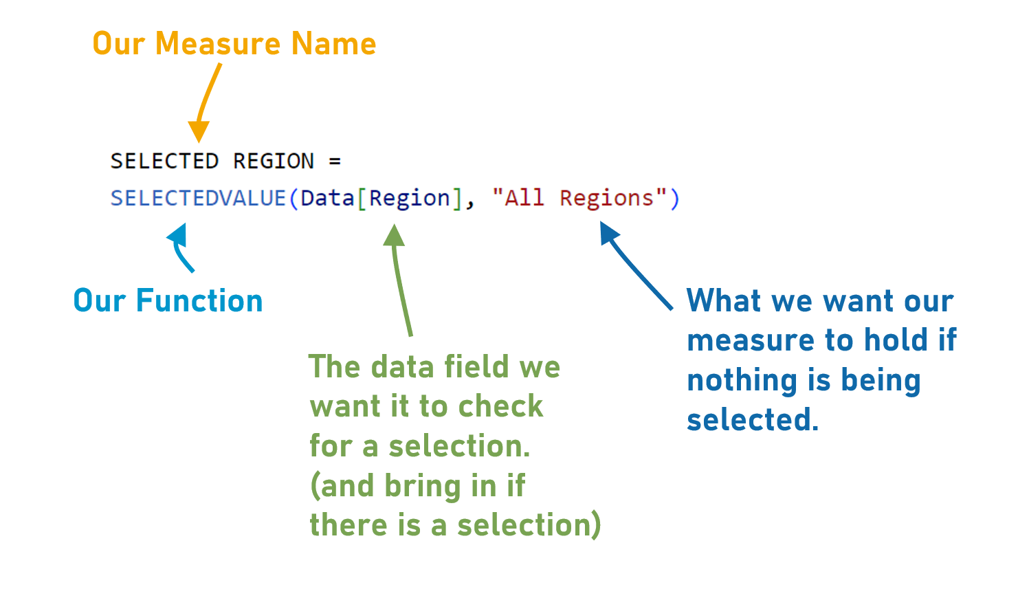
We have a simple basic Power BI report here. We’ve got 3 columns of data about the number of participants in some programs across different regions.
We have a couple basic and unformatted visuals on our report page. A table that shows our data, and a bar chart that summarizes the data by region.

Let’s create a SELECTEDVALUE measure. This function is used when we want to isolate a certain value (whether it is a number or a date or text), namely when that value is selected.
Let’s try it out and see how it works.
Click “New Measure” up in our ribbon and we’re going to write some DAX that looks at the Region column in our data and figures out if one of our regions is selected.
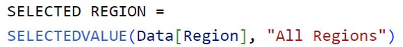
The SELECTEDVALUE function has 2 parts.
The first part is where we identify what field we want this function to check to see if something is selected. In this case, we’re getting it to check our Region field. If a Region is selected, it’ll show that region in this measure.
The second part is optional and Power BI calls it “alternate result” which is their way of asking us “What do you want in this measure if something is NOT selected?”. We’ve put “All Regions” in double quotation marks.
It’s like an IF statement. IF this DAX checks the Region field and a Region is selected, it brings that region name into the measure. But, if no region is selected, it’s just going to bring the text “All Regions” into the measure.
Let’s try it out.
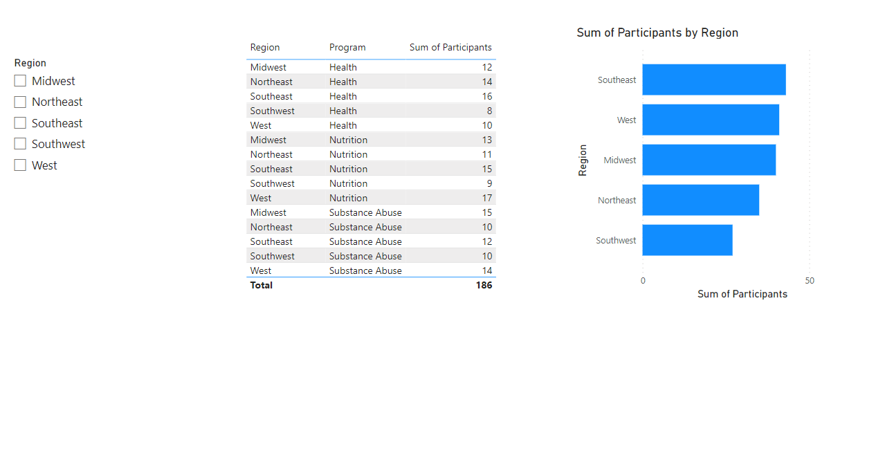
Let’s add a simple slicer to our report, so we can select a region with it.
With nothing selected on our canvas, click the Slicer icon in the Visualizations Pane to make a litter Slicer Placeholder, and then drag our Region field from our Data Pane to our new slicer.
Cool. Now let’s bring in a simple Data Card visual so we can see what’s happening with our measure. Click the Data Card icon in the Visualizations Pane and bring our new “SELECTED REGION” measure over to it.
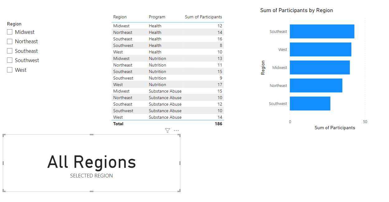
It’s already working! We haven’t selected anything in our slicer, so our measure is showing our “Alternate Result” which is the text “All Regions”.
If we select a Region in our slicer, our measure changes and brings in that selected value:
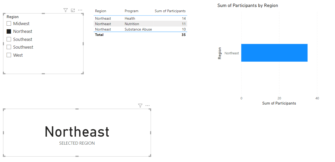
Having a selection in the Slicer not only slices our table and our Bar Chart (to show only data from the Northeast Region, in this case), but our measure displays that selection.
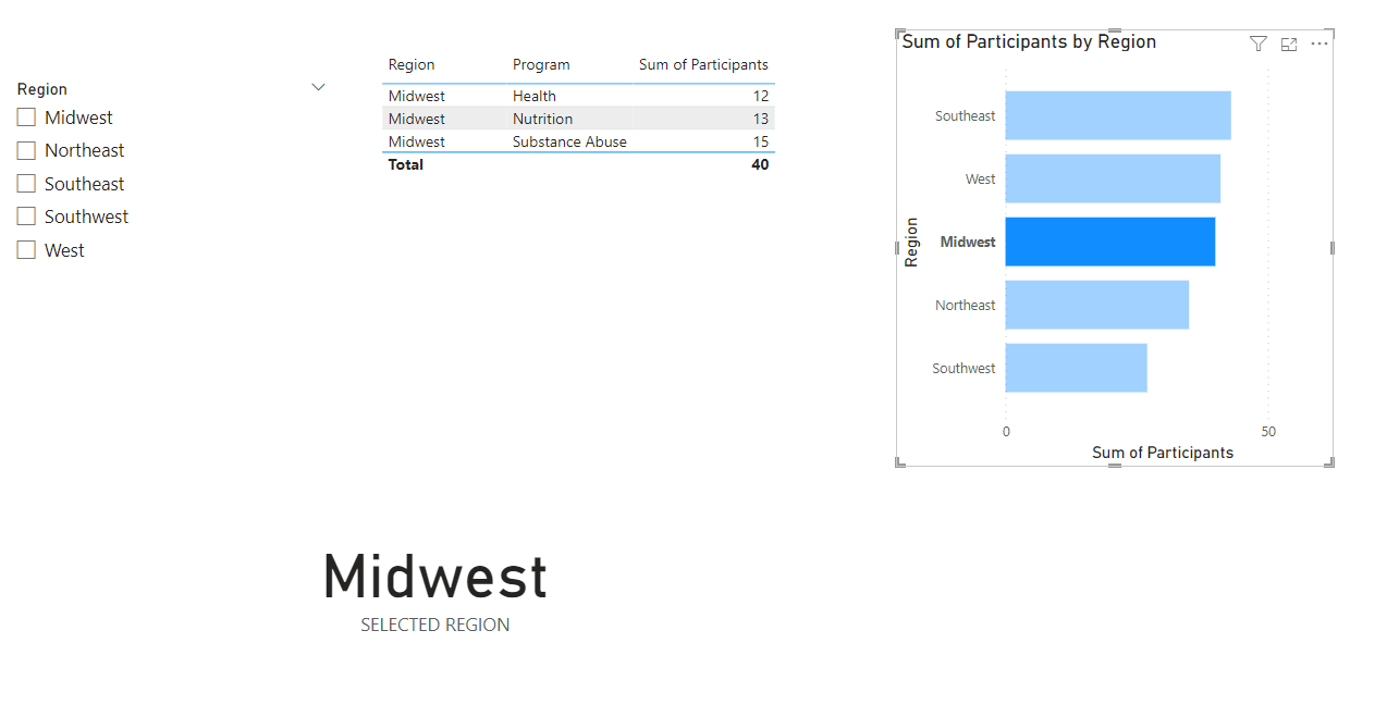
This works with tables and charts too. If we clear our slicer and instead click a Region in our table, our measure updates to show just that region.
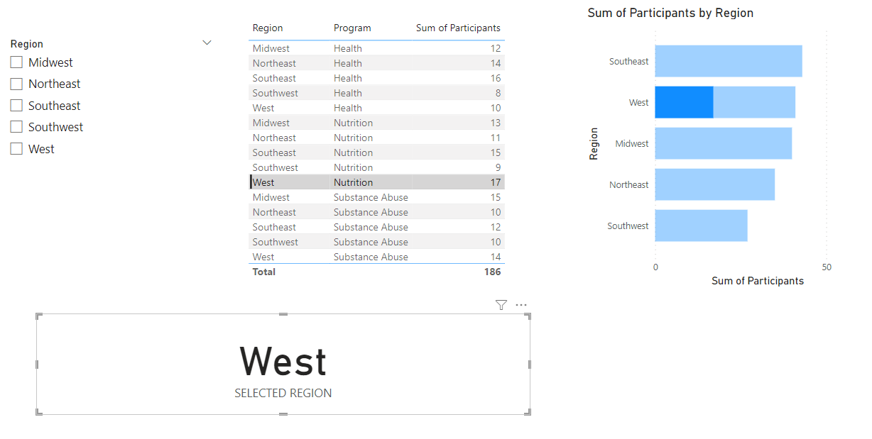
Same thing with clicking a Region bar in our Bar Chart… our measure brings in the selected Region.
Pretty cool.
Have questions about the SELECTEDVALUE function? Let me know in the comments below and we’ll figure it out.
Take care,
Joe.
Like these posts but need more formal (but still engaging and fun) training in Power BI? Contact me, Joe Travers or at joe@traversdata.com. I got you.
