The Power BI User Interface

This post is a very high level look at the Power BI interface. What different ribbons do, what panes there are, what views there are.
This post was made with the November 2023 version of Power BI desktop. While Microsoft updates Power BI Desktop every month, the changes to the User Interface are few and far between. If the User Interface changes a lot, I’ll update this video and write-up.
We won’t get into too much detail about the nitty-gritty of each part today. This is just a broad overview, and every ribbon and pane and view will be explored in much more detail in their own videos and as we learn specific techniques.
Video:
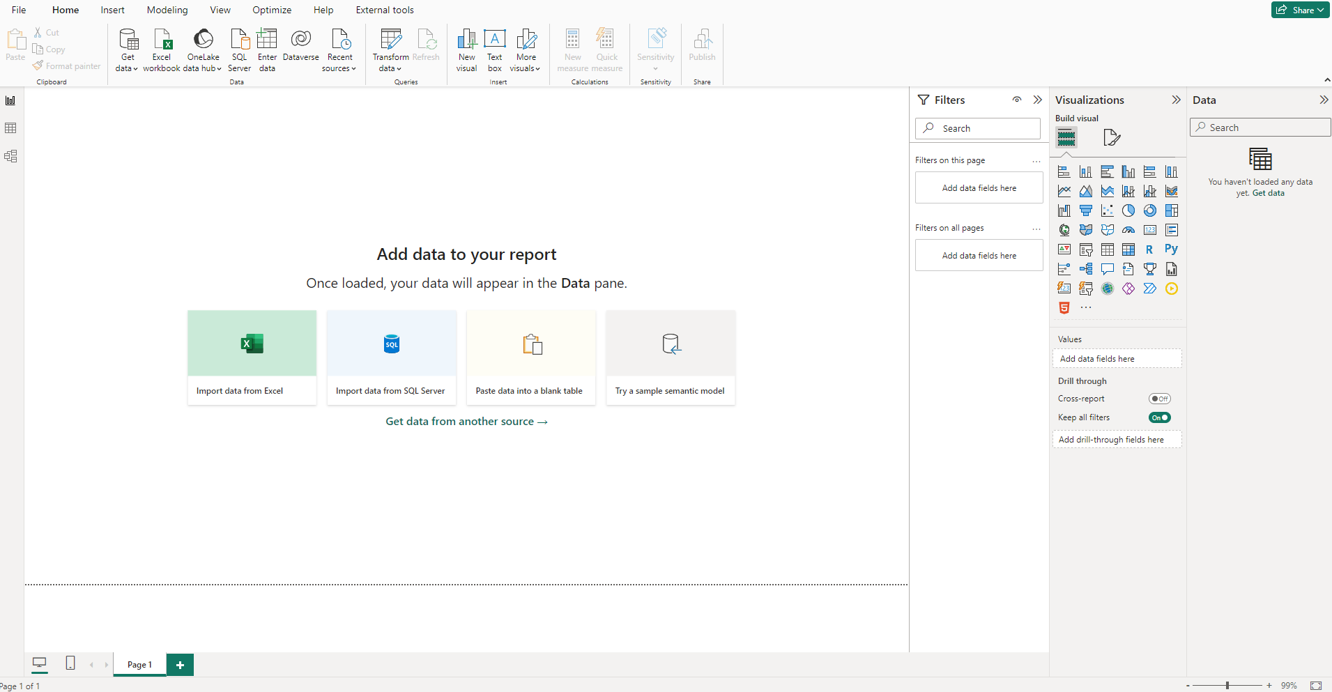
THE CANVAS:
The canvas is the large white space in the middle. This is where all the visuals on our report will live.
THE RIBBON:
At the top we have the familiar Microsoft Ribbon. Just like the ribbons in Microsoft Excel and Word and Powerpoint, the Power BI ribbon is filled with tools split up into different tabs.
RIBBON TABS:
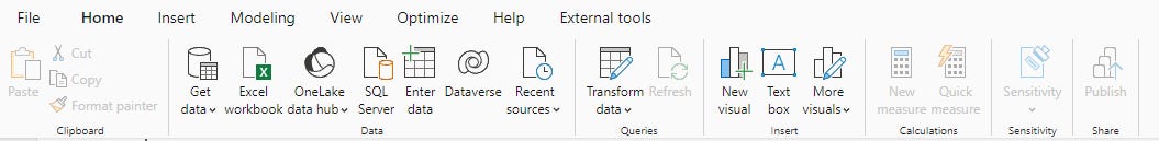
The HOME tab has tools for adding data sources, accessing Power Query Editor (used for cleaning and transforming data) via the “Transform data” buttons, and adding in visuals and more.
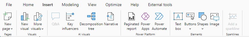
The INSERT tab lets us insert different visuals, text boxes, buttons, shapes, and images.
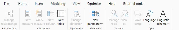
The MODELING tab lets us create DAX measures, or even new columns and tables, and also lets us set up a security model if we need some users to only see some data.
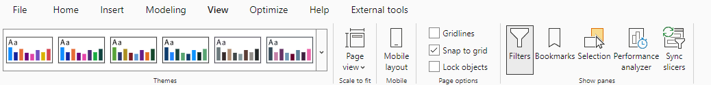
The VIEW tab lets us set a theme for our reports, set up mobile layouts, and access other panes that don’t show up by default.
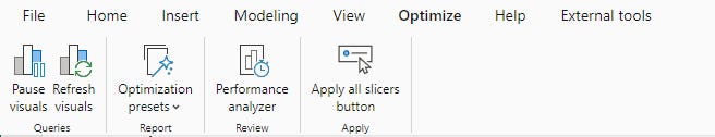
The OPTIMIZE tab has tools to check the efficiency of our reports… as in if they are loading really slow, we can analyze what parts of the report are loading really slowly.
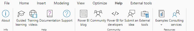
The HELP tab has links to things like Microsoft forums and the Power BI blog which has news about new features.
The EXTERNAL TOOLS tab is where 3rd-party tools live. There are only a few of these okay’d by Microsoft, and if you haven’t downloaded one, this tab doesn’t show up.
PANES:
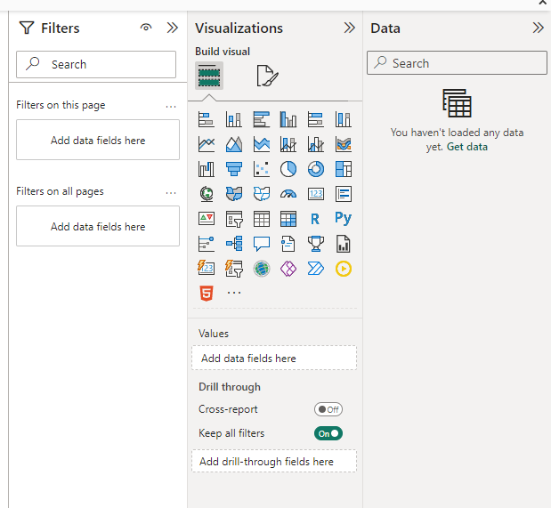
On the right side of the Power BI interface are 3 panes that appear by default.
The DATA Pane is where we see the tables and columns of data we’ve added.
The VISUALIZATION Pane is where we can choose what visual we want to make, and it also has formatting tools.
The FILTERS Pane is where we can create filters and control what data is making it from our data to the visuals on our Canvas.
VIEWS:
The REPORT View is the default view of our report. It shows the Canvas.
The TABLE View shows us our data in a table form. Just like Excel.
The MODEL View show us our data tables and how they are linked together, and where we can create.
Take care everyone,
Joe.
Like these posts but need more formal (but still engaging and fun) training in Power BI? Contact me, or at joe@traversdata.com. I got you. 🙂
