Yes, you CAN tell narrative data stories with dashboards!

Hey there!

When I was young(er) I was very petrified of public speaking.

You may have this fear too, and can relate to the overwhelming anxiety that used to hit me before I was due to speak (even just in front of a small school class). The annual public speaking project we had to do every year is something I dreaded. My stomach would feel sick. I’d sweat and have chills at the same time. I felt like I was going to pass out. This was even BEFORE I stood up to speak.

The usual tips of “just pretend the audience isn’t there” or “look at the back of the room” or “find a friend in the audience and speak to them” or even “imagine the audience naked” (hot, but not useful) didn’t work, at all.


You know what worked, and worked better than I could even imagine? A paradigm shift of how I thought about the audience.

I randomly read a tip somewhere (I wish I could remember where) that since public speaking is *such* a common fear, most of an audience is secretly (or not so secretly) in awe of a speaker who can stand up and present.

That ONE TIP shifted my whole mental approach to public speaking.

Instead of thinking about how nervous and anxious *I* was, I realized that I could think about how the *audience* was feeling, and draw strength (emotional and figurative) from them. There was a GREAT chance that every time I stood up in front of a group, a lot of them were thinking “Wow… I wish *I* could do that…”

The larger the group, the better. In larger groups, even more people would be thinking that, and I knowing that gave me confidence. I used that confident energy that THEY were giving me.

I fed off their energy, like an energy vampire:

Yes, that is actually me dressed up last Halloween as “Energy Vampire” Colin Robinson from “What We Do In The Shadows”…


That ONE realization TOTALLY changed the public speaking game for me. It wasn’t overnight, but each time I spoke in front of an audience I got a little more comfortable and sure of myself.

I had been approaching public speaking in a certain way (the way most people do) because that’s just how it was done. I was focusing on how *I* was feeling instead of what my *audience* was feeling.

This type of paradigm shift is what’s needed in the data dashboard world. Most data dashboard professionals approach dashboards in a certain way and with certain restrictions and preconceived notions about how you can (or can not) communicate data.

There are two kinds of dashboards

There are generally two kinds of dashboards, exploratory and narrative (sometimes called explanatory). Some will say there are more (such as operational, strategic, and analytical), but it’s just semantics. The audience may change with these, but not the overall functionality.

Exploratory dashboards are ones where data is explored, and are most often used by data analysts to suss out stories in the data. It’s like panning for gold in a river. You can spend all day sifting that (data) sand in a river bed and only get a couple nuggets of (insightful) gold.

Narrative dashboards are the ones where identified stories about the data are put on display. It’s like taking your nuggets of gold and polishing them up and putting them in a display case for people to ooh and ahh over.

In the data dashboard world, unfortunately, the consensus seems to be that dashboards are only appropriate for exploratory needs. This belief is what has resulted in dashboards with a ton of different metrics all showing up at once with many filters and slicers for users to struggle through.

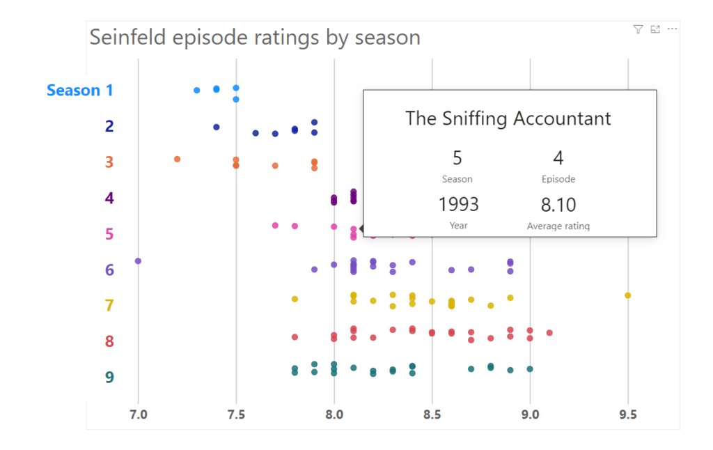
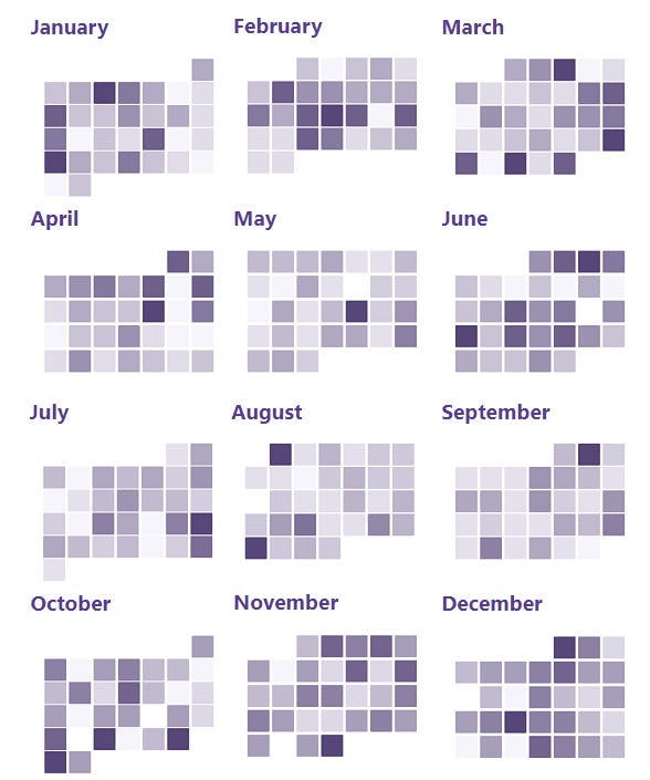
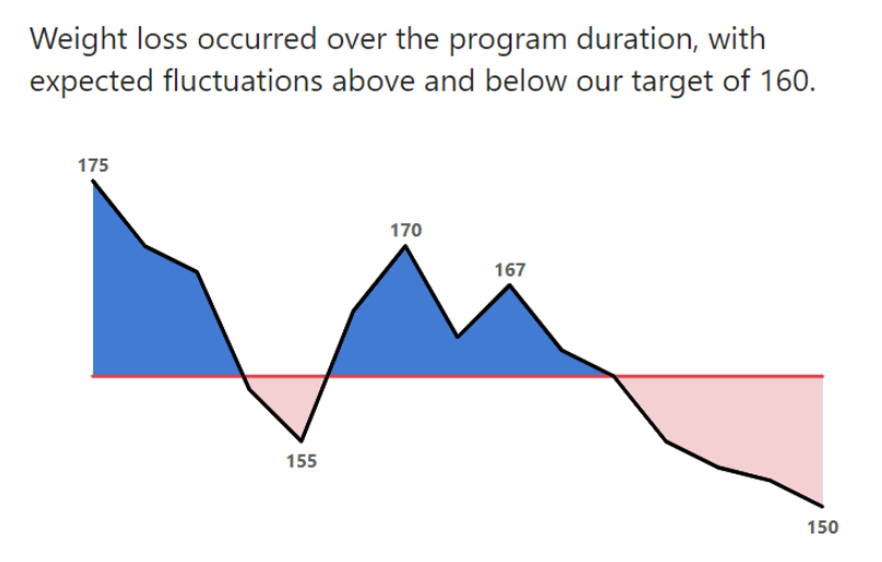
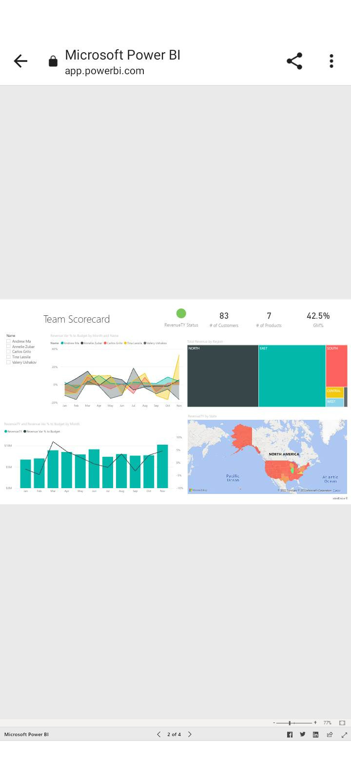
Like these, which are highlighted on Microsoft’s “What is a Data Dashboard” webpage:

These are prime examples of exploratory dashboards, and let’s be frank, 99% of all dashboards are exploratory. If your dashboard only reveals data stories when your users click around and filter and slice data certain ways, it’s not narrative at all. The narrative is there, but you’re making THEM find that narrative. You are making THEM pan for gold nuggets. They do NOT have time for that.

The solution is narrative dashboards, or dashboards that KNOW what users are looking for and GIVES it to them. Whether that’s one short story or an epic novel with chapters and character development arcs and a 2nd act dilemma and a 3rd act climactic resolution.

The data dashboard world still operates with the assumption that dashboards can NOT tell stories, because it’s impossible to know what ALL your users may want to know AND that dashboard data is dynamic, so it’s impossible to tell a story with it.

Both of these assertions are false and lazy.

Your audience is more important than your data.


If you don’t know your users, that needs to be addressed. The first thing you need to know when designing a good effective dashboard product is the audience. NOT the data.

Let’s repeat that.

The first thing any dashboard developer should know is the AUDIENCE. Everything revolves around knowing what they NEED.

If the data doesn’t support those needs, maybe the dashboard shouldn’t be built at all.

Knowing your audience requires talking to them, or someone who knows them really well. What questions do THEY care about that the data can answer? How well do they know the data being funneled into the dashboard? What do they need to DO with the insights (stories) a dashboard can tell them?

Knowing these things allows us to build a dashboard that answers questions quickly. No hunting for nuggets of gold. No one has time to sit by a river sifting that sand.

If someone can’t open up a dashboard and find the answer they are looking for in a few seconds (or a complicated insight in less than a minute), it’s NOT a good dashboard.

Seriously.

My own personal goal when I build a dashboard is to get a viewer in and out of the tool as quickly as possible. If they are spending time searching for the gold nuggets they need, I’ve failed. They have their regular work to do, and they need quick insights to make a decision or move a process along. They can’t be sitting by a river all day looking for that gold.

Talking to dashboard users is not a normal practice. A quick google or search on Linkedin about what one needs to be a great data analyst or a great dashboard developer almost NEVER includes talking to users. These lists include learning SQL, Python, javascript, M Language, DAX, etc., etc., etc. It’s all data and code. It’s never about people and what they need.


Knowing what the people using your dashboards need from them is the first step. It’s the ONLY first step.

If you’re thinking that a dashboard can get unweildy and overly complicated if there are a lot of user groups that all need different things from a dashboard, you’re totally right.

If you’re trying to make a dashboard that answers the pressing questions of multiple disparate user groups, you are doomed to failure. Trying to please all of these groups will mean making compromises and you’ll end up with a dashboard that maybe everyone can use, but no one will be happy with.

At the very least, if you MUST have a dashboard with different users, create different pages for different groups… but ideally, you’ll want different dashboards for different user groups. They can all use the same data, but it’ll be displayed differently depending on the user group.

This user-focused approach ensures that dashboards and charts and every data reporting tool exists to answer user needs. This is even MORE important when we consider (and we should ALWAYS consider) different cultural, racial, and identity contexts. WE don’t know our users’ experiences. Only THEY know them. We have to LEARN from them.

It’s EASY to tell data stories with dynamic data.


On to the 2nd “problem” of narrative dashboards being impossible to build because the data feeding into them is dynamic and one can’t tell stories if the insights are changing.

Seriously, I just read a LinkedIn post from a data communication “expert” the other day that said one couldn’t tell stories with dashboards “because sometimes a metric may be increasing, and the next day it may be decreasing.”

This is, frankly, bulls–t.

Have these people used a computer program in the last decade? Applications built for data visualization (Power BI, Tableau, R, and more) and even those where data viz is icing on top (Excel, for instance) ALL have ways to look at what data is doing and tell a story with it, even when it’s different every day (or hour, or second).

We can literally get a dashboard to do calculations (simple or very complex) and spit out a narrative title/sentence/paragraph that accounts for what the data looks like AND can generate an entirely new title/sentence/paragraph the very next day/hour/minute. It’s not just narrative text either, but visual colors can change, graphics can change, everything can change and adapt to what the data is doing.

It’s not even hard. When I teach half-day workshops to people entirely brand new to Power BI and we have 10 minutes to fill at the end, I teach them the basics of dynamic story-telling..

In 10 minutes. To people absolutely brand new to the software.

It’s not only extremely possible to build narratives and story-telling into dashboards, but if dashboards DON’T do this (which most don’t), they probably aren’t used as much as they should be.

In summary, don’t let anyone tell you that a dashboard can’t be a narrative tool to communicate stories about data.

If someone is saying this, they just haven’t thought about data and communicating it with an end-user in mind enough.

They need a user-oriented paradigm shift.

They need to STOP thinking about THEIR experience with a dashboard and SHIFT to thinking about the experience of their USERS. A whole new world opens up with that paradigm shift.


WHERE TO FIND ME:

TraversData.com | LinkedIn | Instagram | Threads


Put the People in your data first.


Hey everyone,

We have a bit of a departure for this issue of People-Friendly Power BI. While we always talk about how to make Power BI easier to use for our dashboard and report audiences (the people!), this issue is about the people in our data.

Those of you (hi!) who I’ve worked with, or have taught Power BI to (or even been following this newsletter for a bit) know that this newsletter has the name it does because for me, the most difficult and stupid part of working with data is how BADLY it’s communicated to people. It is my #1 pet peeve.

You’ve put all this money and time into collecting data, cleaning data, analyzing data, and then you get to the communicating / reporting stage and …. you do this part badly and all that money and time on the previous steps is basically wasted.

Either data is visualized badly (ignoring the needs of the audience) or it’s communicated by someone who is too techy (sorry techies!) and while they have the “hard” data skills, their people skills are not stellar, and communication breaks down.

Frequently, the issue is BOTH. Bad visuals AND bad communication.

We Gotta Figure It Out GIF - We Gotta Figure It Out Communicate GIFs

I named this newsletter People-Friendly Power BI because I make Power BI friendly to you, who may need to start using it (or continue using it) to develop reports but ALSO for your audience so they’ll LOVE your reports.

People are important to me. They are the most important part of data. They make decisions with data. Use data to move along a process or project. They ARE the data.

Data is people.

(I’m refraining from putting a gif here of Charlton Heston yelling “It’s People!!! It’s made from people!!!”) You’re welcome.

So, what do I mean by this “data is people” statement? Of course it’s people, you say. Data is about people.

We SAY this. Data people SAY this. But do we pay attention to it? Way too often, data is analyzed and displayed WITHOUT thinking about the people and the lives that make up that data. Way too often, a data analyst is trying to make a good chart, or trying to find a pattern or story in the data. It becomes just numbers.


Let’s use an example.

Here’s two charts made with the same data. One is a bar chart, one is a beeswarm (some people call it a jitter plot, but that’s less fun).

Left: Bar chart showing pay disparities between 4 groups of restaurant workers. Right: Jitter plot showing the same data.

The bar chart is aggregating everything together and visualizing the average for each group. Nevermind that a bar chart isn’t the best way to show an average, lots of people use bars for averages… look at the Groups… and imagine if instead of Group A,B,C,D we had races listed instead. Some conclusions, generalizations, and stereotypes would jump out immediately.

The beeswarm is the exact same data, but the individual data points are shown, and they show that the “story” isn’t so simple as the one being told (or being assumed by the audience) by the bars. The averages are really NOT the story. The spread and variance are the story.

(Charts by Eli Holder, via Dr. Stephanie Evergeen. Read more about how visualizing data in a society with hundreds of years of built up systemic racism can make things worse here.)

The data is people.

Let’s take this one step farther, and it’s a step we should all take constantly. It’s a step that anyone working with data should think about. The data isn’t numbers (or words). Any data worth working with (in my opinion) is capturing the lived experiences of people. Their births, their lives, their deaths.

I recently worked with Mamow Ahyamowen, which is an epidemiology alliance of First Nations governed health service organizations based in northern Ontario. Their goal is to provide health information to communities that they can use to work toward health equity.

Before I even started working with them, I attended a virtual session where they presented some health data (specifically mortality data), but before launching into all the numbers of deaths and co-morbidities and how their mortality data compares with province-wide data, they paused.

They paused to reflect on the nature of the data, who the data was about, and what it meant to all of them. When I asked them about it, staff shared that this practice was inspired by teachings from Elders and Knowledge Keepers who have been involved in their work.

More organizations (and the “data world” as a whole) need to do this. Data is not just data. It’s lived experiences, ancestors and history.

Mamow Ahyamowen’s health data is perhaps the perfect example of this. Indigenous communities in Canada (and all over North America, and the world) have lived through centuries of land theft, oppression, and systemic racism. Families and communities were ripped apart throughout the 19th and 20th century and thousands of children were abused and killed in government-run and church-run residential schools. It doesn’t end there; colonialism has changed forms but continues to affect the lives of Indigenous people to this day.

All this affects the health of communities in a big way.

I trained a lot of great people at Mamow Ahyamowen in getting started with Power BI, and these were training sessions that used their data. Data about their families and ancestors.

So, the first thing we did at the start of every session was the same thing they did during the webinar, like all their meetings where data plays a part. We paused and honored the people and lives captured by this data.

We also built a slide like this into the start of the presentation:

This wasn’t lip service. We shared links and phone numbers to mental health and crisis support lines. Because exploring data that tells a story about how your community and family has been abused for generations is traumatic.

I really wish more organizations and data people would think about things like this.

We, the people who collect, analyze and communicate data, cannot in good conscious ignore the stories in the data. We can not present it “without bias” (which is impossible), no matter how much we try. The bias is implicit and systemic.

But we can expose the bias, know why it exists and counteract it, alongside the racism systems that perpetuate it. We can also think mindfully about the lives and communities the data speaks to. Context matters. Data is useless without context.

So this is what I’m doing.. because I think I can use my privilege and skills to help in some meaningful way.


What are you doing?


More about Mamow Ahyamowen:

Building on the success of the mortality analysis discussed above, Mamow Ahyamowen is working on three new projects that will explore chronic conditions, mental health and addictions, and injuries. You can stay up to date with their work by signing up for their newsletter.

More about Maureen Gustafson

(Maureen helped me write and lent her thoughtful editorial eyes to this post):
Maureen Gustafson is a member of Couchiching First Nation with mixed Ojibwe and settler roots. She grounds herself first and foremost in her relationships as an auntie, sister, daughter, cousin, and friend. Maureen holds a Master of Public Health and is privileged to serve Mamow Ahyamowen as a Knowledge Translation & Exchange Specialist.

How to design in Power BI (and anything else) like a freakin’ rockstar.

Hey you. How’s it going?

This is my mom, Marguerite (or Margie, as everyone knew her).

Mom passed away a few years ago, and I still miss her every day, and she factors hugely into today’s post about design.

Mom was an x-ray and ultrasound technician. For over 40 years… from the late 1950s to when she retired in 2005. She worked with a huge range of technology over a lifetime of giving x-rays and ultrasounds to tens of thousands of people.

Adults, kid, famous hockey players.

She was such an expert in her field that by her 40s, she could spot things some radiologists (like, doctors trained to read x-rays) missed. Young doctors would ask her to check over x-rays sometimes, just in case.

So, she knew EVERYTHING about x-rays and ultrasounds, but also managing an office (because she’d usually have to do that too) and putting people at ease (both kids and adults) because they had to be calm and motionless for the scans to be clear.

Also, mom never could figure out home computers. Deciphering them was like learning a new language for her, and by the time there was one in their house, she was at the point in life where she didn’t need to.

She’d often say “I’ve somehow survived without using a home computer so far… I’ll keep doing what I’m doing”.

Not to say she didn’t try, but at some point the effort exerted wasn’t worth the benefits to her. She didn’t need email.. she’d phone us when she wanted to talk.

I miss those calls so much.

I’m sure you know someone like my Mom. Someone who is an absolute ROCKSTAR at what they’ve dedicated years and years to. Someone who can tell you EVERYTHING about that subject, whether it’s x-rays, or event production, or e-commerce, or app development, or evaluation survey creation, or whatever.

I’m a rockstar with visualizing data with Excel and Power BI. It’s not bragging if it’s true, right?

How does this relate to design in Power BI? People-friendly Power BI? Or in anything else. Maybe you’ve already figured it out.


When you’re designing something (anything), there’s a 99.99% chance you’re gonna be sharing it. You try and design something awesome, because if who you share it with really likes it, they’re gonna share it with others.

It could be your boss sharing it with their boss, and their boss sharing it with your Board of Directors.

Or it’s something (a graphic, a chart, a dashboard, whatever!) you put out on social media with the hopes of it going viral (we’ll ignore the dumpster fire that social media is for now).

The point here is that you are making something for an audience. It’s not going to be only YOU looking at what you’re designing. You are designing for others, and they do not have the same skills that you do.


When designing with Power BI, YOU are a data person. You probably know that data inside and out. You dream about that data (or have nightmares about it).

But, no one else does.


Yet, most Power BI dashboards are designed like their audience are data people. Most of them cram a ton of data onto every page, with no explanation about what the data means, or if a chart is showing something good or bad, or even worse, there’s a giant table of numbers with no explanation why any of them may be important.

Power BI developers design for themselves. If they can understand a dashboard, then it’s awesome… everyone else should “get” it too.

But most Power BI developers are data people. Like, hardcore data people. They know the difference between “On Prem” and “Azure” and why a company should use a Data Lake versus a Data Warehouse (or vice versa). They are AWESOME at what they do… making data work.

They are not good at communicating the messages and information that data to others (Sorry data people. you know I’m right). If you have a data person who is the life of the party, belting out karaoke tunes, having regular conversations with regular people, you have a unicorn on your hands (and that unicorn will probably be promoted soon, as they can provide a bridge between technology and people).

Unicorns are super rare. That’s why they’re called unicorns.

You NEED to understand and be able to talk to people to design great Power BI reports that people will USE regularly, if not LOVE.


That’s why, whenever I design a report for any audience that isn’t data people (for a CEO, or a Board, or a department full of people who’s job is NOT data, or something that will be on a website, or shared on social media), I think of my mom.

Would mom understand this dashboard? Could she look at it and immediately know what it was saying? What the key insights were? We’re talking seconds here. Would she know everything she needed to know within seconds?

This is YOUR audience when you design. My mom (metaphorically).

Your audience is people who are excellent at what they do, which is almost certainly not data. People who need to use your dashboard (or chart, or whatever) and get something from it immediately.

They don’t have the time (or the desire) to click around and filter things different ways and waste a bunch of time looking for a number.

You HAVE to remember that.

I’m not saying I’m perfect at this. When I get feedback about a dashboard, it sometimes is like “Joe, I love this… but I couldn’t quite figure out …” and as soon as I hear that I listen VERY closely to what they couldn’t figure out. I don’t explain to them where to find the information they need, I redesign and GIVE them the information, so they don’t have to go looking for it.

It’s what Mom would’ve loved.

We’re not designing for data people. We’re designing for normal people.

6 reasons why you should not use external Power BI visuals


Hey everyone! Happy 2023!

Here’s my daughter from our trip to British Columbia last summer, looking not-to-pleased in a double-kayak:

May be an image of 1 person, nature and lake

You’d think she’d be pleased, right? We were out on the water in Deep Cove, B.C., on an absolutely beautiful day.. and she LOVES kayaking.

Usually.

This time however, the kayak rental place had a rule that anyone under 16 couldn’t pilot a solo kayak. She’d have to share a kayak with an adult. Nevermind that we spent hours and hours every week out on the wilds of Lake Ontario that summer… rules are rules. She’d have to be in a double-kayak.

She was NOT happy about this turn of events. She’s 12. She needs her own her boat, that she can control… not trapped on a double kayak with her father. OH. MY. GOD.

This control issue is what brings me to the topic of this post… using External Visuals in your Power BI reports.

There’s a plethora of free and paid visuals in the Microsoft AppSource resource. It’s a whole ecosystem of visuals. There are developers all over the place building visuals for Power BI and sticking them in the AppSource. I’m very much an outlier for not using them and advocating others not to use them. There are 6 great reasons why below!

Some of them are flashy, some of them are simple… but I haven’t found one yet that I can’t live without, and you can live without them as well.

Here’s why:

1. A Huge Loss of Control.

Hey, Power BI visuals aren’t the best for custom formatting at the best of times. Hacking the formatting of charts so they actually look good and communicate a story to an audience is a HUGE chunk of my work, because the standard options “stock” visuals come with are truly awful.

External visuals? Even less control. I’ve lost count of the number of times I’ve found a cool external visual but didn’t use it because I couldn’t format it to make it easier for my report viewers to interpret the data. There aren’t even options for hacking these to look better because the formatting choices are so limited.

External visuals are often (not always, but often) designed how the designer thinks they should look. If they like the formatting, you’re going to get very few formatting options. Change the color of something? NOPE. Change a font size? NOPE. Add a label somewhere? NOPE.

2. Changes can be sudden and break things

Even worse than the loss of control when designing a visual is the loss of control of what happens with that visual in the future.

When Microsoft makes changes to their stock Power BI visuals (which happens slowly), it seems like they make sure that any changes are backwards-compatible.

You don’t always have that safety blanket with external visuals. If a developer decides to change some code so their visual works in a different way… all of a sudden your copy of it that you’ve been using breaks. Even worse, it breaks and you don’t notice it (because a visual doesn’t send you an email when it breaks) but your report users do… and just think you’ve fallen asleep at the wheel.

3. They are removed from AppSource

It doesn’t happen often, but external visuals sometimes get removed from AppSource, either by the developer or by Microsoft.

You have a copy of it on your report, and it won’t break (it’s your own local copy), but good luck trying to build a report with that visual again. You do NOT want to get dependent on an external visual.

4. They can be expensive (for you and your users)

There are free and “premium” visuals on AppSource. It’s usually on a per-user per-month basis, so if you’re at a large organization and need to lots of people to see an external visual, open up your pockets. Wide.

Here’s an example for a Lollipop chart. Further down this post you’ll see that Lollipops are totally doable without an external visual.

If you are sharing your reports with external viewers, guess what? They ALSO have to PAY to see these visuals. Every month.

These charts run into 100s and 1000s of dollars PER MONTH for ONE CHART if you are working in a large organization and you need a lot of people to see a visual.

5. You can probably make them yourself.

External visuals, generally, can be made with the stock visuals of Power BI. There are a lot of stock default visuals that come with Power BI, and they have lots of options for customizing what type of chart you’re actually making.

A Line Chart can be WAY more than just a Line Chart. A Bar Chart doesn’t have to live it’s whole life as a Bar Chart. A Scatterplot has sooo many possibilities.

Dare to dream. It just takes a bit of creativity to bend Power BI to your will and make things yourself (and once you figure out the tricks, it’s so EASY).

Here’s a few example of what I’ve made with stock visuals… and these are all visuals that a lot of Power BI designers use external visuals for, because it seems like they aren’t possible without external visuals…


Overlapping Bars!

Sweet sweet vertical Lollipops!

Strong powerful Dumbbell Dot Plots!

Buzzy Beeswarms!

Timely Calendars!

(Click here to see this in action)


Filled Intersects!


Actually, this one I haven’t seen ANYWHERE, not even in an External visual…

6. You and your users probably don’t need external visuals anyway!

External visuals are usually used when the stock Power BI visuals “don’t do enough”. Designers use them to make overly-complicated visuals when the stock issues can’t.

These are the visuals that usually go viral on social media… they’re fancy, complicated, have lots of data in them… but they’re not very useful or easy to understand. They are Hot Messes.

Yes, I wrote about Hot Messes a few months ago.

Don’t give your dashboard users a Hot Mess. Give them nice and easy (and innovative) visuals that can help them get the info they need, fast.


Yeah, the kayaking was still amazing. Deep Cove, BC… sunset. How can it not be? 🙂

An image of 1 person in a kayak at Deep Cove, BC at sunset.

Tough Love: Microsoft makes Power BI dashboards awful and difficult on mobile. 

Hey there.

My daughter and I have been watching the Star Wars TV series Andor recently, and it has got me thinking about story-centric design.


Andor isn’t a typical Star Wars show.

It’s not about jedis, or lightsabers. I don’t think they’re even mentioned. Vader isn’t mentioned, either. The Emperor is mentioned once, I think (we still have a couple episodes to go).

The point of the show is it’s about the regular people (like us! no magical powers!) who, in fits and starts, against overwhelming odds, plan and finance a rebellion that brings down the Empire.

That’s what you see. The creators of the show has focused the plot to what the story is about and doesn’t let everything else going on in the galaxy (and there’s SO much of it) distract and take away from the story. It’s a small story, within a much larger context. Everyone is already aware of the context, so there’s no sense spending time on it and distracting from the core narrative.

And this, in a roundabout way brings me to the point of this post… that the mobile version of your dashboard should be the Andor of Star Wars.

It should be focused, user-friendly, and free from distractions, and it’s very very RARE to see a mobile version of a dashboard that has these qualities, and it’s mostly Microsoft’s fault. The ENTIRE infrastructure around mobile Power BI reports is not designed for users, at all.

(heck, that’s a big complaint I have about Power BI and those who develop with it in general)

Strap yourself in… we’re about to go on a journey and take everything mobile apart.

What does Microsoft give us for mobile? Not a hell of a lot.

Let’s start off by looking at one of Microsoft’s “sample” dashboards that they provide on their “Learn” site. This is what one of the pages looks like on their “Customer Profitablity” dashboard:

I am NOT a fan of this sample dashboard, and if you’ve been reading my posts a while (or have worked with me in the past) you probably know this already.

In fact, maybe I’ll base a future edition of People-Friendly Power BI just on the screenshot above… considering I can see 10 design and layout deficiencies immediately just from a quick look at that screenshot…

Let’s pretend this is our dashboard… and that we’ve published it to the Power BI service and made it available to our colleagues or other stakeholders.

Want to see what they see when they open it up on their phones?

Everything is very small, very hard to read, and hard to interact with. You can try tapping on a data point with a finger and hope you hit the right one (or even navigate to other pages using the miniscule page controls at the very bottom.

Now, let’s see how this looks if we flip our phone sideways and make people look at your dashboard that way (you’re already making them do extra work just to try and see anything in your report):


It’s not really ANY better, is it? It’s *slightly* larger, but it’s still hard to read anything or tap on anything. There IS a *zoom* feature on the lower right … but again, WHY are you making your viewers do Extra Work just to see the data? A Power BI report on a phone is horrible.

Now, Microsoft *does* have a Power BI app for phones (for both Apple and Android, and probably the Microsoft phone… if that’s still a thing?), and guess what this report looks like using their app.. their app built for phones?

Basically the same right? The navigation buttons along the bottom are a bit more usable now, but otherwise, this report is just as unusable even within the official Microsoft Power BI app!

Know someone who would love to read about making Power BI more user-friendly?


All right… next step is “Optimizing this report for mobile” which is a tool you can use in Power BI Desktop to make customize each page of your report so it’ll look better on a phone. You can make a “mobile” view and move stuff around to fit into a portrait-orientation phone view. Here’s what it looks like:

So, this is a little better… our visuals are a bit more usable now (and we now have to scroll down to see the whole report), and while it’s still not easy to tap on things to get things like tooltips popping up, we’re getting there.

FYI, even IF you have mobile-optimized your report in Power BI Desktop, the above view will ONLY show up in the Power BI app. It’ll STILL look small and cruddy if someone accesses your report without the app.

Design for your medium and your user

So, with all that said, the main issue with this dashboard right now is that it’s NOT a dashboard anymore. A dashboard should be a quick at-a-glance look at high level insights. This is no longer at a glance. This requires scrolling… and there’s not even very many visuals on this dashboard page.

We are using a different medium here. Someone isn’t sitting down at their laptop (or desktop) computer and accessing this mobile report. They are on their phone and maybe need a few bits of data to do their job or make a decision while on the go. They don’t NEED everything on their phone.

This isn’t a dashboard anymore. You user can’t see everything on a page at the same time anymore. This is now a series of charts, mainly looked at on their own. If someone needs to compare one metric with another, it’s probably not going to work on mobile without a chart built with that specific purpose in mind

The ideal way to fix this is to make a report that is designed for mobile first. This will likely require a separate report being built with page sizes that match a phone screen ratio. While Microsoft does allow for formatting changes when setting up a mobile report, it’s not enough to make something actually usable.

Think about what your favorite apps look like on your phone. Maybe it’s facebook, maybe it’s instagram, maybe it’s Gmail, maybe it’s a banking app. NONE of them look like the desktop versions of their websites do they? They are ALL simpler, basic, and easy to use.

Your manager and CEO and Board and customers don’t want dashboards they have to figure out. Make your dashboards people-friendly!

Get rid of (most of the) stuff.

If you have a ton of data and visuals in there (or just make people use the default desktop version, there’s a ton of distractions, everything is too small, and you’re gonna lose people. No one will like viewing your work on their phone.

Talk to your viewers. Find out what they actually need from the mobile version while they are on the go. They likely only need some key numbers or a “snapshot” graph of where things are at present, or if a certain value (or values) are increasing or decreasing.

They likely don’t need to see 2 years of historical breakdown about a metric, or a map of what’s happening with a product/client/widget across the entire United States (or any country), or excessive detail.

Think (and breathe and care) about accessibility

After you figure out what you TRULY need in a mobile version of a Power BI report, you then have to think about accessibility.

Everything is smaller on a phone. Text is smaller. Maps are smaller. Data points are smaller. Data Labels are smaller. While you may be young and have perfect eyesight, a lot of your colleagues may have vision challenges, or just need help. Your manager is likely older than you. Senior management may be in the 50s or 60s.

You want them to LOVE the reports you build them, and they’re gonna need to see things on their phones too. You may be tempted to add a lot of stuff to a mobile report to impress your boss, but guess what? They already hired you because they know you know your stuff. For a mobile report they need key facts. That’s it.

Wow them with the non-mobile report, if you need to. Do not do it on mobile. It’ll make your report harder to use on their phones.

Reduce the Interactivity, the bells, the whistles.. this isn’t the circus!

On Mobile, get rid of the Tooltips and Drill-Through filters. They are hard to access and interact with. If drilling down into data is needed on mobile, put it on a new page and put a big ol’ navigation button to that page so they can see it and access it easily.

Technology Accessibility

Finally – think about your users and the capacity they have for accessing content on their phones.

There are many places in the world (and even large expanses here in North America) with very poor cell service. There are even more places with poor wifi.

If you’ve made a mobile report with tons of visuals and content and data to download, it’s going to take a looooong time for your viewer to access it. So keep your reports as simple as possible. It’ll speed up loading time and your report will be used more.

Let’s summarize!

– Power BI reports look awful on phones. They’re small and inaccessible. Do not live with the defaults Power BI provides. They’re horrible. If your viewers need to view reports on their phone, BUILD them something that will work on their phone.


– Design a version of your report specifically for mobile, bringing in only the key essentials your dashboard users need while they are on the go. You need to TALK to your viewers and find out what they need.


– On mobile, your dashboard is in a different format. Design for that new format. It’s now impossible for a viewer to look more than 2 charts at once. Tell your data stories one chart at a time.


– Accessibility is always important, but even MORE important on mobile. Design for people with vision challenges and/or technology / wifi access issues.

Do these things, and even within the horrible mobile infrastructure surrounding Power BI reports, your report users will like what you do.

Why I used to hate Power BI and how that has made me a better teacher.

(NOTE: This post was originally written in November 2022)

Hey there,

I’m in New Orleans this week at the American Evaluation Society conference. I’m mainly here to teach a Power BI Crash Course workshop to Evaluation professionals who have never used it before. I named it “Paradise by the Dashboard Light”, because I strive to make (and teach) dashboards that are fantastic and easy for users, and also because it’s an awesome name.

I forgot to take a photo of the crowd of 53 people in my workshop (It went very well and I forgot to take a photo – I think everyone had a great time and learned a lot), but here’s a photo I took yesterday when I was snooping around to check out my workshop room.

(they actually moved us to a new room twice the size of this one to fit us all. We would have been on top of one another in this small room shown below.)

No description available.

All 53 people in this workshop were brand new to Power BI. They were all trying something new.


I LOVE people who are up to trying something new. LOVE them.

And, I’m here for them. Every Single One of them. I am here to make every single one of them not only love what Power BI can do, but give them the knowledge and techniques to make useful and easy dashboards using it.

I used to work in an Evaluation and Research department. Evaluators are awesome. They are the professionals that measure when and if programs, projects, and actions have merit, value, and significance. Basically, they answer the question of “Is this thing worth doing?”

So, they are not technology experts… they may have some data skills, but it’s not the main purpose of their job… they are brand new to Power BI and it has to be easy for them to GET how to use it.

That brings me to the main point of this post:

I used to HATE Power BI

… and that hate has MADE me a BETTER teacher.

When I started using Power BI, I was busy with a thousand different things (as we all are at all stages of our lives) in addition to learning Power BI.

I didn’t have the time or the energy to devote 100% of myself to learning the nitty-gritty technical details and data geekiness that Power BI “experts” know. I needed to make charts and dashboards, and fast.


Learn how to make Power BI People-Friendly. In your email. Once a month. Easy-peasy.


I couldn’t make it work. I’d throw data into Power BI and try to visualize it and I’d get mysterious jargony error messages that had no relation to the english language. If my data was formatted incorrectly did I get an error message that said that? NO. If I put a continuous data variable in a place that should have a categorical one, was there any error message at all? NO.

Things just didn’t work and there was no explanation. I hated it.

Additionally, every online resource by Microsoft (and others), and every how-to YouTube video on Power BI was basically equally inaccessible. Every one of them assumed that their viewers had used Power BI at least a bit and understood the basic nuts and bolts. I hated those too.


I eventually muddled through, and now not only make dashboards that are loved by users, but have started hacking functionality in Power BI that no one else has figured out yet.

BUT, I have not forgotten how much I hated Power BI when I started using it.

It wasn’t totally Power BI’s fault… it was the fault of the documentation and the Power BI lessons out there. They were not accessible. They were not easy. They were not user-friendly.

Power BI doesn’t have to be hard or scary or frustrating or &#!%$*!! It CAN be EASY…

My responsibility as a teacher of people new to Power BI is to make it easy.


Very few people have the time and energy to devote 100% of themselves to learning a new piece of software, and more importantly, they should NOT have to.

When I teach, I teach for my audience. If you’re brand new to Power BI, I make it make sense for you. If you already have some experience with it, I teach you some more advanced things, using what you already know as a starting point.

This is why I get amazing feedback from students when I teach. Feedback like “Joe’s expertise, patience, kindness, and attention were instrumental to my development”.

I get this feedback because I won’t let myself forget how much I hated Power BI when I started using it. That hate has made me better.


So, whether you need to learn Power BI or Excel or some other piece of software (or anything, really), look for the teachers that make it accessible. Look at their testimonials. Talk to their formal students. Make sure they haven’t forgotten what it’s like to be a complete newbie.

If you’re a teacher, do what I do. Think about your students’ perspective. It’s just like thinking about your end-user if you’re creating a dashboard, or one chart, or a report, or a memo, or ANYTHING. Think about your user.

Some teachers think that teaching is about showing how smart they are. It isn’t. It’s about their students.

Remember that, and you can’t go wrong.


Need to know more about how I teach Power BI? How I totally customize Power BI training for every group I teach? Why I get so many glowing testimonials?

Get in touch with me. I love to teach people new things.

You can reply to this email (or comment below if you’re not reading this in your email.)

Email me at joe@traversdata.com


Follow me on Instagram @travers.data

Connect with me on LinkedIn @traversdata

Dashboards: Hot, Desirable, and a Useless Mess?


Hey there!

What do you think of when I say the phrase “data dashboard” to you?

You probably think of either a dashboard you use regularly, or one that you’ve seen that made an impression on you. Either of them (or both) were probably jam-packed full of data and visuals and tables, right? Some pie graphs… some line charts. Tons of stuff.


Data dashboards are great for that, right? Just being able to have a ton of information right there for anyone to sift through and explore. THROW ALL THE DATA IN THERE!!!

This is the big draw of dashboards. This is why everyone wants them.


It’s also the #1 reason why most dashboards are TERRIBLE.

They are a HOT MESS.


Think of a dashboard again… FILLED with data.

Now, imagine that you are trying to find one bit of insight from one of these complicated dashboards. The insight isn’t immediately evident because there’s so much data being shown. You probably have to filter something, and then filter another thing, and then filter yet something else to find a key number or insight you are looking for. Like, how many widgets were sold in a certain area in a certain time period, by a certain salesperson.

It’s a Hot Mess. It may look impressive, but it’s a functional mess. Hard to use, hard to find key bits of data, hard to love.

Your users will end up either ignoring your report completely or if they can’t ignore it, they just hate using it.

Most dashboards try to be a jack of all trades, and become a king or queen of NONE.

They do an okaaaay job at a bunch of things, but you don’t want to make something that someone describes as “okaaaaaaay…” You want to make something that knocks their socks off with awesomeness. Like, knock their socks into the next county with ease and speed.

Make your dashboards easy to read, and easy to use. You don’t *need* everything in one view. A dashboard can have a ton of data coming into it without hitting the viewer over the head with it.

Make that dashboard quick to use and easy to use.

People want quick. People LOVE easy.


Want to know how to make easy and quick dashboards that drive right to the point for your viewers?

Get in touch with me. I love to teach people new things.

You can reply to this email (or comment below if you’re not reading this in your email.)

Email me at joe@traversdata.com


Follow me on Instagram @travers.data

Connect with me on LinkedIn @traversdata

Dealing with a Data Source Dilemma

When to use Direct Query and when to use Import (and scheduled refresh)

Hey Power people,

We’re gonna start off this newsletter real nice and easy and talk about a basic Data Source dilemma. I recently solved some report loading issues on a large report (which was not originally built by me) with a simple data source change and making the data model more efficient.

In fact, most editions of this newsletter will deal with real world challenges in making Power BI easier for people who use it. I’m not talking about those of us who make Power BI reports… I’m talking about the regular folks who may interact with a Power BI report once a day to help them do their jobs.

People-friendly Power BI is all about putting our users first so they LOVE the reports we make for them.


This week (our first edition!), let’s start where our Power BI reports start – the data source for your report.

Specifically, let’s discuss if you should use Direct Query (where your report connects directly to your data source) or Import (where it imports a copy of your data source).

Using Direct Query has advantages – if your data source is constantly updating, your report will also constantly update. That’s awesome, right? Yes. However, having this awesomeness comes with a tradeoff. Having your Power BI report directly connected with your data means it has to interact and do calculations with it any time your users load your report, filter your report, basically do anything with your report.

This takes tiiiiiiime.


The more data your report is connecting directly with (even if you don’t use all the data in your report – a subject for another issue of this newsletter), the more it is going to slooooow down. It has to possibly connect and filter and calculate with tons of columns, and thousands (or millions) of rows of data.

Guess what? Your dashboard users will hate this. They. Will. Hate. It.

A data dashboard that takes 5, 6, 7 seconds (or longer!) to change and update EVERY time something is clicked? Each slicer? Each table row you want to expand?

They. Will. Hate. It, and YOU will hear about it.

What do you do, hotshot? What do you do?


Well, knowing what your users need is your secret weapon here.
 If your users don’t need up-to-the-second data in your report, you can use the Import option to connect to your data source, and then set up auto-refreshes throughout the day, where your report will check the data and bring in any updates (you can set these up for every hour between 9am-5pm, for instance).

This way, your users still see updated data, and they’ll know that it’ll update every hour (be sure and tell them!) and most importantly, their report will be FAST.

They will LOVE you.


Have a question or a comment? Leave one by clicking this here button.

You can also find me at traversdata.com and on LinkedIn.

Have a great one. Talk to you soon!

Best,

Joe.