The next time you’re starting to work on a Power BI report, think of Healthcare.gov.
Yup, you read that right. Healthcare.gov, the website designed to help people across the United States sign up for health insurance after the passage of Obamacare.
If you are an American, you probably remember when it first launched and it failed spectacularly. (heck, I’m Canadian and I know about it). Healthcare.gov crashed repeatedly in its first days/weeks of existence.
This post is NOT a post about Obamacare, or about the American style of healthcare. This post is about trying to do too much.
There is a LOT out there about what went wrong with Healthcare.gov, from bad product management to tight timelines to inefficient contractors…
“Product management is the art of deciding what to do.
HealthCare.gov just tried to do all the things.
It didn’t have somebody who was empowered to say: “I don’t think we can launch a system this complex, that handles this many edge cases, and have it work for everyone on Day One.”
…we need to have that idea of what is it that we’re actually deciding to do, and then empower someone to make those choices instead of say, Here are literally thousands of requirements, and have them all work the first day that the site launches.
I mean, it’s in retrospect insane.“
The beautiful thing about Power BI (and dashboards made in any software) is that we can build dashboards that are all things to all people.
But we should NEVER do that.
If you want a dashboard that people actually USE, it has to be focused and purpose-driven.
There needs to be questions that have to be answered. It can NOT be just something that throws all the data in an organization into a reporting tool that your users have to figure out.
You ARE allowed to make more than one dashboard with different goals, and you NEED those goals BEFORE you start building.
You can look at the data available … but before you put time and effort into building something, step away from your computer and go talk to the people who will be using what you will be building.
Those people do NOT need to examine every piece of data in your organization. They need certain insights and metrics and trends to do their job or to report to their boss, their board, or the public. That’s it. Full stop.
Don’t build the (first version of) Healthcare.gov of dashboards. Focus that sucker. Define a SCOPE and ROCK the HELL out of that scope.
Your dashboard users will love you rocking that scope. They’ll get a purpose-driven dashboard they can use easily.
Ah, January! The month of resolutions, unreasonable diets, being “dry”, and here in Canada, the darkest and coldest month of the year. It’s exactly the time when warm carb-rich foods and booze work the best.
I’m going to start this year with a simple love letter to Microsoft and Power BI, and when I say “love letter”, I mean I’m going to write about 2 really BASIC data visualization options that I (and every other Power BI designer worth their salt) would LOVE to have added to the program.
These 2 items (just 2!) would make Power BI sooo much more People-Friendly! They are two things that every other visualization software has … so what gives, Microsoft?
It’s a 2 item wishlist, darlin’. Nice and easy, right?
Wishlist Item 1: Axis Interval options
Somehow, in the year 2025, the popular data dashboard software made by one of the most valuable companies in the world does NOT let people customize the axis intervals on their charts.
Let me give you a bar chart example:
See those X-Axes along the bottoms of these charts? Power BI decides what intervals should be displayed and does NOT give you a chance to change it.
Want to set the intervals to occur at every multiple of 10? 25? 50? How about you are counting up days, weeks, months, etc and having an axis interval of 7 or 28 or 12 or anything other than the default intervals would help your chart be easier for your viewers to understand…?
Tough sh–, Sherlock.
We can’t do it.
Does Excel let us change axis intervals? Hell yes… it’s been able to do it for a few decades.
Does Tableau, Power BI’s largest competitor let us change axis intervals? YOU BETCHA.
Will my Axis Interval Control wish come true in 2025? MAYBE.
You know what you can do in Excel? You know Excel right? That other Microsoft program that can visualize data?
In Excel, you can select ANY label and adjust where it should be in relation to a data point. Above, below, left, right, centered? YOU CAN DO IT.
You can choose if a series of data should have labels on every data point or just a couple. You can literally click each one and decide if you want it visible or not.
Power BI doesn’t let you do this.
It lets you choose the “density” of labels on a data series (100% density means every data point has a label… 50% means half do… maybe… but Power BI decides which labels are in that half).
Power BI lets you choose if an entire series of data has labels “Above” or “Under” a data series. You do NOT have the option of “Left” or “Right” or “Centered”. Don’t even dream of clicking an individual label and expecting to format it.
(don’t even get me started on whoever decided the wording options should be “Above” and “Under“… Above goes with Below. Over goes with Under… in every world except the Power BI dimension.)
Now, I’ve figured out how to custom place labels, like in the Bump Chart below where I centered labels on data points but it takes quite a bit of Power Query magic and potions to make it happen…
… but should you have to resort to magic and potions and hurting your brain figuring out Power Query editor to make a SIMPLE thing like Label Placement possible?
NO. It should be easy, just like it is in Excel.
Will my Label Positioning wish come true in 2025? DOUBT IT.
This is nowhere on the Power BI Vision Board, that I can see, but it’s a freakin’ mess regarding navigation and finding anything, so maybe it’s there somewhere?
Sincerely Yours…
So, these are 2 of the most important things Microsoft SHOULD add to Power BI to make it a dashboard software that does these BASIC things.
I don’t personally believe we’ll see either of them, but we can have hope (and I can keep nagging them).
Until then, I’ll figure out workarounds for these. I’ve already figured out custom label placement!
What about you? What useful feature would you like to see added to Power BI in 2025? Let me know in the comments down below.
If you’re a parent, or know a parent (or even if you don’t) you have probably heard of the concept of giving kids “free play” time. This is unstructured play with no rules (well, within reason… like burning down the house isn’t an option) so kids can explore toys or games or anything in a way that interests them.
Sometimes it’s good for children to play alone or independently because they can be more creative when they are playing by themselves.
When a child is playing alone, they are engaging themselves, using their imagination and from very early childhood they are being independent.
Building independence at a young age is beneficial later in life.
Free play is also important for learning problem solving skills. They can try to solve a problem or come up with a solution on their own while playing.
They need to express their own way of thinking. Those skills develop when a child is playing independently.
Photo from UNICEF
It’s not just a good practice for kids, but for grown-ups too.
Google is (was?) famous for a “20% Time Policy” where employees could spend part of their work time working on projects of THEIR choosing (or invention), and Gmail, Adsense, and Google News came out of it.
Pretty HUGE projects!
I’ve been using Power BI in some way just about every day for about 6 years now, and I can make many user-friendly charts in it using formatting and DAX and Power Query that NO ONE else has figured out yet. It’s a professional edge I have. Knowing how to make Power BI user friendly.
The ironic part of this is that this professional edge I have with the program is due to me being unprofessional.
You see, when I’m getting tired of working on something, and when I don’t have the time to go for a walk or a bike ride, or get my paddle board out on Lake Ontario (weather permitting) my preferred way of taking a break or procrastinating for a bit is just to play in Power BI.
Most of the time I have NO objective to this play. I get some data, and I start testing weird things like extreme formatting settings, or programming DAX measures so they are different EVERY time a chart loads. Sometimes I DO have an objective, like making animations that change as data changes, or randomizing the color of EVERY element of a chart (lines, bars, markers, labels, titles).
Most importantly, the results (or process) of this playing have NO Immediate Use. I do NOT know how I will use anything I figure out.
And that is the point.
When I do this, I have no parameters or restrictions or official goals. I can be as creative or as “stupid” as I want to be as I experiment to see how different formatting settings work with one another, or how different DAX statements can be hacked and built upon.
Have I used anything I’ve discovered while playing in “official” work?
All. The. Time.
I’ve lost count of the number of times clients have asked me “Is _____ possible in Power BI” and I’ve gotten to say “Not officially, but I have an idea… let me get back to you on that.” because something I’ve learned through play can be applicable to that situation.
I want YOU to PLAY with Power BI more!
The fact is that I have learned WAY more from *playing* in Power BI than I have learned from *official* training from Microsoft. ANYONE can use Power BI the way it was designed to be used… it takes someone with a sense of play and adventure to try to do unorthodox to see how far Power BI can be pushed.
I want you all to embrace that sense of play. You can’t break Power BI… push it to (and beyond) the limits.
I end all my training workshops with that tip (and a few others) to help them get awesome at Power BI. The love of experimentation and creativity will take you far.
What can I (or anyone who thinks a bit differently about how Power BI builds things) do in Power BI?
Below are 18 Chart types that Power BI doesn’t make without some play/creativity.
These are the Power BI charts I hacked using what I learned from the Academy. Stephanie taught me how to think differently in Excel (and that it’s beneficial to PLAY in software) and I use that now to make Power BI do things it’s not supposed to do.
Get out there and PLAY. You never know what you may come up with. Probably something revolutionary!
Stay tuned… this blog (as well as How To Use Power BI) will have lots more cool tips and tricks for Power BI, and a lot of them I figured out by PLAYING.
The Good, Bad, and Ugly of using AI for learning Power BI
When you were in school, was there always that one kid who never really did the reading they were supposed to?
(Maybe *you* were that kid?… no problem)
I had a friend who was “that kid”, and when it came time to turn in a book report, they’d watch the movie adapted from the book, write up a few pages of the plot, and turn it in.
I’m talking about book reports based on movie adaptations because this is what AI *constantly* reminds me of.
Whenever I ask ChatGPT a question (and yes, even the most current version that costs a monthly subscription), the answer I get looks correct at first glance, but then on closer inspection, it’s just not quite right.
Chat GPT is like the tech version of the kid who watches the movie adaptation or reads the Cliffs Notes / Coles Notes of the book (for my Gen X and older readers) or reads the wikipedia summary of a book.
It’s technically correct, probably, but lacks depth and knowledge.
Pop Quiz, Hot Shot
I tested AI to see how it would fare if I asked it how to make a really easy chart in Power BI.
I tested the prompt “How do I make a bar chart in Power BI?” in ChatGPT 3 (the latest free version), Chat GPT 4o (the latest paid version that is billed as “Best for complex tasks”, and also the free version of Google Gemini.
The answers from all 3 of these AIs were *kinda* right, but were missing key steps and information AND are severely out-of-date in some respects. I expected more from Chat GPT 4o for actually correct instructions about how to make a very simple chart after paying for it, honestly.
Chat GPT 4o’s answer was almost word-for-word identical to the Chat GPT 3 version.
Here’s how the AIs did when I asked them “How do I make a bar chart in Power BI?”
Loading Data to Power BI:
The GOOD: They both started with loading/importing data.
The BAD: there is NO help regarding how data should be structured so you can make a bar chart. They both just assume you know, or it’s implying that ANY data can make a bar chart. Minor points to Google Gemini here for including a step of “Transform your data as needed using Power Query Editor” which, yes, is good to know, but it includes NO information about how the data needs to be structured. It even links to a website for this instruction, which you would assume have helpful instructions for transforming data into a form that you need for a Bar Chart.
My VERDICT: A little bit helpful, but missing a LOT of key information and help. Having an image or even a description of what kind of data structure is needed would go a long way.
Choosing the Bar Chart Visual:
The GOOD: They both recommend choosing the Bar Chart visual
The BAD: ChatGPT recommends choosing a ‘Clustered Bar Chart’ or a ‘Stacked Bar Chart’ depending on what kind of bar chart you want to create, with no help about when you choose a Clustered Bar over a Stacked Bar, or vice versa.
The UGLY: Chart choice often makes the difference between a good and bad chart. It would be nice to have an AI offer the pros and cons of each when saying “pick this or that”. While both kinds of bar charts DO allow viewers to compare categories of data, both are used for very different purposes. Also, it totally ignored the other bar chart type that comes with Power BI (100% Stacked Bar, which has a purpose unique from the other two).
My VERDICT: It knows that we’re making a bar chart (big whoop), but is totally ignoring the context that has to be known to make a GOOD Bar Chart.
Add Data to the Bar Chart
The GOOD: Both AIs correctly say to use a category field and a numerical field to make a bar chart.
The BAD and the UGLY: Both AIs are producing their answers from a version of Power BI that is at least 2 years old (as of now). The answers are very out-of-date. They both say to add a category field to the ‘Axis’ and a numerical value to ‘Values’. The problem is that these places where fields are added haven’t been named this for a couple years. They are called “Y-Axis” and “X-Axis” now.
This may not seem like a big deal for you, but it’s VERY important and confusing to people just starting out with Power BI. If the instructions don’t match reality, everything gets more frustrating.
The EXTRA UGLY: Both AIs note that you can add another category field to the Legend space in Power BI, but you almost NEVER want to do this if you want your chart to be easily understood. Adding a legend category splits all your bars into multiple bars and creates an interpretive mess of a bar chart. ONE Bar per category, okay? If you feel the urge to do this, email me first and ask me if you should. I’ll say NO! but give you better alternatives.
My VERDICT: The fact that even the paid “advanced” version of ChatGPT has data that’s 2 years out of date is a HUGE problem, because it makes their instructions technically wrong.
Formatting
The GOOD: Both AIs say “customize the appearance of your chart using the ‘Format’ pane.
The BAD: There is NO information about how to format to make a good bar chart that easy and accessible for users.
My VERDICT: Total FAIL. Good formatting can make ALL the difference between a good bar chart and a bad one, and in fact is the most important part of a Bar Chart. A great descriptive title, accessible colors, eliminating clutter.. these are all the bare minimum for Bar Charts, and AI doesn’t mention these at all.
OVERALL VERDICT
In summary, AIs provide the barest minimum of instructions about how to create a Bar Chart in Power BI, and if followed verbatim (with a lot of interpretation on your part) will give you a Bar Chart, but it will be a Bar Chart that sucks.
Vague, incomplete and out-of-date instructions is what we get from AI.
Seeing as how AI right now is basically an amalgamation of all the info online (which is good, bad, and ugly) it makes sense that their Power BI Chart instructions are horrible. Power BI instruction online is overwhelmingly inaccessible, user-unfriendly, and kind of obnoxious, assuming that there are some things you should just KNOW *before* opening Power BI.
Present company excluded of course.
Unfortunately, this incompleteness and vagueness is not limited to Bar Chart instructions from AI. I’ve asked them how to make many kinds of Charts, and the results are almost always bad or even completely wrong or impossible, like the AI has never actually used Power BI before.
This is because it hasn’t used Power BI before. It’s just saying stuff that *sounds* correct.
A lot like a kid writing a book report when they haven’t read the book.
How conquering your Imposter Syndrome makes your Data Viz awesome.
Note: In this post I talk about Imposter Syndrome. It affects all of us from time to time, and letting it take over and influence our work to address our own feelings of inadequacy hurts our data visualization, our Power BI dashboards, our powerpoint designs, and so much more.
I’m not an Imposter Syndrome expert, I just know it well. I’m here to tell you right now that I don’t know *everything* about Power BI (or anything else). However, I’m working on that.
Also, because I love sharing music, here’s a song to sing along to while you read. 😉
Have you been at a party with a know-it-all? Someone who has a (loud) opinion about everything and always seem to have to be right about everything? They’re not fun to hang out with.
Alternatively, have you gone on a first date with someone and all they do is talk about themselves, not even asking any questions about you? Those people rarely get 2nd dates, right?
I’m pretty sure (but I’m not a psychologist) that these people suffer from Imposter Syndrome, and feel the need to show everyone how they’re great, really.
Let’s be honest, we ALL suffer from Imposter Syndrome sometimes. Some of the most famous people in the world suffer from self-doubt (either occasionally or constantly). It’s only natural to be self-critical and to want to be perfect in everything we do.
But if we let our Imposter Syndrome take over and we feel like we need to show everyone everything to prove right away that we’re awesome… then we turn into the equivalent of insufferable bores at parties or really bad dates.
Our instinct, if we feel we need to prove ourselves, is to show what we can do. To prove we CAN do it, whatever it may be. To prove we’ve done the work.
Those powerpoints at conferences with slides filled with paragraphs and paragraphs of tiny font text? They’re built by extremely intelligent people who want to communicate as much knowledge as possible to their talk audiences. Some of them feel like they need to get as much data as possible onto a slide to show all their work. They did all that hard work. They want to show it off.
No Caption
No Caption
No Caption
Data visualization “experts” (or “gurus” or “visionaries” or whatever other title they use) often create beautiful and complicated data visualizations that look impressive and show off their skills, but are actually horrible at communicating any insights or messages. It’s data visualization, but it’s not data *communication*.
No Caption
No Caption
No Caption
No Caption
No Caption
No Caption
I have a theory that these beautiful and complicated data visualizations are partially built from a mental outlook of “Hey, look what I can do!” rather than an outlook of “How can I communicate x,y, and z effectively and easily?” and it stems from a bit of Imposter Syndrome.
What better way to show people that we can make data visualizations than by making something that gets oohs and aahs? What better way to show that our 5/10/20 years doing something makes us worthwhile?
The thing is, this approach strokes our own egos, but it doesn’t actually help anyone else.
I’m not arguing that complicated and beautiful data visualizations aren’t both beautiful and complicated, but they don’t do the job of communicating data and stories effectively and easily.
Putting a ton of data in a visualization or on the front page of a dashboard, or on a powerpoint slide is the equivalent of going on a first date and talking non-stop about how great we are. Even if we are (or our data viz is) super pretty, we’re probably not getting an invite back to their place.
Effective and *engaging* dataviz uses a concept of “details on demand”. Show them a bit of the data, and then if they want to know more, they’ll ask for it.
If you’re designing a powerpoint slide, put one chart on it with high-level data (but have the data that supports it available if someone asks for it).
If you’re making an interactive dashboard, show high level data, but provide opportunities for people to click into the data and find out more about it (if they need it).
If you’re on a date, say a bit about yourself, and if your date wants to know more about that, they’ll ask you.
You’re not perfect (nor is anyone else) but you ARE awesome. Whatever you do, you do a great job. You’ve put in the time, effort, and experimentation, and all your knowledge and life experiences mean that you not only do it well, but you do it uniquely. NO ONE else can do quite what you do.
You don’t need to feel like an imposter, because you aren’t.
You can let people discover that for themselves. You don’t need to overwhelm them with how great you are… they’ll find out.
Tease them with a just a bit of your brilliance. They’ll want more, and you’ll have it to give it to them.
Here on People-Friendly Power BI, I talk a LOT about how Power BI is horrible at visualizing data effectively (and by effectively, I mean in ways that are easy to understand so that decisions can be made, actions take, processes progressed, etc., etc.)
This is all in the cause of helping people make Power BI visuals and reports that are effective and engaging. You know… people-friendly.
So, I definitely have opinions.
While I’ve started posting about better ways of making visuals in Power BI, like in the Essential and Advanced ways to make Bar Charts the best way in Power BI, and also alternatives to Bar Charts, I think it would also be useful if I took “official” visuals shown by Microsoft as examples of what Power BI can do and make them over.
Put your money where your mouth is, Joe! (okay, fine. challenge accepted.)
Why make them over? Because Microsoft’s examples are horrible. Capital H Horrible.
Let’s dive in and have a look at our first example and how it can be worlds better.
Here’s what we’re making over today:
This is a column chart shared by Microsoft in their “Sample Datasets” section of their Power BI site. They contracted with a company (and probably paid a ton of money) who call themselves “pioneers… shaping key features of Power BI…”
Now, you could quibble with me and say “Joe, this is just a SAMPLE”, but if you’ve seen a few Power BI dashboards, you KNOW that everyone (except me and a select few other people) designs charts just like this in Power BI.
How many things can you see wrong with this chart?
Almost everything is wrong with this chart. Let’s circle all the wrong things:
The biggest issue here is that it’s totally unclear what the point of this chart is. What is the message that is important to communicate to viewers?
We need to decipher what the point of creating this chart is. It looks like it’s showing “year over year” (YOY in data-speak) change over 12 month rolling periods across 3 regions.
So, it looks like they’re trying to show TWO things with this chart.
First, change over time (it looks like the change is more pronounced at the beginning and end of the chart, and minimal in the middle.
Second, they are trying to compare 3 different regions against one another.
We can use that “point” to determine how to visualize this data better.
It’s not hard to choose a chart type when you know the point / message / “raison d’etre”… and because there are TWO points to this chart (showing change over time AND comparison), that’s a clue that this data MAY be better communicated using TWO Charts.
So here are some options for telling these two data stories better, and this includes not only choosing the right chart type, but paying attention to your Title, your Legend, and your Axes… all important assistants that help your viewer, when they are built correctly.
Makeover A: Regular Line Chart
Makeover A: Regular Line Chart
Use a regular line chart when you want to show change over a time for just a few categories of data. 3 is about the maximum, as it gets too messy with more. Even these 3 are a bit messy.
Did you spot the color change? Ditch those green/red stoplight colors. Not only are they bad for people who are color blind, but because so many (bad) charts are made with red and green to denote bad and good respectively, a green line could be interpreted as good and a red one as bad for no valid reason whatsoever.
You’ll also notice we added a title that tells the viewer a story about the data. We also got rid of the legend and added Series Labels instead, embedding our legend at the ends of our lines.
We also fixed the horrible X-Axis Microsoft had with months labeled in reverse numerical order (see the “before” version above).
Makeover B: Small Multiple Lines
While the above Line Chart works just fine for showing the overall trends of all 3 lines as a group, it gets a little difficult to quickly figure out what’s happening in each individual line.
That’s when splitting a chart into small multiples is fantastic:
When you need your viewers to quickly see the nuances of each line, split them into Small Multiples. Quick and easy.
Makeover C: Small Multiple Diverging Columns
We can still have a column chart option, but let’s use the Small Multiple option again so the changes in each Region are easy to see AND we’re going to use a diverging color scheme to easily show when the Year-over-Year change is positive or negative. Users don’t have to look over at a Y-Axis to see if a value is positive or negative. The direction of the bars and their color does it for them.
I’ve labelled just the starting and ending columns here, but that’s customizable too, if you want to highlight just the highest or lowest bars, for instance.
3 Makeovers, all 3 way clearer (better) than Microsoft’s
Go scroll up and look at the “before” chart from Microsoft. How long does it take you to figure out what’s happening in the data over time AND in each Region? It takes a while, and honestly, most viewers will spend 10-15 seconds trying to figure it out before thinking “I have better things to do” and clicking away / turning the page.
ALL 3 of our makeovers communicate the message of our data quickly and easily.
The system that keeps Power BI visuals from being great (and how to beat it)
Have you heard the saying“If all you have is a hammer, everything looks like a nail”?
This is actually a cognitive bias concept that is about over-reliance on whatever tool is on hand.
It also reminds me of Peter, Paul and Mary’s “If I Had a Hammer”:
Or maybe Queen is more your speed?
In short, this saying came from a speech given in 1962 at a education research conference by a professor of philosophy, Abraham Kaplan. He was talking about how scientists had (have?) the habit of formulating problems in a way that solving them requires only the skills they already have.
“We tend to formulate our problems in such a way as to make it seem that the solutions to those problems demand precisely what we already happen to have at hand.”
Abraham Kaplan, 1964
Warren Buffet also referenced this saying 40 years ago when complaining about financial data analysis that was kinda useless:
…it’s simply that the data are there and academicians have worked hard to learn the mathematical skills needed to manipulate them. Once these skills are acquired, it seems sinful not to use them, even if the usage has no utility or negative utility….
Warren Buffett, 1984
So both of these old white guys are basically talking about what I’ll (and probably others) call “tool bias”. If someone (or a group of people) know a certain set of things, the tendency is to use only those things to solve problems. Not that they can’t learn new things, only that inertia and momentum plots them along a certain path, and it’s hard to deviate from that path.
A variation of this concept is *everywhere*. If something seems really hard to change (ie. how an org does things, how systemic racism is everywhere, even though most of us know it’s horrible, etc) it’s because things are systemically hardwired that way.
The system tries to keep you in a box.
What’s this have to do with data visualization and dashboards and Power BI?
I’m glad you asked.
If you’ve followed me for a while (and/or subscribed to this newsletter for a while) you know I’m constantly frustrated by the state of data dashboards. They are ugly, user-UNfriendly, and throw too much data at viewers at once. It’s like most of the people who design these things have NO experience or training in User Experience.
Here are some of the horrible examples that came up when I googled “show me great Power BI dashboards”. NONE of these are great, and while this is just a few.. ALL the results were horrible.
No Caption
No Caption
No Caption
No Caption
No Caption
No Caption
Almost every dashboard out there has TOO MUCH data, hitting viewers all at once, put into horrible looking charts that are hard to digest.
Why, for the love of everything good in the universe, WHY?
I’ve been wondering WHY there are such bad dashboard / chart designs out there, and specifically with Power BI (although this problem is not software-specific). Why do default Power BI charts look awful? Why are they designed by Microsoft the way they are? Why are formatting options so awful and limited? Why do so many dashboards CRAM a ton of info into every page and every chart?
Why does making a user-friendly dashboard take a TON of knowledge and time?
It’s because of a system. This system is called the International Business Communication System, or “IBCS” and if you spend any time in the Power BI sphere, you start seeing everyone talking about it. It’s what the people behind Power BI’s charts use when they are adding features to Power BI and making new versions of chart types.
The IBCS is why formatting options are SO limiting in Power BI… because the IBCS says “this is they way charts should be made” and Power BI is developed with that narrow (and incorrect) ruleset in mind. The IBCS is being used by Power BI as their ONLY tool to guide visual development and updates.
That’s a HUGE problem. We can’t format charts as much as we want to to get them as user-friendly as they should be (but, hey, it’s also why I’m known for hacking my way around these limitations) because the ICBS says “charts need to look this ONE way”.
You may have already guessed it, but the “International Business Communication System” is HORRIBLE at the only important concept in their acronym: Communication.
Blame Capitalism
This system was NOT designed so people could easily understand charts. This system was designed so the business community could have some kind of standardization… so everyone would HAVE to look at the same boring, confusing, awful charts.
The IBCS website says things like (and has videos about) “Imagine if every music composer documented their music with *different* notation! Imagine if every architect used their own *individual* system for creating building blueprints. We wouldn’t be able to have musicians play music that wasn’t their own, or we wouldn’t be able to build buildings… we at IBCS bring this same standardized system to data visualization.” (I’m paraphrasing here, but not much.)
Now all this SOUNDS good, but it’s completely missing the point.
A musician writing down their music the same way as other musicians or an architect drawing up a blueprint in a standardized way is NOT the same as data visualization. These analogies apply to capturing and documenting data, so that everyone knows what the data means and how to interpret it, but data visualization is the creative phase of the data life cycle.
Data visualization is when a chart or dashboard designer takes the data and then takes information about the context it’s being used in and applies it to the visual. What does a chart or dashboard audience need from the data? What goals are trying to be achieved by that audience? This is DIFFERENT for every organization, every dataset, every audience.
If we applied the logic of IBCS to music and architecture, every version of a song would sound exactly the same. Every building would be built exactly the same. No creativity. No consideration of context.
Context is EVERYTHING. Everything fails without context.
Blame Capitalism some more
It’s the “Business” in the IBCS acronym that is causing this. The desire to have everything fit into nice little boxes so it can be measured and commodified and made efficient.
While the IBCS documents and templates say things like “keep chart clutter to a minimum” and “label data points” (both good recommendations), in practice and in their visual templates, their chart “examples” are the stuff of nightmares (and Power BI is adding features to charts to pursue these IBCS standards).
Here’s an example that gets “praise” (NOT from me) in Power BI forums and posts:
This is probably the most uncluttered “IBCS” chart I’ve seen, and it’s still freaking horrible.
Here’s a list of issues from this column chart from a 2 second glance:
The title sucks
The legend is barely a legend. There’s 4 colors in this chart (+ white) and the legend explains 2 of them, with mysterious acronyms.
There are 3 data points in each column, so you’ve tripled the mental work your viewers have to do
Red and green, for positive and negative, are the only colors really recommended in the IBCS, which is not accessible at all for anyone with red-green color blindness.
There’s not explanation of what green and red mean (which, if you HAVE to use red/green, is essential for your colorblind viewers along with directly labelling a color with what it means.
The red/green bars don’t even have standardized placement. Sometimes on the left of columns, sometimes on the right?
I WISH I could say this was the worst example, but it’s not. Here are 3 of their “templates” they offer to “guide” data visualization professionals, all from the Templates section of their website:
No Caption
No Caption
No Caption
The IBCS standards advocate for putting MORE data points into visuals (Power BI has been adding features to do this for the last few months) in the interest of “showing more data” and at the same time obviously disregarding every User Experience recommendation out there (Basically, don’t drown your users in data. Give them a sample, and let them choose to see more)
Know thy Enemy
This is what you’re up against if you want to design user-friendly Power BI reports that are easy, digestible, and effective. The system wants NONE of these things. The system wants reports made in a standardized and ugly way.
This is where we beat the system.
Knowing that these IBCS standards (and Power BI by extension) is NOT being designed for people (but for business) is our advantage.
While most Power BI designers are going to lean on the IBCS “standards” as the only tool in their toolbox (see our discussion about hammers above) and say “oh, IBCS says to design it this way…”, those of us who are paying attention know that it’s PEOPLE at businesses (but also hospitals, and school boards, and foundations, and non-profits, etc.) that USE the reports.
If your report is designed to “communicate” to a business, it’s gonna fail and go unused.
If your report is designed to communicate to PEOPLE, those people are gonna love it.
Know the system you’re up against, so you can actively work around it.
Years and years ago (like, pre-podcast era) I heard a radio interview with a Russian who had escaped to the West just before the fall of communism. The only part of the interview I remember is that he tried to go grocery shopping once he got settled into his new life in America and couldn’t.
One of the items he went to buy was a jar of jam. In contrast to his old life, where finding jam at the grocery store was sometimes a rare event, he found a huge assortment of jam at his new grocery store. Different flavors. Different sizes. Different qualities.
He was simply overwhelmed by choice. It was TOO MUCH. After decades of having to just use whatever jam (sometimes) would up in a grocery store, he was hit over the head with basically every jam ever.
He ended up being paralyzed by choice, leaving his cart in the jam aisle, and going home, not buying anything as he was too overwhelmed by the experience.
Data dashboards have this same problem, and it hurts them. It paralyzes the people who try to use them to do their jobs.
I’m willing to bet that the last dashboard you looked at was busy. Lots of charts and numbers and filter options. There’s also a good chance it was designed with a lot of different purposes in mind.
That’s the beauty of dashboards, right? You can throw a TON of data into them and show tons of visuals for different people for different purposes.
That’s what (most) Power BI developers do. Power BI can do it, so let’s do it, right?
WRONG. SO SO WRONG.
This is the Jurassic Park problem.
Just because you CAN hit your viewers with a ton of data, you SHOULDN’T.
Just because you may have worked with data for years/decades, it does NOT mean you’re automatically allowed to confuse people with overly complicated charts and dashboards.
Let’s use an real-world example to demonstrate this. This is just ONE example.. there are a billion out there in Power BI / Dashboard-land.
I recently came across a post from a tech dude (honestly there are so many tech dudes that think because they know how to make a complicated graph it makes them a data visualization “expert” everyone should listen to…) who wanted to take a tweet by Elon Musk (who, let’s be frank, is a horrible person) that had a table and make it a “well designed dashboard.”
Here’s the tweet:
It’s a table with a lot of data. Different regions, different metrics, total users vs mobile users. It’s kind of hard to figure out what’s going on here easily.
Here’s a (their words) “well designed dashboard” using this data that I witnessed other tech dudes fall over themselves praising:
So, a couple bar charts, still a TON of numbers… some heat map -ish colors in that grid of numbers (good job Canada re using twitter less!) … it’s still hard to figure out what to pay attention to. What is most important here? Who knows?
This “dashboard” is horribly designed. It’s awful, and completely misses the point.
This is the Jurassic Park problem.
Many (not all, but many) data visualization people have powerful tools at their disposal. They can take a table full of numbers (like Musk’s) and visualize it in a different way. They have the tools, and the data, so their instinct is to puke all that data over a dashboard and firehose it at viewers.
Again, just because you CAN, it doesn’t necessarily mean that you SHOULD.
I can hear you saying “Yeah, but Joe… what would be better than this? Is there a better way to visualize that table”. Hell yeah there is!
Let’s look at the original tweet/table again, but this time let’s look at what the world’s biggest grifter (or is it Tr–p?) is trying to communicate as his main message.
Did you catch it? What’s his main takeaway here?
That’s it. The main takeaway / message / insight is that usage is up 3.5%. (well, it’s actually 3.6% with rounding, but that’s beyond Musk, maybe?)
All the rest of the data is extra. It allows people to see usage by region or by total vs. mobile if they want.
Do we need to firehose all this data at people on a dashboard? NO, we don’t.
An actually good well-designed dashboard using this data would ONLY show that takeaway message (it doesn’t even have to be in a table/chart! It could just be a sentence on the screen! It’s ONE number!) and THEN if people wanted to know more about it, then they could interact with the dashboard (it’s what dashboard software is designed to do) to get more information.
Enough talk Travers, right? Let’s give this a try.
First, communicate the key insight. If it’s ONE number, you don’t need a freakin’ chart or table crammed with numbers.
This is all you need:
Do you see how much more user-friendly this is? It communicates the key insight and ONLY the key insight, but it also gives your audience the option of seeing more data.
Clicking that little “click here” link can make a chart appear (on the same page, in another page, wherever) that gives them some more info:
You could show Total usage and also Mobile usage, too.
Or you could add another layer of detail that would show up in a tooltip IF your audience wants it (yeah, we’re talking multiple levels of “details on demand” here)!
It’s SO easy to design dashboards that are actually good and pay attention to what key insights and messages need to be communicated, but the Power BI world and the dashboard world in general (but not everyone!) just crams too much on there, without paying attention to what users actually need.
Next time you get a table of data and asked to visualize it, think about the dinosaurs at Jurassic Park making lives miserable (and short). That’s what busy dashboards and reports do to your audience.
They may look impressive at first glance, just like genetically re-engineered God Lizards, but you’re gonna regret it. God, are you gonna regret it.
Don’t you hate how whenever you buy something online, you see algorithm ads for days/weeks/months afterwards for that same product?
It’s like that big AI Skynet hivemind living in Jeff Bezo’s basement, while very smart, isn’t necessary intelligent. You have bought, say, a chandelier, and now the Amazon/Google monster thinks:
“they bought one chandelier, and haven’t returned it, or left a bad review, therefore they must want MORE chandeliers. Bombard them with chandelier ads! Money money capitalism singularity sell to the humans”.
It has LOST the thread of our chandelier story. We don’t need another chandelier once we’ve bought one (usually, I don’t know your lighting needs situation). What we need to buy is maybe special-sized lightbulbs for that chandelier, or we need a guide to figure out how to install it. Or we need some kind of special duster to clean it.
We need a different tool. We bought the tool that holds light sources. Now we may need the light sources, or an installation guide tool, or a cleaning tool.
This is why it’s SO important, when you are building something, to actually know the needs of the person/people that will be using it.
This is why we need charts other than regular ol’ Bar/Column Charts. While easy and useful, sometimes something else is better.
We’re ending our Bar Chart series (for now) with 4 Alternatives to Bar Charts. A couple of these are variations of bar/column charts (they still use bars) but have important differences, and a couple are completely different chart types.
Alternative 1: Overlapping Bar Charts
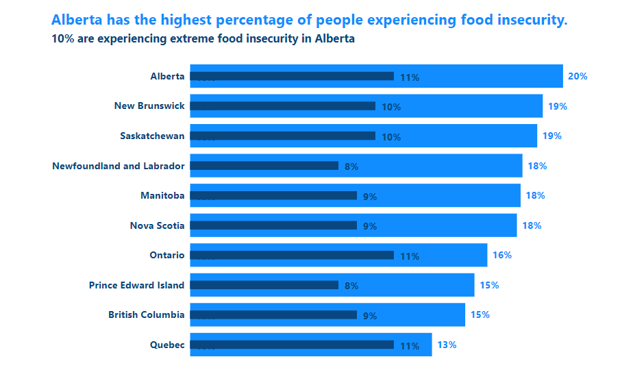
True, we’re still in the Bar Chart part of the data visualization world with an Overlapping Bar Chart, but it serves a whole different purpose than a regular bar chart.
While a regular bar chart allows us to compare categories of something really easily, an overlapping bar chart lets us do this PLUS show how a subset of data relates to the whole.
This chart type is VERY alternative in the Power BI world because it’s NOT a chart type that comes with Power BI. It has to be hacked using Power BI’s formatting options. It’s not hard once you know how. I try not to use external visuals and all their issues.
If you’d like to learn about how to make an Overlapping Bar Chart, get yourself on the VIP List for the Evergreen Data Visualization Academy. I create the Power BI tutorials there and we have one on how to make Overlapping Bars.
Alternative 2: Waterfall Charts
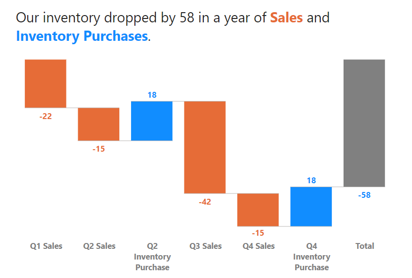
Waterfall charts are a different form of bar/column chart. Instead of each column starting at the 0 point on the y-axis, each bar either rises (or falls) from where the previous bar ends. It’s fantastic way to show how different elements or factor contribute to an increase (or decrease) of a metric.
Waterfall charts come as a “stock” option in Power BI. I customized it by formatting the heck out of it, adding dynamic colored value labels and of course a great descriptive title.
Alternative 3: Lollipops!
Sometimes a regular bar chart IS the right chart for your users and the insight you are trying to communicate from your data, but bar chart fatigue is a real thing.
Change things up with a Lollipop Chart, which is still excellent for comparing categories of something (just like a bar or column chart), but is a little easier on the eyes AND emphasizes the value more visually. A dot that represents the number gives more emphasize to that number.
Lollipops don’t come stock with Power BI, and there are some custom visuals you can add to make them (all with limited formatting), but why go out and get a visual when a Lollipop Chart is totally doable (and easy) to do in Power BI?
Vertical Lollipops (columns) are totally doable and easy. I’ve alllllmost figured out Horizontal Dumbbells (without resorting to adding in an external visual). Almost.
If you’d like to learn about how to make a Lollipop Chart, get yourself on the VIP List for the Evergreen Data Visualization Academy. I create the Power BI tutorials there and we have one on how to make Lollipop Chart.
Alternative 4: Dumbbell Dot Plots
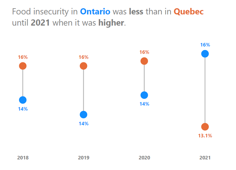
Sometimes, people try and use Bar Charts to show the difference between two metrics across categories, and they always end up with those charts with a ton of bars that are impossible to decipher with a lot of work. It’s a mess. A Mess.
If your message is about the difference, then just show the difference, and emphasize that difference. Dumbbell dot plot charts are great at doing this. They focus the visual on just the data points and the differences between them.
This is another chart type that Power BI doesn’t come with, and while there are external visuals that will make these, they can be made with an easy Power BI hack.
If you’d like to learn about how to make a Dumbbell Dot Plot, get yourself on the VIP List for the Evergreen Data Visualization Academy. I create the Power BI tutorials there and we have one on how to make a Dumbbell Dot Plot.
Now you have 4 options to change things up and visualize bar/column chart data in different ways to tell the stories in the data better. That’s what it’s all about.
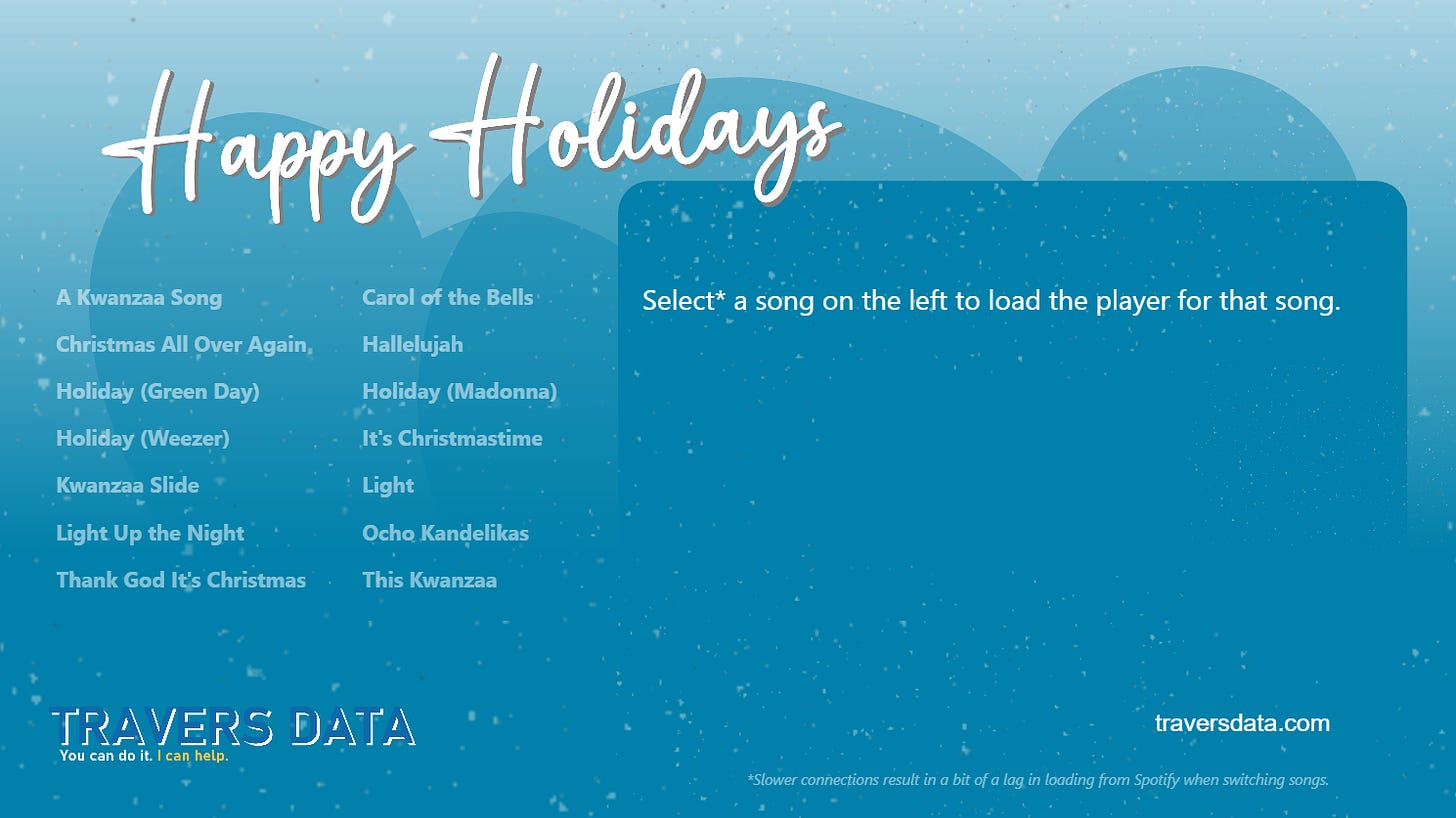
I’ve been playing with Power BI and Spotify music player embeds the last little bit to see if I could get music embeds to show up in an attractive way (and have the color formatting of everything change for every song.
Here’s what I’ve come up with (and will likely expand and enhance this next year). I hope you enjoy clicking and listening to different songs.