The Filter Pane

In this post we’ll be going over the basics of the Power BI Filter Pane, including the many many ways we can use it to filter our visuals differently.
We’ll be using a simple pre-built report to learn about the basics of the Filter Pane. You can download a copy of it by clicking here.

The data the Power BI file connects to is the same data as is used in the How to build a bar chart tutorial. If you want your own copy of it, you can download it here:

To learn how to connect Power BI to Excel data, click here.
Video:
Written Instructions:
Our report is very simple, with one bar chart on one page and that’s it. (click here if you need to learn how to build a bar chart.)
We’re using this super simple report so we can concentrate on how our Filter Pane works.
The Filter Pane is one of the panes that loads by default when Power BI Desktop is launched, but it may be collapsed. Just click it to open it up.
When you have a visual made and selected, the Filter Pane for that visual has some information in it automatically. The Filter Pane will have possible filters sitting there based on what fields you’ve added to your visual.
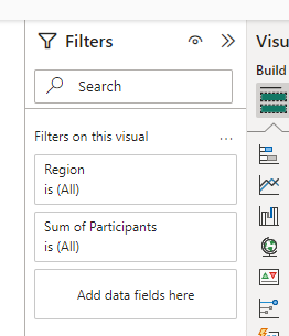
In our case, we can see possible filters for Region and Participants already sitting there in the Pane. Neither are filtering anything yet. They are there because they are the fields we’ve built our visual with.
Let’s try building our first filter.
Let’s say that we don’t need to report on our Southwest region in our bar chart. We can open up the Region part of our Filter Pane and select all our regions except the Southwest Region. This is basic list filtering.
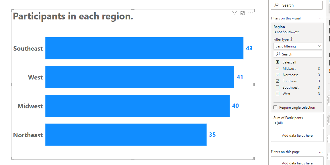
We can do the same thing using other fields in our data. We have various Programs in our data and we may not want to report on all of them in this chart. We can drag our Program field over to the Filter Pane and select which programs we want to filter. Let’s select Health and Nutrition but filter out Substance Abuse.
Let’s explore other types of filtering we can do in the Filter Pane.
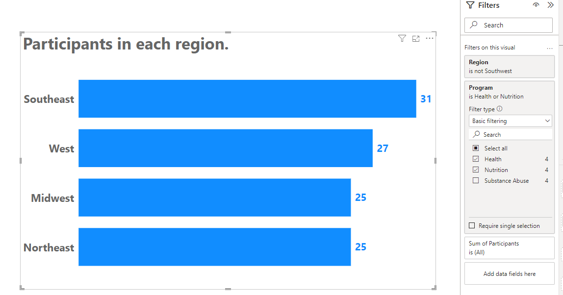
We’ve done Basic Filtering thus far, but let’s change the Filter Type dropdown in our Region filter to Advanced Filtering. This gives us a lot of options for filtering according to conditions. Since Region is a text field, we have options for looking for certain text (or the absence of it, if data is blank or empty. All kinds of things.
Let’s try selecting “contains” and typing in the word “west” and then clicking where it says “Apply Filter”. Now we only have bars for regions that contain the word “west”.
Pretty neat, huh?
Okay, let’s try a 3rd way of filtering. Let’s select “Top N” in our Filter Type dropdown for our Region filter. Let’s say we only want to show the Top 3 regions of our 5, using the number of participants for ranking, we’d type a “3” into where it says Show Items and then drag our Participants field, which has numbers of participants, to the By Value box. We want to make sure it says “Sum of Participants” but according to your needs you could select Average or Max or Counts, for instance.
Then click “Apply Filter”.
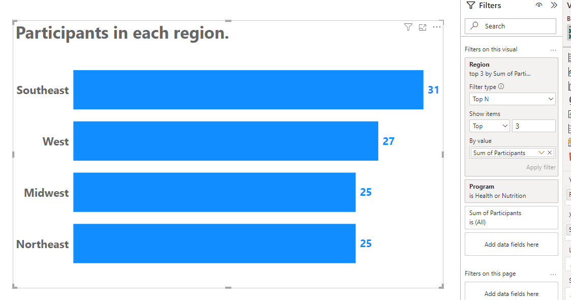
Now we get 4 regions showing as our 3rd and 4th spots are actually a tie, so thankfully Power BI is smart enough to recognize this.
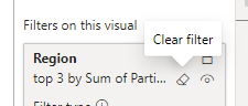
That’s the very basics of our Filter Pane, but we’ll explore one more thing here before we finish.
We’ll clear our Region filter completely by clicking the little eraser symbol that shows up when we hover over it.
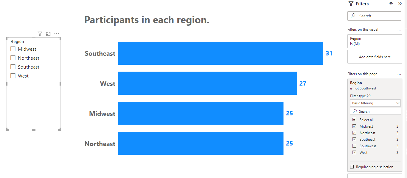
Then, we’ll bring in a simple slicer for our page by making sure our bar chart is NOT selected and clicking the Slicer icon (the one with the little funnel) on the Visualizations Pane.
We’ll drag our Region field to our slicer to give us a list of our regions that our users can select. If we don’t want the Southwest Region on our page, we don’t have to filter our chart and slicer separately. We can do them at the same time.
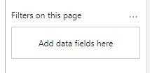
Drag our Region field from our Data Pane to where it says “Filters on this page” in our Filter Pane and we can filter anything on our page at once.
We’ll select all our regions in this new filter except Southwest and now both our chart and our slicer only has the fields we care about. Well, the ones we are reporting on, anyway.
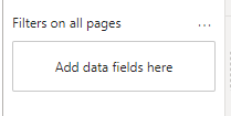
Finally, there’s a spot down at the bottom of the Filter Pane where we can create a filter for all pages on an entire report, so if you don’t want the Southwest region anywhere in your report, you can filter it out here.
That’s the basics of the Filter Pane. Extremely powerful stuff.
Take care everyone,
Joe.
Like these posts but need more formal (but still engaging and fun) training in Power BI? Contact me, Joe Travers or at joe@traversdata.com. I got you.
